| Image |
Comment |
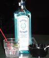
| 05/19/2004 05:31:01 AM |
night capby breezee70Comment: Good one! I love how the smoke is wafting from the ashtray. Very nice effect. Unfortunately, the bottle cover is too bright (making it look washed out). Suggestions: Show the whole bottle instead of cutting the top off, make the background completely black (shoot the picture on/near the table's edge so the table won't show up in the background), and be conscious of perspective as it looks like the bottle is leaning just a bit to the left. (Could be me, though.) Overall, a very nice picture and it captures the "Habits" theme perfectly. Great work! |
 Photographer found comment helpful. Photographer found comment helpful. |
| 05/12/2004 07:09:23 PM |
Dead and Aliveby neehaiComment: Somewhat dark and lacks 'punch' (not colorful enough). Maybe use a flash or wait until the sun shines on the plant? Interesting plant, though. I like the blurry background - nice depth of field! Maybe a close-up will make it even more interesting and eye-catching. Great attempt! |
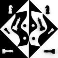
| 05/12/2004 06:58:50 PM |
Some Things Are Just Black and Whiteby bruskiComment: I can visualize this wonderful image on a cover of a chess magazine! :-) Any more contrast and it'd fool people into thinking that this was a graphic illustration instead of a photograph. Very cool! I like how the black curve overlaps the white curve. That caught my eye and added some 'flavor' to the picture. Both curves could've been just a wee bit smoother and more exaggerated, but that's just me. Kudos! |
| Photographer found comment helpful. |
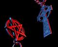
| 05/12/2004 06:47:41 PM |
The Exorcistby labudsComment: This is great! I love how you picked the colors (red versus blue) and represented them accordingly. Very nice highlighting. The black background is pleasingly solid, though there's a bit too much of a black area above the pentagram (as compared to the area below the cross). If symmetry was your intention, probably would be better to move the pentagram up a bit. Then the negative space would be balanced. Just my two cents. Sharp and wonderfully done! :-) |
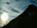
| 05/12/2004 06:36:16 PM |
Darkness and light...eternally opposedby geewhyComment: Wow! Love the diagonal composition, it's just perfect and very pleasing to the eye. Definitely fits the theme. The sun 'spot' is too bright, might be better if it was reduced and slightly more contrast is given to the sky. All in all, a beautiful shot! |
| Photographer found comment helpful. |
| 05/12/2004 10:22:21 AM |
A Classic Rivalry!by LENWOODBLUZComment: I don't know if it's the packaging themselves or the lighting, but it's a bit too orange. Other than that, great concept and shot! |
| Photographer found comment helpful. |
| 05/12/2004 09:51:29 AM |
Light and Shadow. A Kiss.by la magaComment: Lovely! I like the pattern made by the shadows. Great composition. Though I can't say I like the borders... they're too thick (and too gray, too) and takes away the attention. |
| 05/12/2004 09:37:46 AM |
Fire and Iceby JukomoxComment: This is a cliche, but I like it. How you captured the flames is very good. I only wish this was less blurry, is in color, and has more contrast. Nice attempt! |
| Photographer found comment helpful. |
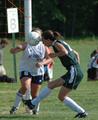
| 05/12/2004 09:34:55 AM |
oppositeheadersby rrp1Comment: The picture is too blurry... the "8" sign is distracting... and I can't see the white-shirt girl's face. Good capture, though. Better luck next time. |
| 05/05/2004 05:43:46 PM |
Window Viewby WildflowerJoyComment: Wow! I like how you got the bird right in the middle and in a perfect position. How'd you do that? Or is the bird a fake one? Either way, wonderful! If it's real then you got very, very lucky. If it's fake, then you're very creaive. If I have to complain about something, it would be the wood thingy in the front which is somewhat distracting. Would like to know where this was taken. Bravo! |
| Photographer found comment helpful. |
Home -
Challenges -
Community -
League -
Photos -
Cameras -
Lenses -
Learn -
Help -
Terms of Use -
Privacy -
Top ^
DPChallenge, and website content and design, Copyright © 2001-2025 Challenging Technologies, LLC.
All digital photo copyrights belong to the photographers and may not be used without permission.
Current Server Time: 04/08/2025 03:04:11 PM EDT.