| Author | Thread |
Comments Made During the Challenge  |
|
|
05/25/2004 04:24:43 PM |
|
|
|
05/25/2004 12:52:29 PM |
| your lighting is a little too direct, slightly washing out the detail. |
|
|
|
05/25/2004 08:30:17 AM |
| Sorry, but dreary composition |
|
|
|
05/25/2004 06:29:21 AM |
| Enter your comment here, and t |
|
|
|
05/23/2004 11:23:32 AM |
| Overexposed, harsh lighting, and spots on a dirty lens. |
|
|
|
05/22/2004 05:15:08 PM |
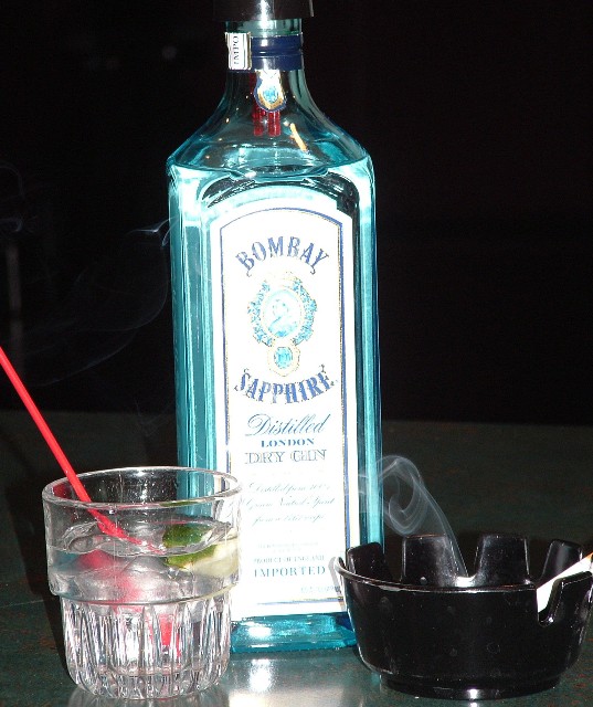
| The Gin should have been rotated slightly to reduce glare, otherwise, nice composition. |
|
 Photographer found comment helpful. Photographer found comment helpful. |
|
|
05/22/2004 08:35:23 AM |
|
| Photographer found comment helpful. |
|
|
05/22/2004 05:34:29 AM |
| This would be better if the label on the bottle wasn't washed out. That was done by your attached flash. It's a guarantee of flare. |
|
| Photographer found comment helpful. |
|
|
05/21/2004 08:58:57 AM |
| Lighting is way too harsh for this still life, spoils what could be an decent shot. 3 |
|
| Photographer found comment helpful. |
|
|
05/21/2004 08:19:13 AM |
| Horizon is very tilted. It looks out of focus (note the blurriness of the label). There are a lot of hot spots from flash (in the glass, in the lower edge of the bottle and it's reflection,in the neck of the bottle, in the lower edge of the ashtray and inside the ashtray). I'm guessing this was taken using just a flash. This would account for the flat lighting and all the glare. |
|
| Photographer found comment helpful. |
|
|
05/21/2004 05:20:14 AM |
| I like it but would like to have seen it not cropped so tightly...IMO |
|
| Photographer found comment helpful. |
|
|
05/21/2004 03:20:34 AM |
| The subject is significantly tilted. There is some overexposure on the bottle - looks like you used flash. I like the uncluttered background keeping your attention where it should be. |
|
| Photographer found comment helpful. |
|
|
05/20/2004 01:43:24 PM |
| I like the curve of the smoke very much. The overall composition is a little bland for me - a tighter crop, less glare from the flash would have helped (but I understand lighting smoke is pretty tough). The look of the photo now gives a sense of these habits as unappealing, which works well for the challenge - they're something that you do, but after a while you must do but not necessarily take the same enjoyment from anymore. |
|
| Photographer found comment helpful. |
|
|
05/20/2004 11:10:19 AM |
| The icy blue a very nice contrast. I would like to see this shot with a crisp, clear glass of "vodka", sharper focus and straightened. Black a good choice for background. |
|
| Photographer found comment helpful. |
|
|
05/20/2004 07:20:47 AM |
| Lighting is a tad harsh. Cheers anyway! |
|
| Photographer found comment helpful. |
|
|
05/20/2004 02:02:18 AM |
| A little too bright and a little too dark. |
|
|
|
05/19/2004 02:28:54 PM |
| Nice picture and composition, but the lighting seems too harsh |
|
| Photographer found comment helpful. |
|
|
05/19/2004 02:20:46 PM |
| Light is harsh. Next time use a diffuser on your flash or use a flash with a diffuser. |
|
| Photographer found comment helpful. |
|
|
05/19/2004 01:30:46 PM |
| get away from the flash...the line in the back could've been eliminated. all the lines seem off, if you deemed elements important to the composition you might want to keep them in completely (glass & ashtray) or try a more creative arrangement of the pieces. maybe a more downward shot would've been better? |
|
| Photographer found comment helpful. |
|
|
05/19/2004 11:15:32 AM |
| better on still life to not use flash. |
|
| Photographer found comment helpful. |
|
|
05/19/2004 10:54:33 AM |
ahhh my favorite ... sapphire :)
Looks like a little hot on the flash... maybe an off camera flash, or dialing down the flash exposure a bit, could've helped. |
|
| Photographer found comment helpful. |
|
|
05/19/2004 08:24:17 AM |
| Not very original. Smoking and Drinking are the most obvious habits. Decent photograph though. |
|
|
|
05/19/2004 06:19:30 AM |
| burnt out, poorly lit, tilted, lazy cropping |
|
| Photographer found comment helpful. |
|
|
05/19/2004 05:31:01 AM |
| Good one! I love how the smoke is wafting from the ashtray. Very nice effect. Unfortunately, the bottle cover is too bright (making it look washed out). Suggestions: Show the whole bottle instead of cutting the top off, make the background completely black (shoot the picture on/near the table's edge so the table won't show up in the background), and be conscious of perspective as it looks like the bottle is leaning just a bit to the left. (Could be me, though.) Overall, a very nice picture and it captures the "Habits" theme perfectly. Great work! |
|
| Photographer found comment helpful. |
|
|
05/19/2004 03:47:04 AM |
| Great idea for a shot. Also happens to be my night cap of choice (well, except the smoke which I quit 6 months ago! still want them though), lighting is hard though and could be improved with a softer source (looks like you used direct flash?) |
|
| Photographer found comment helpful. |
|
|
05/18/2004 11:28:35 PM |
| Nice colors. The picture needs rotated to the right, and the glare is distracting. |
|
| Photographer found comment helpful. |
Home -
Challenges -
Community -
League -
Photos -
Cameras -
Lenses -
Learn -
Help -
Terms of Use -
Privacy -
Top ^
DPChallenge, and website content and design, Copyright © 2001-2025 Challenging Technologies, LLC.
All digital photo copyrights belong to the photographers and may not be used without permission.
Current Server Time: 04/07/2025 12:49:06 PM EDT.