| Author | Thread |
Comments Made During the Challenge  |
|
|
05/18/2004 06:58:57 PM |
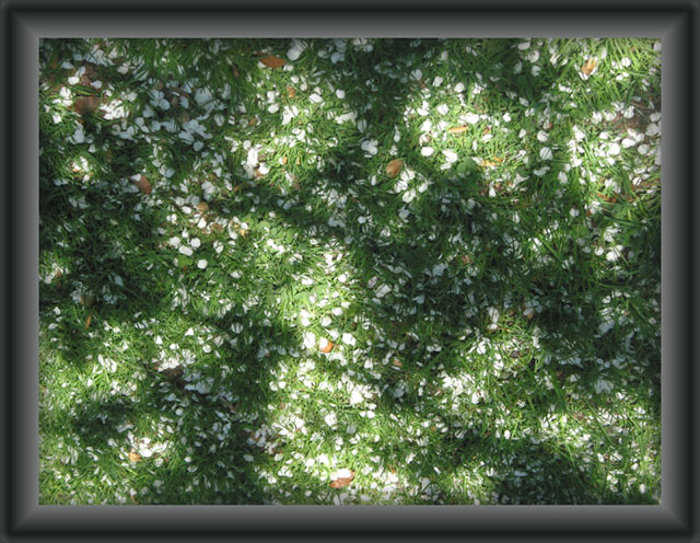
| I'm bugged immediately by the border on this. If it were solid, I think I'd be happier. I do, however, love the subject with its textures and variations and I think it's a lovely, subtle way to meet the challenge topic. |
|
|
|
05/18/2004 03:55:59 PM |
| i really like this, it's pretty and original |
|
|
|
05/18/2004 12:02:04 PM |
| very nice abstract from a natural scene |
|
|
|
05/18/2004 06:16:55 AM |
| This image is pretty hard to figure out and the frame is much to bulky for my opinion. |
|
|
|
05/17/2004 11:43:43 PM |
Border was way too big and image detail lacking a lot of clarity.
Interesting composition though. Not sure what the kiss was. |
|
|
|
05/17/2004 10:56:26 PM |
| The frame doesn't do this image any favors IMO |
|
|
|
05/17/2004 03:09:41 PM |
| I don't like the frame, too big! THe photo is ok, I like it, but the frame... |
|
|
|
05/15/2004 01:37:29 PM |
| Border is smart...But i cant recognize the items on the grouns..Are the leaf? |
|
|
|
05/14/2004 10:33:08 PM |
| Different. I think the pic would have more impact if the shadows were darker/smoother or if the view were up much closer, maybe crop it down to just about the center 30%. Your border is ok, but I think more effort on the pic would be more effective. 7 |
|
|
|
05/13/2004 09:08:48 PM |
| It looks really good with the border. |
|
|
|
05/13/2004 06:14:17 PM |
| This photo gives me a nice feeling. One of my top picks. |
|
|
|
05/13/2004 05:53:35 PM |
| lovely capture - although frame first appears rubbish it does give fantastic effect of looking down in 3D |
|
 Photographer found comment helpful. Photographer found comment helpful. |
|
|
05/13/2004 03:32:08 PM |
| This is a pictire that grows on you. I actually like it, even with the border! |
|
|
|
05/13/2004 03:07:32 PM |
| Very nice. The best picture portraying lights and shadows I have seen in this challenge until now. |
|
|
|
05/13/2004 02:24:38 PM |
| Really neat photo, but I'm not sure I'm feeling it for the challenge. Nice job though! |
|
|
|
05/13/2004 03:54:57 AM |
| It appears to me that the frame is more important than the image. It appears a little flat - I think it would help to adjust the levels in photoshop. |
|
|
|
05/13/2004 02:46:14 AM |
| very creative idea. nice image. |
|
|
|
05/13/2004 12:48:16 AM |
| Wow! I love this image. Great abstract. Certainly a gem that deserves a wall for hanging. Good use of light to make the image real shine. |
|
|
|
05/12/2004 09:19:45 PM |
|
|
|
05/12/2004 07:32:45 PM |
No, doubt this is pretty. I personally love shaddows.
This could of been improved with less of a heavy frame......! also the light area at the bottom is really hot.
Maybe crop it a different way. Good luck in the challenge. |
|
|
|
05/12/2004 06:21:07 PM |
| very trippy... i like the blending of the light and shadow. -10 |
|
|
|
05/12/2004 02:31:00 PM |
The fallen petals on the grass form a nicely colored mural for the tree shadows to play. I like the focus and point of view. The frame seems an integral part of this picture as if it were a window through which this scene was viewed by the camera. I just covered it with my hands and I think I like the picture better without.
A 7. |
|
|
|
05/12/2004 01:51:29 PM |
| Lovely! I like the pattern made by the shadows. Great composition. Though I can't say I like the borders... they're too thick (and too gray, too) and takes away the attention. |
|
|
|
05/12/2004 01:40:28 PM |
|
|
|
05/12/2004 09:36:55 AM |
|
|
|
05/12/2004 03:45:46 AM |
| big border. not a good border, just big. |
|
Home -
Challenges -
Community -
League -
Photos -
Cameras -
Lenses -
Learn -
Help -
Terms of Use -
Privacy -
Top ^
DPChallenge, and website content and design, Copyright © 2001-2026 Challenging Technologies, LLC.
All digital photo copyrights belong to the photographers and may not be used without permission.
Current Server Time: 02/01/2026 10:22:58 AM EST.