| Author | Thread |
Comments Made During the Challenge  |
|
|
05/18/2004 11:29:07 PM |
| Nicely shot - the lighting and colors are great - they could be abstracted even more to provide a more interesting composition. |
|
 Photographer found comment helpful. Photographer found comment helpful. |
|
|
05/18/2004 10:55:49 PM |
| I don't like to comment on my lower scores because I am not a professional, but I think this image is just to orange. If more of the white was a crisp white, I think it would've made for a better photo. |
|
| Photographer found comment helpful. |
|
|
05/18/2004 04:24:13 PM |
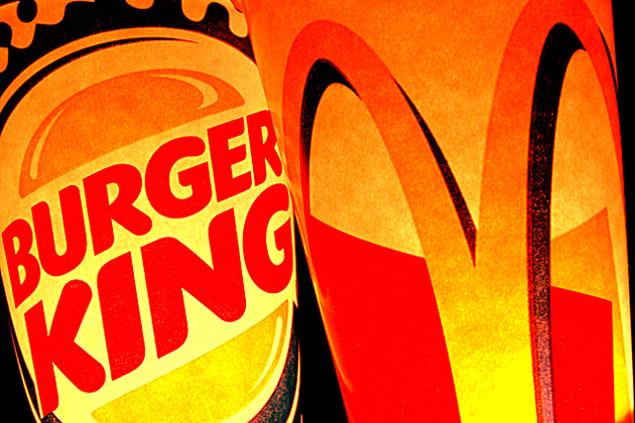
| Gorgeous color...is that light coming from inside the cups? |
|
| Photographer found comment helpful. |
|
|
05/16/2004 06:26:45 PM |
|
| Photographer found comment helpful. |
|
|
05/15/2004 10:14:45 AM |
Great composition, lighting & colors. I like it as it is, don't see how it could be improved. The grainy look in the whites and yellows makes it look classic.
I wonder how you lit the cans up, from the inside? |
|
| Photographer found comment helpful. |
|
|
05/15/2004 12:34:48 AM |
Hardly opposites IMO in fact I would say same sh... er crap, different pile.
Only a five from me I feel it misses the challenge theme somewhat even though the are "opposition" but that does not make them opposite. |
|
| Photographer found comment helpful. |
|
|
05/14/2004 04:02:30 PM |
| how did you get the colors..... it is disturbing |
|
| Photographer found comment helpful. |
|
|
05/14/2004 11:34:08 AM |
| Neat colors and composition. This has a lot of artictic appeal. |
|
| Photographer found comment helpful. |
|
|
05/14/2004 11:13:35 AM |
| Yes it is, but not really opposites per say, more like opposition. Slight difference. I like the way you lighted the cups from within but the harshness is a bit much for my taste. Also the set up leaves me wanting, the black line on the right is distracting and the cropping seems a bit tight. A 3 |
|
| Photographer found comment helpful. |
|
|
05/14/2004 11:12:03 AM |
|
|
|
05/14/2004 10:28:44 AM |
| Classic rivalry, but not exactly opposites. |
|
| Photographer found comment helpful. |
|
|
05/14/2004 01:32:37 AM |
| has an Andy Warhol feel..impressive |
|
| Photographer found comment helpful. |
|
|
05/13/2004 08:20:27 PM |
| Interresting. Although they are fierce competitors, they are certainly not opposites. They are pretty much both the same: crap. |
|
| Photographer found comment helpful. |
|
|
05/13/2004 12:52:03 PM |
Wow, this photo is awesome. I really like it. Hope it places well!
|
|
| Photographer found comment helpful. |
|
|
05/13/2004 12:28:18 PM |
| you should reduce the noise on this picture, it would make it a lot sharper. good concept though! |
|
| Photographer found comment helpful. |
|
|
05/13/2004 12:27:44 PM |
|
| Photographer found comment helpful. |
|
|
05/13/2004 06:42:41 AM |
I don't like the colors.. but I like the idea
= 6 |
|
| Photographer found comment helpful. |
|
|
05/13/2004 01:40:42 AM |
| good composition, but would've preferred a truer white-balance |
|
| Photographer found comment helpful. |
|
|
05/12/2004 08:29:30 PM |
| Hope you don't get DQ'd for photographing artwork...I won't tell! I don't think they are opposites because they are direct competitors for the same market demographics...all of us who eat! :o) |
|
| Photographer found comment helpful. |
|
|
05/12/2004 05:07:42 PM |
| Nice shot but Burger King and McDonalds are rivals: not opposites, they are fast food chains selling broadly the same product. Hence marked down. |
|
| Photographer found comment helpful. |
|
|
05/12/2004 02:22:21 PM |
| I don't know if it's the packaging themselves or the lighting, but it's a bit too orange. Other than that, great concept and shot! |
|
| Photographer found comment helpful. |
|
|
05/12/2004 11:50:30 AM |
| Good idea and its layout great but the lighting is a bit intense - 6 |
|
| Photographer found comment helpful. |
|
|
05/12/2004 03:30:12 AM |
rivalry, sure. opposites? hmm... i don't know. that's a stretch.
i don't think i like the unnatural yellowy colors here. |
|
| Photographer found comment helpful. |
|
|
05/12/2004 02:36:16 AM |
Rivals...yes. Opposites...????
interesting effect. 4. |
|
| Photographer found comment helpful. |
Home -
Challenges -
Community -
League -
Photos -
Cameras -
Lenses -
Learn -
Help -
Terms of Use -
Privacy -
Top ^
DPChallenge, and website content and design, Copyright © 2001-2026 Challenging Technologies, LLC.
All digital photo copyrights belong to the photographers and may not be used without permission.
Current Server Time: 02/01/2026 09:00:28 AM EST.