| Author | Thread |
Comments Made During the Challenge  |
|
|
05/18/2004 06:08:04 AM |
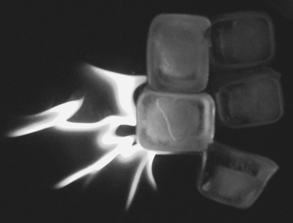
| I like using black and white but it would seem to me that the subjects in this photo would have much more impact in color. |
|
 Photographer found comment helpful. Photographer found comment helpful. |
|
|
05/17/2004 07:28:11 PM |
| Image quality was lacking detail & focus. |
|
| Photographer found comment helpful. |
|
|
05/17/2004 07:11:38 PM |
| This photograph is out of focus and uninspiring -- the composition looks entirely unplanned, and the entire photo is grainy. |
|
| Photographer found comment helpful. |
|
|
05/16/2004 05:43:25 AM |
| Really interesting perspective, needs contrast and sharpness though. Good job... |
|
| Photographer found comment helpful. |
|
|
05/15/2004 08:47:07 AM |
| the focus is not very good on the ice |
|
| Photographer found comment helpful. |
|
|
05/14/2004 05:00:16 PM |
| Fire and Ice is tough to pull off. Here's what I think falls short in this image: contrast, using ice cubes, and going in black and white (which seems like a waste of color for this kind of image!). The "flame" is a bit odd, and there's no visual explanation for that. The composition doesn't treat the eye, IMHO. |
|
| Photographer found comment helpful. |
|
|
05/14/2004 08:23:53 AM |
| This picture could be in better focus, and have more contrast - it's too dark and grey. |
|
| Photographer found comment helpful. |
|
|
05/14/2004 06:30:19 AM |
| Totally out of focus, and the image has a grainy appearance. |
|
| Photographer found comment helpful. |
|
|
05/14/2004 05:44:13 AM |
| The ice looks out of focus and is awfully dark. It doesn't stand out from the background at all. The fire is interesting and by itself might make a good photo, but this combination is pretty dull. |
|
| Photographer found comment helpful. |
|
|
05/13/2004 01:28:57 PM |
| It probably would look much better in color. It also appears to be out of focus |
|
| Photographer found comment helpful. |
|
|
05/13/2004 10:42:19 AM |
| I would much prefer colors for a flame. A 4. |
|
| Photographer found comment helpful. |
|
|
05/13/2004 06:39:09 AM |
| would have been better if it was in focus. |
|
| Photographer found comment helpful. |
|
|
05/12/2004 05:03:39 PM |
| Neat Idea, but needs to be infocus. Also should be in color so you can see the different shades of the fire as well as the clear ice, and the picutre is very flat try bumping up your contrast!!! |
|
| Photographer found comment helpful. |
|
|
05/12/2004 10:03:38 AM |
| Nothing is in focus here, and coupled with the fact that there are many, many 'fire and ice' entries this joust doesn't match up. Sorry |
|
| Photographer found comment helpful. |
|
|
05/12/2004 09:37:53 AM |
| Dark, out of focus and nothing to really hold my attention. A 2 |
|
| Photographer found comment helpful. |
|
|
05/12/2004 09:37:46 AM |
| This is a cliche, but I like it. How you captured the flames is very good. I only wish this was less blurry, is in color, and has more contrast. Nice attempt! |
|
| Photographer found comment helpful. |
|
|
05/11/2004 10:21:55 PM |
| dunno why you chose to make this b & w ... |
|
| Photographer found comment helpful. |
|
|
05/11/2004 10:16:27 PM |
| I don't see anything sharp, and I think it would be better in color. 3. |
|
| Photographer found comment helpful. |
Home -
Challenges -
Community -
League -
Photos -
Cameras -
Lenses -
Learn -
Help -
Terms of Use -
Privacy -
Top ^
DPChallenge, and website content and design, Copyright © 2001-2025 Challenging Technologies, LLC.
All digital photo copyrights belong to the photographers and may not be used without permission.
Current Server Time: 04/07/2025 02:21:17 PM EDT.