| Image |
Comment |
| 09/30/2002 07:08:00 AM |
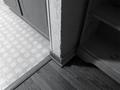
Rental Homeby hypoStillerComment: Thanks for the input, as always. :) I see this time around that I wasn't adept at providing a focal point or "subject" for my shot. Still, I like my framing and do appreciate the variety of textures -- though admittedly, the "wow factor," if there is one, is not pronounced; I had intended to showcase an abstract expression of shape and tone. We'll miss this old house, I think, but we're very happy with the new one. |
| 09/19/2002 09:30:00 AM |
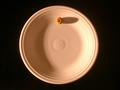
Dietby johnsonComment: Very nice play of shadows, and a humorous shot. The composition is witty. The colors are well chosen. In this case the negative space is used with intention, and it reinforces the hunger of the unfortunate recipient of this meager meal. 9 |
| 09/20/2002 12:59:00 PM |
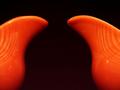
A New Bell Curveby just-marriedComment: You managed to pull a good sense of depth out of your subject. The more I look at the orange areas, the more I appreciate their curves and glossy surface. I like the tiny discrepancy in the height of each pitcher, though I’d vote for a slight shove to the right in framing. The negative space is strong and seems to hug your subject. |
 Photographer found comment helpful. Photographer found comment helpful. |
| 09/23/2002 06:55:00 AM |
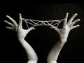
Jacob's Ladderby hypoStillerComment: Thanks, folks, for the great input! :) I can see that many of you wanted the framing to exclude the elbows -- and isn't that funny? One person's trash is another's treasure. The awkwardness introduced by leaving them in is one of my favorite things about this lucky shot. The additional angles give the image a "froggy" appeal that suddenly made the negative space more interesting than my initial attempts, which show the arms coming parallel from the bottom. Thanks to my lovely wife for the patient hands! (She assures me her limbs didn't cramp up, but thanks for the concern *wink*). I may go over this photo again for a non-challenge version to manually darken the background so that I can achieve a stronger tonal range on the skin without getting overly grainy. |
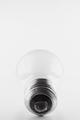
| 09/20/2002 07:03:00 AM |
Edisonby hokieComment: This is very simply a beautiful shot. The light bulb has always been a good metaphor for Edison because he was involved in its creation, and also because light bulbs have been used for decades to show -- bing! -- the occurrence of an idea, and then there's the pun en"light"enment, etc. It's subtle, but to me the negative space (above the bulb) is used to indicate an inviting gap upward for creativity, as if to say, "Here we are, and it's great, and there's so much more to discover!" 8 |
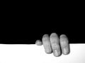
| 09/20/2002 06:57:00 AM |
Hangin' Onby karmatComment: To me, this photo poses a friendly debate over which of the spaces is the negative space. It's the debate that keeps me interested, after the initial grin at this poor soul clinging to the edge. I would have preferred a perfectly even white area (the line is a tiny bit crooked), but the general composition is right on. Good lighting (maybe a bit more contrast?) and good use of negative space up top ... it weighs down on top of the fingers. 8 |
| Photographer found comment helpful. |
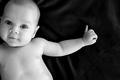
| 09/20/2002 06:50:00 AM |
Hannahby ZeissmanComment: You have captured an adorable baby in a pose balanced between awkward and graceful. Something about the extended pinky adds interest to me, suggesting future sophistication (the way some people drink wine) and future language (lettering in Sign). At first, I wanted the background to be stark black, but the hints of velvet-highlight are ultimately okay with me. They are a little like the lines a cartoonist draws around a subject to suggest movement. The negative space in this case swirls my eye around the hand, then tosses me back to the rewarding image of such a cutie. I would have preferred more contrast in the baby, but you caught a wonderful expression. 8 |
| Photographer found comment helpful. |
| 09/20/2002 12:10:00 PM |
Runnerby lionelmComment: The white area adds energy to the shoe and leg. In our left-to-right culture, moving to the left in motion or still pictures often suggests moving against the flow. Though nicely lit, I'd like to see a touch more detail in the end of the shoe lace (it almost disappears), and maybe a bit more contrast without overblowing the highlights on the show. 8 |
| Photographer found comment helpful. |
| 09/20/2002 06:52:00 AM |
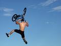
Wipe-Out by rcrawfordComment: Very dyanmic! The fact that your subject is fully in the air (no grass or road to be seen) emphasizes the excitement of this stunt. The fact that your negative space is filled with clouds pushes that excitement further. Great sprawling of legs and bicycle! 8 |
| 09/20/2002 12:16:00 PM |
Light Danceby bobtburgComment: Nicely lit! The blackness seems warm and envelopes the model cozily. Everything about this negative space suggests woman. 8 |
Home -
Challenges -
Community -
League -
Photos -
Cameras -
Lenses -
Learn -
Help -
Terms of Use -
Privacy -
Top ^
DPChallenge, and website content and design, Copyright © 2001-2026 Challenging Technologies, LLC.
All digital photo copyrights belong to the photographers and may not be used without permission.
Current Server Time: 02/01/2026 10:05:14 AM EST.