| Author | Thread |
|
|
09/23/2002 08:11:00 PM |
|
 Photographer found comment helpful. Photographer found comment helpful. |
|
|
09/23/2002 04:35:00 PM |
| JM this should have scored way higher. The lack of complete symetry is not a problem to me. Would have looked artifiscial otherwise. |
|
| Photographer found comment helpful. |
|
|
09/23/2002 11:03:00 AM |
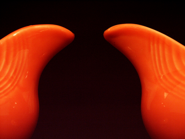
Thanks to everyone who took the time to study my photo enough to make comments on it. In response to the comments:
1) Lack of perfect symmetry bothered many. Unfortunately, these are two pieces of unique pottery (Yes Grayce, Fiesta!), so perfect symmetry was not really an option. If you look carefully you can see that the slope of the pitcher on the right is more inclined than that on the left. Couldn't be helped.
2) That said, I did break out Cool Ruler and measure the photo and I could/should have framed it with ten more pixels on the left and ten on the right. Good eye.
3) Swash, it never occurred to me to to credit Escher. I'm not sure I understand why I would...? While he certainly has images that take use the negative space to create a shape unto itself, he did not create that concept. Is there something I don't know? I am pretty familiar with the body of his work and cannot think of a bell reference. Correct me if I'm wrong.
In response to the "Comment on your Negative Space entry" thread, please see the Details above.
Thanks again to all.
Dawn |
|
|
|
09/23/2002 12:23:00 AM |
| I think this was one of the few (if not the only) photographs that actually demonstrates the topic of the challenge..... The subject was supposed to be the negative space..... Just framing a photo so that the subject is off in a corner with a bunch of empty grass, sky, etc., taking up most of the frame doesn't fit this subject... The key was to make the negative space interesting.... Most photographers and voters apparently did not "get it"..... |
|
| Photographer found comment helpful. |
Comments Made During the Challenge  |
|
|
09/22/2002 02:56:00 AM |
| What are those? I like the black and orange in this shot. 5 |
|
| Photographer found comment helpful. |
|
|
09/21/2002 10:26:00 AM |
Reminiscent of the two candlesticks image where the neg space suggests a face. But the shape here isn't as fascinating. Good colour and contrast.
6, Kavey |
|
| Photographer found comment helpful. |
|
|
09/20/2002 03:45:00 PM |
| Aha...Fiesta! I collect dinnerware so this appeals to me. :-) Great use of color and meets the challenge well. Good luck in the current challenge! Grayce aka Gracious |
|
| Photographer found comment helpful. |
|
|
09/20/2002 03:42:00 PM |
| I like the colors and symmetry. karmat |
|
| Photographer found comment helpful. |
|
|
09/20/2002 02:53:00 PM |
| Interesting. Truly. Good Negative Space. 8 |
|
| Photographer found comment helpful. |
|
|
09/20/2002 12:59:00 PM |
| You managed to pull a good sense of depth out of your subject. The more I look at the orange areas, the more I appreciate their curves and glossy surface. I like the tiny discrepancy in the height of each pitcher, though I’d vote for a slight shove to the right in framing. The negative space is strong and seems to hug your subject. |
|
| Photographer found comment helpful. |
|
|
09/20/2002 12:25:00 PM |
| This picture needs a focal point |
|
| Photographer found comment helpful. |
|
|
09/20/2002 09:19:00 AM |
Very nice... I love the way the symmetry works in this photo... Some images do vey nicely when they are symmetrical and this is a great example of that. The color also works very well against the dark background. Nice!
Meets Challenge: 10
Technical Merit: 8
Artistic Merit: 8
Creative Merit: 10
WOW Factor: 8
Score: 9 - JMSetzler |
|
| Photographer found comment helpful. |
|
|
09/19/2002 09:01:00 AM |
| I'd say this is a great (maybe perfect?) example of negative space! Love the orange color - maybe the dishes (or whatever) might have been better fully centered for this symmetrical study. Nice job! |
|
| Photographer found comment helpful. |
|
|
09/17/2002 06:03:00 PM |
Very good, (I would have liked it slightly better if you had given some credit to Esher) I see the bell! Slight reflections on the orange surfaces, but not horrible.
I don't see giving many 10s this week, so you may be the one. 10 Swash |
|
| Photographer found comment helpful. |
|
|
09/17/2002 11:52:00 AM |
| Not symetrical, which is a pretty basic error for a shot like this. |
|
| Photographer found comment helpful. |
|
|
09/17/2002 12:04:00 AM |
|
| Photographer found comment helpful. |
|
|
09/16/2002 04:04:00 PM |
| Yes! Good color, composition. Nice. Score 7 Justine |
|
| Photographer found comment helpful. |
|
|
09/16/2002 02:42:00 PM |
| attractive! Color is great! 8 sgtpepper6344 |
|
| Photographer found comment helpful. |
|
|
09/16/2002 11:57:00 AM |
Great work (more comments later) 10
Ruthann Negative space at it's best |
|
| Photographer found comment helpful. |
|
|
09/16/2002 11:48:00 AM |
| just a touch off centered---7bobgaither |
|
| Photographer found comment helpful. |
|
|
09/16/2002 09:04:00 AM |
Composition: 7Lighting: 6,
Appeal: 5, Total Rating6 Sulamk
|
|
| Photographer found comment helpful. |
|
|
09/16/2002 01:39:00 AM |
| NIce use of the negative space to form the Bell Curve. Nice contrast of colors. |
|
| Photographer found comment helpful. |
Home -
Challenges -
Community -
League -
Photos -
Cameras -
Lenses -
Learn -
Help -
Terms of Use -
Privacy -
Top ^
DPChallenge, and website content and design, Copyright © 2001-2026 Challenging Technologies, LLC.
All digital photo copyrights belong to the photographers and may not be used without permission.
Current Server Time: 02/01/2026 06:59:59 AM EST.