| Image |
Comment |
| 01/14/2009 05:14:25 PM |
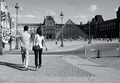
A day in our office is funby WilltorecordComment: I feel like this may be a stretch, thematically. That said, compositionally, I like the balance of the frame, the sense of movement. It's an interesting capture, it just doesn't line up thematically, for me personally. |
| 01/14/2009 05:07:48 PM |
DPC inc.: We Cut Through The Competition! by leugim_sevenComment: Nice concept. Good lighting. Excellent use of a concrete saw. Something I notice in your model that has been missing in some other entrants' models is that his expression matches the title. He looks like a guy that wants my business and wants to take it to the next level. Great effort. |
 Photographer found comment helpful. Photographer found comment helpful. |
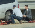
| 01/14/2009 05:01:20 PM |
Visa and Mastercard; cross cultureby rajronComment: I understand the selective desat. In fact, I wouldn't have noticed the Visa/MC sign without it. But the comp itself is rather unbalanced. It seems slightly out of focus, and even though the eye is drawn to the Visa/MC sign, I am still not sure where the focal point of the image lies. This is all convention, and I'm sure many people will adore this image more than I do as a matter of taste. I hope this helps. |
| 01/14/2009 04:56:59 PM |
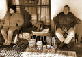
Soon to be sealedby BJokerudComment: I like the idea. It IS stock, IMO. The thing I'm not keen on is the upward lighting. It creates some blown out highlights and some distracting shadows. |
| Photographer found comment helpful. |
| 01/14/2009 04:54:34 PM |
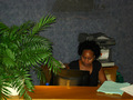
Dear Emilyby oldgrouseComment: There are several distracting elements at work here. Firstly, that plant, the paperwork, and the printer in the background. Changing the POV may have helped this. Secondly, the frontal lighting is harsh, and creates some nasty highlights. I also feel that the model isn't helping the composition any. |
| Photographer found comment helpful. |
| 01/14/2009 04:49:03 PM |
Getting Ready For Workby angkokwengComment: The highlights are a little harsh in this capture, and it could be a touch sharper. Other than that, I could see this as a business stock photo. Those are some wicked shorts! |
| Photographer found comment helpful. |
| 01/14/2009 04:47:07 PM |
|
| Photographer found comment helpful. |
| 01/14/2009 04:45:54 PM |
Charting the progress by TygerrComment: This is a wonderful image. First impressions, the DOF is perfect. It's effective, the model is effective, and the bar chart is perfect. It screams stock photo.
Technically, all the elements are there. The lighting is well placed and not harsh. I wish I could go 8.5. Will you settle for a n 8? |
| Photographer found comment helpful. |
| 01/14/2009 04:41:33 PM |
There for youby aKiwiComment: That is one UGLY briefcase. That said, it's a sound image. tell me you used a coat hanger for that tie. I don't really like the white background, necessarily. If I could change one thing, that would be it. Or crop tighter to the body, the run looks a little bit contrived. |
| Photographer found comment helpful. |
| 01/14/2009 04:36:48 PM |
What? No jobs? by bjh0705Comment: I'm a dog owner, so I have to try to be unbiased, but I know what this look means ;) This is both clever and sound, technically and thematically. 8 |
| Photographer found comment helpful. |
Home -
Challenges -
Community -
League -
Photos -
Cameras -
Lenses -
Learn -
Help -
Terms of Use -
Privacy -
Top ^
DPChallenge, and website content and design, Copyright © 2001-2025 Challenging Technologies, LLC.
All digital photo copyrights belong to the photographers and may not be used without permission.
Current Server Time: 04/07/2025 06:23:22 AM EDT.