| Image |
Comment |
| 12/12/2008 05:51:21 AM |
|
 Photographer found comment helpful. Photographer found comment helpful. |
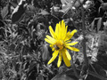
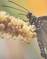
| 12/12/2008 05:50:14 AM |
A Bee's Lifeby butterflybettaComment: I'm not sure, but is a color selection like this allowed in Basic Editing?
The flower is pretty, but it and the bee are OOF. And how does this meet the challenge? |
| Photographer found comment helpful. |
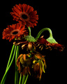
| 12/12/2008 05:48:36 AM |
Descent of Daisiesby banmornComment: Meets challenge, but the lighting seems a little off. The way the stems look bothers me too, how the two live ones appear to be leaning on the dead ones. It seems a little distracting to me. |
| Photographer found comment helpful. |
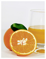
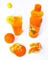
| 12/12/2008 05:46:52 AM |
Orange / Juiceby CraftyComment: This is probably the best OJ one I've seen so far. Simple, clear, delicious! :) |
| Photographer found comment helpful. |
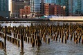
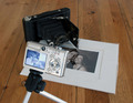
| 12/12/2008 05:45:57 AM |
Old meets Newby dzone1Comment: Oh, such a neat idea, but it looks like its been over processed... Its really dark, too. |
| 12/12/2008 05:44:54 AM |
|
| Photographer found comment helpful. |
| 12/12/2008 05:43:59 AM |
|
| 12/12/2008 05:43:16 AM |
Before and After Digitalby GreatJobBobComment: I get what you're going for here, but things feel a bit cluttered. I think its because you have all of that space around it. I either would have spread things out a bit, or cropped it closer (particularly on the L&R sides). Also, this really needs some better lighting. |
| Photographer found comment helpful. |
| 12/12/2008 05:41:20 AM |
Ouch this really grates on meby LutchenkoComment: Really interesting idea! I'd probably suggest some better lighting, though, and maybe bring the grater down closer to the carrot shreddings. |
| 12/12/2008 05:40:06 AM |
The Orange Cycleby offiofComment: Very cool idea, though it looks like you cranked the contrast up a little too much, IMHO. Also the orange in the background seems a little out of place. |
Home -
Challenges -
Community -
League -
Photos -
Cameras -
Lenses -
Learn -
Help -
Terms of Use -
Privacy -
Top ^
DPChallenge, and website content and design, Copyright © 2001-2025 Challenging Technologies, LLC.
All digital photo copyrights belong to the photographers and may not be used without permission.
Current Server Time: 04/12/2025 11:21:35 AM EDT.