| Image |
Comment |
| 09/01/2004 02:02:20 PM |
|
 Photographer found comment helpful. Photographer found comment helpful. |
| 09/01/2004 02:01:48 PM |
|
| Photographer found comment helpful. |
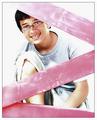
| 09/01/2004 02:01:17 PM |
macucatby simo25Comment: I think I would have adjusted the crop of this image. Include more of the frame in the upper left corner (which has been cut) and eliminate the sides of the picture, which don’t really add anything to the center frame. The frame doesn’t necessarily need to be centered, just reoriented a tad. Good idea though and the shadow from the railing adds nice detail. |
| Photographer found comment helpful. |
| 09/01/2004 01:54:23 PM |
sternby brunasComment: Love it!! I know some people may comment on the green tinge, but I think it's great. Original and well done. |
| Photographer found comment helpful. |
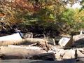
| 10/22/2003 03:58:53 PM |
Aaron All Aloneby sssobelComment: I think Aaron in this picture is a little hard to find, and the branch in front of his face is distracting. I would have had him sit on the edge of the rock in the centre, foreground of this picture, that way he would be more of the focus, and it would take away from overblown rock he is sitting on - It just happens to be one of those tricky outboors shot on a really sunny day. The colour of the trees are very nice and add appeal. |
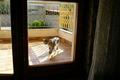
| 10/22/2003 03:53:37 PM |
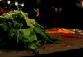
Lettuce join the party...... please?by darcyComment: I find this image a tad dark, when there are such bright background elements. The 3 lights are very distracting. I do like the angle of your shot and the lettuce looks very good. |
| Photographer found comment helpful. |
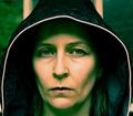
| 10/22/2003 03:51:24 PM |
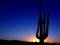
Silent Sentinelby ArtifactsComment: Very soft image with the sunset background, but the subject itself pops out. I like the negative space, but I'm still having an inner debate whether or not I would have changed the orientation and rearranged the negative space to add more upwards, while removing from the left. Given that the image is so straight and has a natural upwards motion, as well as the majority of the suns colours being really centralized I think I would have flipped to portrait. But that's just my opinion. I still really like the shot as presented. |
| Photographer found comment helpful. |
| 10/22/2003 03:45:31 PM |
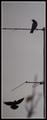
Not Alone So Much Longerby MonaComment: I like this image. I just wish you could have edited out the background tree it's distracting (but that's obviously not in the rules) and I find the border really competes with the pole. i would have skipped it entirely. Other then those 2 aspects, great colour, meets the challenge, and the crop you've selected is perfect. |
| Photographer found comment helpful. |
| 10/22/2003 03:42:38 PM |
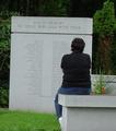
Missing youby Melissa7285Comment: This is a tricky shiot because of the angles of the image. The first thing I thought when I looked at it was I wish they had fixed the tilt of the memorial so it was straight. However, when looking at the bench, the angle isn't all that crooked. Still I think you need to work with the more powerful of the two which in this case would be the memorial. As for meeting the challenge this obviously does, and the colour/lightng is well done. |
| 10/22/2003 03:39:02 PM |
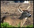
Alone In Man's Worldby geminiwbComment: This shot is really pixilated - did you use a digital zoom by chance to get this close? I like the deer’s alertness, but the background elements are very distracting. I think I would have also skipped the heavy black border; it doesn't help the image at all. Obviously meets the challenge. |
| Photographer found comment helpful. |
Home -
Challenges -
Community -
League -
Photos -
Cameras -
Lenses -
Learn -
Help -
Terms of Use -
Privacy -
Top ^
DPChallenge, and website content and design, Copyright © 2001-2025 Challenging Technologies, LLC.
All digital photo copyrights belong to the photographers and may not be used without permission.
Current Server Time: 04/09/2025 12:52:33 PM EDT.