| Image |
Comment |
| 02/14/2006 10:27:32 AM |
Wash Day Bluesby akuliComment: I don't agree with some of the other comments. I think the simplicity of the clothespins without clothes makes the photo more, not less interesting. You EXPECT to see clothes with clothepins, so the lack of clothing make it more interesting. And it doesn't looked "staged" to me, not any more than any other photo in this challenge. And I also think the size works for this particular composition. Okay, I can see that it would work in a larger format, but this size works too. If I had a suggestion at all, it would be maybe that the pins could be a bit more sharply focused, to make the image pop a bit more. Like the pic a lot. |
| 02/02/2006 12:15:58 PM |
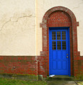
Sleeping Inby susanhComment: I like this photo quite a bit. Nice and crisp. I'd prefer the door and door frames to be vertical though. Nice combination of colours. Nice work. |
 Photographer found comment helpful. Photographer found comment helpful. |
| 02/02/2006 08:25:32 AM |
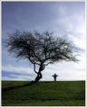
I Miss You Alotby HalimComment: Nice composition. I like the lighting contrast between the foreground and the sky, and how the green of the grass is muted: it allows the eye to take in other characteristics of the photo such as the shapes, shading, the neat outlines of the tree branches. Very beautiful blue in the sky--you avoided a cheesy hue. My only 'complaint' would be that the person looks kind of like a scarecrow, and I'm not sure you want that effect. Nice work. |
| Photographer found comment helpful. |
| 01/09/2006 01:03:55 PM |
|
| Photographer found comment helpful. |
| 01/09/2006 01:03:09 PM |
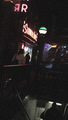
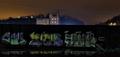
a long nightby dig-itComment: I'd prefer a brighter image. As it is, I don't get the impression of a night city scene, I get the impression of a blackout. |
| 01/09/2006 01:01:17 PM |
|
| Photographer found comment helpful. |
| 01/09/2006 12:59:12 PM |
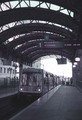
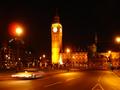
Policing Londonby DoigComment: The fact that nothing is in focus gives me the impression that the picture is just, well, out-of-focus. |
| 01/09/2006 12:58:17 PM |
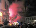
Happy New Yearby emitComment: The subject (the smoke) seems wedged into a narrow space which I don't find pleasing to the eye. It's somewhat hidden, behind a building on one side and next to an obscure dark space on the other. Should a subject be so hidden? |
| 01/09/2006 12:54:31 PM |
|
| Photographer found comment helpful. |
| 01/09/2006 12:53:08 PM |
Territory at Nightby butch81385Comment: I have difficulty getting a read on this picture. The foreground looks conjures an urban, industrial idea, but the background impresses me as a chalet on a verdant hill. But I'm not sure, because everything is so dark. Also, I prefer a less distinct division between foreground and background. It's a perfect line that divides, which make the division look unnatural. |
| Photographer found comment helpful. |
Home -
Challenges -
Community -
League -
Photos -
Cameras -
Lenses -
Learn -
Help -
Terms of Use -
Privacy -
Top ^
DPChallenge, and website content and design, Copyright © 2001-2025 Challenging Technologies, LLC.
All digital photo copyrights belong to the photographers and may not be used without permission.
Current Server Time: 04/07/2025 10:52:45 PM EDT.