| Image |
Comment |
| 01/24/2003 03:12:40 PM |
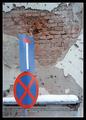
War signby bkumerComment: Love the barren dismal mood of this image. The Battered wall and cold snow contrast very well to the bright signage. Perfect composition, DOF and lighting. Good location shot that makes a statement |
| 01/24/2003 03:08:45 PM |
Nailedby jmsetzlerComment: Great sense of humour. I like the bit of blue to compliment the overwhelming yellow. Nice tight shot. The nail shadow really adds value to your image. Good go. |
| 01/24/2003 03:06:29 PM |
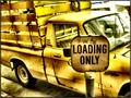
Loading Onlyby GotchaComment: The monochromatic theme of this image has lots of power. The rough and ready nature of both the sign and truck add lots of character to the foto. The limited DOF certainly focuses attention on the sign. Good job. |
 Photographer found comment helpful. Photographer found comment helpful. |
| 01/24/2003 03:01:54 PM |
The High Streetby GinaRothfelsComment: The crisp bright color scheme is very eyecatching. Extremely graphic look. The impact of the sign seems relatively secondary to the other visual elements. In otherwords the gratings, shadows and brick texture steal the show. An alluring shot just the same. |
| Photographer found comment helpful. |
| 01/24/2003 02:57:15 PM |
One Wayby boyte1Comment: A cute pic! Good sense of humour and a nice creative touch. B&W works well for this shot. I like the close cropping, too. The knuckles are a tad bright compared to the other flesh tones for my taste. A good foto. |
| Photographer found comment helpful. |
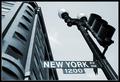
| 01/23/2003 12:25:14 PM |
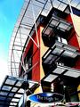
Start Spreadin' the News by magnetic9999Comment: I love the crisp metallic look of this image. Hard steel urbania mood. The dramatic edges among shadows and highlights are very appealing. The cloudless sky really adds to the starkness. The viewpoint is well chosen and adds to the towering looming metropolitan aura. Personally I would like a touch of space between the sign and tower. Otherwise this image has an awe inspiring modern age impact. Hope you receive many more positive remarks. Good work |
| Photographer found comment helpful. |
| 01/23/2003 12:17:57 PM |
No Pedestrian Crossingby bdshortComment: The lighting is very pleasing in this image. I especially admire the wet look on the pavement and the various textures. The highlight on the pavement is beautiful. Personally I would like to separate the sign from the lights and building corner in the background. A matter of breathing space.The hint of bright sky adds an uplifting note to a sombre picture. The sign does stand out well from the background which is another nice contrast. A worthy notable image. |
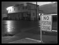
| 01/23/2003 12:10:56 PM |
At the Corner of Charles and Mapleby karmatComment: Top marks for DOF in this image. The toppled sign and weathered tree trunk compliment each other well. The hint of bush on the right is a nice touch to soften the harsh sign edges. What does this image look like in B&W? I find the Maple St. sign a tad dark but that is probably the best you could do considering the shadow-highlight extremes under those conditions. Your vantage point is also well chosen. I would like to see the right corner of the Maple St. sign. Otherwise a very good effort. |
| Photographer found comment helpful. |
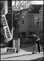
| 01/23/2003 10:01:14 AM |
The Intersection of Humanity and Right Nowby mjcecilComment: I like the gritty alley feel of this foto. The abused fence, the draped signage, the long shadows, the hunched over figure in front of stairs and the grey shadowed homes are among the visual elments that call my attention. A welcome change of vibrant reality edge street photography as opposed to clinical studio shots. Very good vision and quick reflexes. |
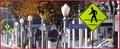
| 01/23/2003 09:53:00 AM |
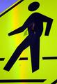
walk walk 40 walk no stopping no stopping no stopping no stopping walk no stoppingby spidermanComment: The urban crush is well exemplified by this image. I like the splash of russet foliage to soften the harsh city look. The panorama format suits the foto perfectly although I am not a big fan of the red border. This format seems to balance the plethora of vertical elements present. The pedestrian signs pop out well from the relatively high key background. Order among chaos. A well executed concept. |
| Photographer found comment helpful. |
Home -
Challenges -
Community -
League -
Photos -
Cameras -
Lenses -
Learn -
Help -
Terms of Use -
Privacy -
Top ^
DPChallenge, and website content and design, Copyright © 2001-2025 Challenging Technologies, LLC.
All digital photo copyrights belong to the photographers and may not be used without permission.
Current Server Time: 04/11/2025 04:35:58 PM EDT.