| Author | Thread |
|
|
06/16/2005 05:50:57 PM |
| I really like this shot, the noise, colour and perspective suit all seem to work well together. |
|
|
|
07/04/2004 11:04:20 PM |
| Is this Melrose Place? :) Great shot, very nice colors and texture. |
|
|
|
01/30/2003 10:11:48 PM |
Critique Club Comment:
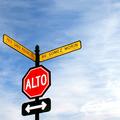
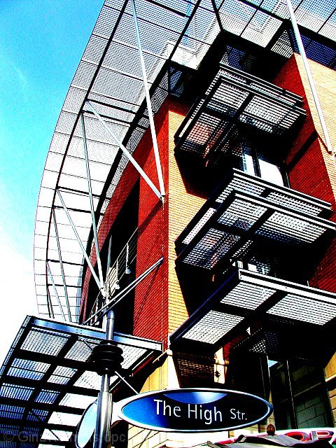
The contrast of sharp angles with the curves of the overhang and street sign have a powerful impact with me. When a photographer can capture different textures and elements with in his shot, it shows me that they have an artful eye and are looking at the world from a different perspective. Your shot here shows just that. The bold oranges with the cool blue contrast beautifully to the eye as a perfect marriage of warmth and cold. The cold is further carried into the metal of the structure while the warmth is seen in the highkey of the sky and reflections off of the building.
Techinically I think that you have a very sharp picture. There is some edgies on the white curved part that are probably do in part to your compression of the image. I also am a little distracted by the noise in the sky. Both of those do not however take away from a strong composition.
This is a good shot! Keep them coming! |
|
 Photographer found comment helpful. Photographer found comment helpful. |
Comments Made During the Challenge  |
|
|
01/26/2003 02:24:34 PM |
| This is Cute. Sign looks to goot to be real. Good Job. |
|
|
|
01/25/2003 09:20:04 PM |
| I really like the high contrast of this shot, as well as the composition. Good graphic impact that catches the eye immediately. (8) |
|
| Photographer found comment helpful. |
|
|
01/25/2003 05:59:31 PM |
| What an interesting picture...so graphic! Colorful too. Nice job! |
|
| Photographer found comment helpful. |
|
|
01/24/2003 09:23:14 PM |
| That is one fancy street sign. I like the angle your used; showing the funky building. Good luck. |
|
| Photographer found comment helpful. |
|
|
01/24/2003 08:01:54 PM |
| The crisp bright color scheme is very eyecatching. Extremely graphic look. The impact of the sign seems relatively secondary to the other visual elements. In otherwords the gratings, shadows and brick texture steal the show. An alluring shot just the same. |
|
| Photographer found comment helpful. |
|
|
01/24/2003 12:51:01 AM |
| the photo doesn't make me think that the sign is the primary subject |
|
| Photographer found comment helpful. |
|
|
01/23/2003 08:14:31 AM |
| Beautibul colour and contrast. |
|
| Photographer found comment helpful. |
|
|
01/22/2003 11:32:31 PM |
| beautiful color, composition, would like to have seen more of the sign on the bottom right and perhaps more of the roof and sky. |
|
| Photographer found comment helpful. |
|
|
01/22/2003 10:18:51 PM |
| that's a cool sign, very modern. i don't think your composition reflects what you were trying to do here very well though. it just seems too cluttered |
|
| Photographer found comment helpful. |
|
|
01/22/2003 01:17:32 PM |
| Wow! The colours, angle, composition....just can't find anything I don't like about this one. 10. |
|
| Photographer found comment helpful. |
|
|
01/22/2003 12:33:17 PM |
| Yeh !!! I like this,vibant,good colour, good shot 9 |
|
| Photographer found comment helpful. |
|
|
01/22/2003 11:17:37 AM |
| Good color, good focus, good frame. Nice photo. |
|
| Photographer found comment helpful. |
|
|
01/21/2003 11:19:48 PM |
| Very interesting, tchno modern feel about this. Oversharpened, exaggerated colors, funky high street sign. All makes for a very unique, enjoyable image. Good job! 9 md |
|
| Photographer found comment helpful. |
|
|
01/21/2003 09:17:41 PM |
| I liked the colors. The contrast of all the blocks and line versus the solid nature of the sign was good |
|
| Photographer found comment helpful. |
|
|
01/21/2003 08:02:50 PM |
| Love the angle on this one. Beautiful colors. Not really sure what it is, but it made a really nice photo. Great focus and cropping. Well done photo. It's an 8. |
|
| Photographer found comment helpful. |
|
|
01/21/2003 06:27:07 PM |
| That's a pretty trendy streetsign. It looks like you've done some trendy editing to this photo - I'd love to compare the original. Perhaps its worthy of a "How'd they do that" type tutorial. Focus and exposure is great, composition is good (shame about the partial sign in bottom right corner) and overall it has a real magazine / brochure type quality to it. Well done. |
|
| Photographer found comment helpful. |
|
|
01/21/2003 05:20:42 PM |
| Very high contrast, but it works well with all the geometric shapes. Interesting angle, I like it :) |
|
| Photographer found comment helpful. |
|
|
01/21/2003 07:59:29 AM |
| Good architecture pic. Debatalbly on subject. |
|
|
|
01/20/2003 11:06:06 PM |
| lovely, abstract, funky image |
|
|
|
01/20/2003 07:13:52 PM |
| Kool. Abstract building/sign. Like it. |
|
|
|
01/20/2003 09:13:46 AM |
| if you could have done this at a bit more of an angle to keep whatever the "OP" sign at the bottom is for out of it, this would be a winner. I love the busy-ness of all the lines. |
|
| Photographer found comment helpful. |
|
|
01/20/2003 04:43:20 AM |
|
| Photographer found comment helpful. |
|
|
01/20/2003 02:40:35 AM |
| A little bit over-contrasty and over-sharpened for my tastes, but good composition and interesting photo. |
|
| Photographer found comment helpful. |
|
|
01/20/2003 01:41:16 AM |
|
Home -
Challenges -
Community -
League -
Photos -
Cameras -
Lenses -
Learn -
Help -
Terms of Use -
Privacy -
Top ^
DPChallenge, and website content and design, Copyright © 2001-2026 Challenging Technologies, LLC.
All digital photo copyrights belong to the photographers and may not be used without permission.
Current Server Time: 02/01/2026 09:02:59 AM EST.