| Author | Thread |
|
|
01/29/2003 01:36:00 PM |
Hello from the Critique Club (again).
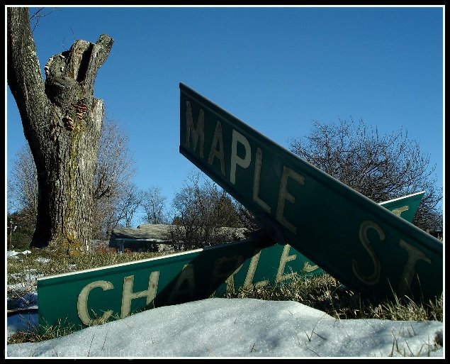
Good find! You just came accross these road signs? No vandalism was involved I assume. I suppose anyone could have stumbled upon a broken road sign but what you chose to do with it was really interesting. This is really a great photo!
The point of view here makes a statement. It's almost as if you are trying to put that sign back up. You got down under the sign and took it from just about the angle it was intended to be viewed at. That's what creates the stunning visual contrast. It strengthens your statement that "here is a sign out of place". Great start.
Next you made a wonderful composition out of that sign. The X it forms in the not-quite-center of the photo is a strong arrangement (good thirds). The x shape itself is wonderful because ti creates four visual leading lines. You have chosen to emphasize one and use the other more subtley. Charles is the less dominate line but you have used it to mirror the slant of the hill and the pitch of the background trees. Maple is the dominant line and you have pointed it right at a tree (I think it's an oak). Ah but wait, you did another reverse. you have lighted the less pronounced side of the X to make it stonger and left the stronger side dark so that it doesn't carrry more weigt. Lovely.
More...Now you made use of the word MAPLE by putting two trees in the V under it, one horiaontal, one upright. Nice. And repeated the V in the branching of the tree- nice. I particularly like how you cleaned off the P (middle letter) in the word maple for emphasis, otherwise the word would have beeen too dark and maybe missed.
Colors are natural. Focus and DOF are perfect. Lighting is exquisite, hard to achieve at mid day. Mabe the snow could have been a bit whiter? On my monitor the whole picture is just a hair too dark. And I think it is a bit over sharpened. The words have some jaggies and the background treetops are sparkly. I think that's what dragged you down to 29th place. Could have been higher!
Okay - the usual disclaimer - this is just my opinion, I am not an expert by ANY means.
Message edited by author 2003-01-30 09:41:49. |
|
 Photographer found comment helpful. Photographer found comment helpful. |
Comments Made During the Challenge  |
|
|
01/26/2003 08:55:55 AM |
| Congrats to this shot, good eye, to catch this! I really like the conntection between the old signs and the broken tree. IMHO more structure (clouds) in the sky would add something to this shot. The upper right corner is too empty. But I can't change the weather myself ;-). Perhaps you sharpened a little too much. Nevertheless a really great shot and my favourite this week! - 10 |
|
| Photographer found comment helpful. |
|
|
01/26/2003 08:55:00 AM |
| too sweet. great find. classic. worth getting on your knees in the snow for a thousand times over. get down their in the dirt, humility pays off. |
|
|
|
01/26/2003 02:33:49 AM |
|
| Photographer found comment helpful. |
|
|
01/25/2003 02:26:55 PM |
|
|
|
01/24/2003 06:15:58 AM |
| Well shot. Not wild about the composition generally, but it is better than if it were where it was supposed to be - Inspzil |
|
| Photographer found comment helpful. |
|
|
01/24/2003 05:08:54 AM |
| Way to get aggressive with the viewpoint! This would have been a good time for fill-flash. The one stripe across Charles is OK, but the total shadow on Maple is tough to overcome. |
|
| Photographer found comment helpful. |
|
|
01/23/2003 12:10:56 PM |
| Top marks for DOF in this image. The toppled sign and weathered tree trunk compliment each other well. The hint of bush on the right is a nice touch to soften the harsh sign edges. What does this image look like in B&W? I find the Maple St. sign a tad dark but that is probably the best you could do considering the shadow-highlight extremes under those conditions. Your vantage point is also well chosen. I would like to see the right corner of the Maple St. sign. Otherwise a very good effort. |
|
| Photographer found comment helpful. |
|
|
01/23/2003 07:03:54 AM |
| Well done, nice perspective. |
|
| Photographer found comment helpful. |
|
|
01/23/2003 03:36:53 AM |
| The idea is good. Pity the Maple Street sign is a little to dark and the shadow falling across the Charles Street sign also distracts. But other than that I like the photo, especially against that crisp blue sky. Cool angles and good use of thirds! |
|
| Photographer found comment helpful. |
|
|
01/22/2003 05:43:31 PM |
| I think if you cleared the snow in the foreground you should have exposed for the shadows...signs seem a bit too dark and that is the main subject. Also, think if your DOF rendered the tree out of focus would have been even more effective...nice colors and also like the composition A LOT. Pic has a lot of potential. |
|
| Photographer found comment helpful. |
|
|
01/22/2003 02:24:15 PM |
| Good capture. Nice colours. |
|
|
|
01/22/2003 11:54:12 AM |
| Unfortunately the tree really steals the show for me - probably because it's so well lit and the signs (especially Maple) are very dark to read. I like the composition though - it feels very balanced. The border feels appropriate and isn't overdone. Good job. |
|
| Photographer found comment helpful. |
|
|
01/22/2003 08:52:35 AM |
| you can't even read the signs, so i guess we have to trust you. this doesn't work because the shadow is just too much in the foreground. everything else is right on |
|
| Photographer found comment helpful. |
|
|
01/22/2003 04:04:24 AM |
| Nice composition and wide DOF. I would have wanted the Maple Sign a bit lighter - maybe a reflector, or some post production techniques, still overall very nice. |
|
| Photographer found comment helpful. |
|
|
01/21/2003 07:22:11 PM |
| Great Sky Color. I think I also get the concept. One technical idea that would have earned another point from my perspective, would have been the addition of a bouce screen to cast sunlight on the top sign. ( Maple St.) |
|
| Photographer found comment helpful. |
|
|
01/21/2003 06:24:18 PM |
| A certain post civilization feel to it, like The Postman or Planet of the Apes (the originals, not that crappy remake with Mark what's his name). The Maple St part of the sign is just a little too dark. And it seems a tad oversharpened. Otherwise, nice composition and colors. Well done. 8 md |
|
|
|
01/21/2003 06:02:24 PM |
| GReat idea, meets the challenge well. THe lovely tree in the background really caught my eye first, though. |
|
| Photographer found comment helpful. |
|
|
01/20/2003 04:06:53 PM |
| ten ten ten ten ten ten ten ten ten ten ten ten ten...Need I say more |
|
|
|
01/20/2003 02:43:37 PM |
| OK even tho the signs aren't interesting, the picture is pretty good... But, you should have used a strong flash to partially remove the shadow from the lower sign, and make the upper sign more readable. |
|
| Photographer found comment helpful. |
|
|
01/20/2003 12:48:31 PM |
| Was it the storm that took the tree down that took down the sign? My biggest complaint is the shade on the sign that says "Maple". Can't read it. May move a little and you could get a little more light on it. Other wise it's a fantastic photo and definitely meets the challenge. I'll still give it a 7. |
|
| Photographer found comment helpful. |
|
|
01/20/2003 07:12:01 AM |
| Pretty dramatic, perhaps a little too dark. |
|
| Photographer found comment helpful. |
|
|
01/19/2003 11:14:39 PM |
| Its a shame that the sign is in shadow. |
|
|
|
01/19/2003 09:09:53 PM |
| I like it!! Nice shot, good DOF, good composition. Cub |
|
| Photographer found comment helpful. |
Home -
Challenges -
Community -
League -
Photos -
Cameras -
Lenses -
Learn -
Help -
Terms of Use -
Privacy -
Top ^
DPChallenge, and website content and design, Copyright © 2001-2025 Challenging Technologies, LLC.
All digital photo copyrights belong to the photographers and may not be used without permission.
Current Server Time: 04/06/2025 10:44:22 PM EDT.