| Image |
Comment |
| 01/24/2003 03:33:31 PM |
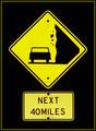
signs of sea dogsby andresComment: Good sense of humour. As a suggestion perhaps a bit more sea in your shot to emphasize the sea dog quality. The lagre area of sky tones are nice and tend to draw the attention to the background instead of the sign and sea. I guess you need a 20 ft ladder to work the vantage point here. Not a bad shot |
 Photographer found comment helpful. Photographer found comment helpful. |
| 01/24/2003 03:28:18 PM |
|
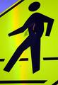
| 01/24/2003 03:26:02 PM |
Stop!by JackoComment: Spooky stuff. A bit sinister for my taste. But what the hey, it's a different style with it's own speaks. Like a bittersweet licorice kiss. Grows on you after a while. Unusual and inspiring. |
| Photographer found comment helpful. |
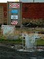
| 01/24/2003 03:21:15 PM |
The Crossingby howzaComment: Great urban comment. The shopping cart in the puddle steals the show. I also like the brick wall texture and the freezer rust. Box shapes throughout the image pull the whole show together. Well done. |
| Photographer found comment helpful. |
| 01/24/2003 03:17:58 PM |
Go Away!by myqylComment: The sweep of the horizontal lines go well with the panoramic format. The greenery softens the edge of modern age. If the viewpoint was a little lower perhaps the white portions of the sign would not blend in with the curb but contrast against the plants instead ( a small suggestion). What do you think of placing the sign a bit more off center? Otherwise a good solid shot. |
| Photographer found comment helpful. |
| 01/24/2003 03:12:40 PM |
War signby bkumerComment: Love the barren dismal mood of this image. The Battered wall and cold snow contrast very well to the bright signage. Perfect composition, DOF and lighting. Good location shot that makes a statement |
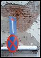
| 01/24/2003 03:08:45 PM |
Nailedby jmsetzlerComment: Great sense of humour. I like the bit of blue to compliment the overwhelming yellow. Nice tight shot. The nail shadow really adds value to your image. Good go. |
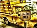
| 01/24/2003 03:06:29 PM |
Loading Onlyby GotchaComment: The monochromatic theme of this image has lots of power. The rough and ready nature of both the sign and truck add lots of character to the foto. The limited DOF certainly focuses attention on the sign. Good job. |
| Photographer found comment helpful. |
| 01/24/2003 03:01:54 PM |
The High Streetby GinaRothfelsComment: The crisp bright color scheme is very eyecatching. Extremely graphic look. The impact of the sign seems relatively secondary to the other visual elements. In otherwords the gratings, shadows and brick texture steal the show. An alluring shot just the same. |
| Photographer found comment helpful. |
| 01/24/2003 02:57:15 PM |
One Wayby boyte1Comment: A cute pic! Good sense of humour and a nice creative touch. B&W works well for this shot. I like the close cropping, too. The knuckles are a tad bright compared to the other flesh tones for my taste. A good foto. |
| Photographer found comment helpful. |
Home -
Challenges -
Community -
League -
Photos -
Cameras -
Lenses -
Learn -
Help -
Terms of Use -
Privacy -
Top ^
DPChallenge, and website content and design, Copyright © 2001-2025 Challenging Technologies, LLC.
All digital photo copyrights belong to the photographers and may not be used without permission.
Current Server Time: 04/11/2025 04:41:42 PM EDT.