| Author | Thread |
Comments Made During the Challenge  |
|
|
01/26/2003 11:21:28 PM |
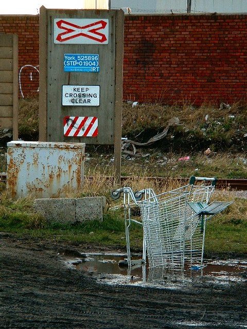
| a little to much for me in this picture. I like the shopping cart though |
|
|
|
01/26/2003 09:00:12 PM |
| This image is a little dark. The problem with this image is that you oversharpened it wayyyy too much. The shot no longer looks natural. I recommend that you do a search for a tutorial on how to use an unsharp mask correctly! I like your composition though. jgillard4 |
|
|
|
01/25/2003 12:26:17 AM |
| Interestin gchice for a location, it sure is not scenic. I just love the shopping cart in the mud puddle, for som ereason I find it funny. The placement of the objects sign & cart is superb. The focus is sharp, the lighting a tad dark, could stand to be a bit lighter. Subject matter, OK, but not a shot I would want to hang on my walls. 7. |
|
 Photographer found comment helpful. Photographer found comment helpful. |
|
|
01/24/2003 08:21:15 PM |
| Great urban comment. The shopping cart in the puddle steals the show. I also like the brick wall texture and the freezer rust. Box shapes throughout the image pull the whole show together. Well done. |
|
| Photographer found comment helpful. |
|
|
01/24/2003 01:58:24 PM |
| a bit too sharpened the shopping cart looks unnaturally edgy. |
|
|
|
01/23/2003 09:21:16 AM |
| This is a messy neighbourhood. I had to laugh at that shopping trolley sticking out of the ground there. I feel the signs are a little out of focus, but otherwise good job. |
|
|
|
01/22/2003 11:44:17 PM |
| Wow! Talk about a message! Like the color of the rust showing on the box, the red and white stripes on the signs, the red brick wall with the white graffiti. Nicely done! |
|
|
|
01/22/2003 09:27:36 PM |
|
|
|
01/22/2003 05:39:20 PM |
| I like the atmosphere. Good shot. |
|
|
|
01/21/2003 04:39:58 PM |
| Very clear shot. (Is there a social statement here? I'm not getting any strong emotional connection, except junky) What does the blue sign refer to? (my last name is York, after all) 7 Swash |
|
|
|
01/21/2003 05:08:07 AM |
|
|
|
01/20/2003 07:14:55 PM |
|
|
|
01/20/2003 06:30:17 PM |
| What is supposed to use this crossing. Looks like it hasn't been used in years, many years. Nice photo but you need something to "wow' it up. It's looks too drab, which I realize it is a mess there. I can give it onyl a 6. |
|
| Photographer found comment helpful. |
|
|
01/20/2003 10:07:30 AM |
| looks like the shopping cart didn't read the signs :-) |
|
Home -
Challenges -
Community -
League -
Photos -
Cameras -
Lenses -
Learn -
Help -
Terms of Use -
Privacy -
Top ^
DPChallenge, and website content and design, Copyright © 2001-2026 Challenging Technologies, LLC.
All digital photo copyrights belong to the photographers and may not be used without permission.
Current Server Time: 02/01/2026 10:01:38 AM EST.