|
|
| Image |
Comment |
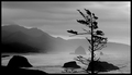
| 12/02/2005 12:52:54 PM | "The sea, once it casts its spell, holds you forever in its net of wonder."by DrAchooComment: There's obviously a truly beautiful photograph to be made at this location. However, this one is not it, I'm afraid. I think that the tree is an intruder obstructing the grander view behind it. The completely black blob at the bottom-left corner weakens the composition too. As for the exposure, and this is only a matter of personal taste, I would have tried to darken the sky a little bit while still retaining some more detail on the foreground rocks by using a soft egded gradual neutral density filter, or certain exposure blending techniques (I believe it's legal in advanced editing to get multiple frames with different exposure adjustments from a single RAW negative and blend them in editing software). |  Photographer found comment helpful. Photographer found comment helpful. |
| 12/01/2005 03:54:11 PM | Colorfulby dr rickComment: Focus is perfect, and the subject is nicely isolated from the background. However, half of the bird is in the dark, therefore barely visible. Moreover, the tail should not be cut out in my opinion, i.e the camera should have been moved to the right so as to frame the bird entirely. | | Photographer found comment helpful. |
| 09/29/2005 03:19:30 PM | Open Armsby jrsnowComment: Frankly, the first time I saw this photograph, I thought that although it was a very nice candid, it failed to meet the challenge. On second thought, however, I realized that it did meet the challenge, if not in a physical sense, indeed in a philosophical sense; from the ground up, from a child to an adult, etc. I don't know whether or not that's actually what you have intended to convey, but I guess that's irrelevant; I've seen what I needed to see, and that's all that matters. Not much to say about the technical side of the image; composition, exposure, sharpness and post-processing all look very good. Of course, one might nitpick and say that the treeline should have been placed higher so as not to be cut by the bride's head, and the bride's face, especially her eyes, should've had more detail/light (which could be fixed with spot editing anyway, if this were not a basic editing challenge), etc. But I think that in this photograph, none of that really matters...Long story short, good work! | | Photographer found comment helpful. |
| 09/29/2005 02:17:38 PM | The Beachby marboComment: Very nice! Too bad this is a basic editing challenge, otherwise with some selective curves adjustments, contrast and detail could be enhanced further to turn this very fine photograph into a stunning one. | | Photographer found comment helpful. |
| 08/30/2005 06:33:23 PM | Delivery & Laborby skiefComment: Sometimes, showing less tells more. Zooming in on the baby and showing nothing more than him/her and the doctor's hands would have been a clean and simple yet very effective and story-telling composition, in my opinion. | | Photographer found comment helpful. |
| 08/30/2005 06:27:30 PM | Darcy & Leavesby TerramarComment: Interesting take on portraiture, nice model who seems comfortable with posing, good focus and depth of field. Although generally I have nothing against selective desaturation, in this case I do not think that it's a wise visual design choice, as it creates a rather heavy imbalance. Additionally, the strong and directional light not only causes problems with exposure (i.e. blown highlights), but also creates those not-so-attractive strips of shadows on the model's face. I'd try to get this shot under more diffuse lighting and also go with a straight-on and tight composition. |
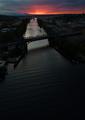
| 08/02/2005 03:28:47 PM | Sunset on Lake Elginby LouiseBComment: Colors are gorgeous, and the exposure seems accurate. Composition is a bit awkward, I'm afraid. I don't quite mind the horizon being right in the middle but the pier cutting across the frame, and lack of foreground interest or some other kind of front-to-back lead cause the image to appear static and only 2-dimensional. | | Photographer found comment helpful. |
| 07/12/2005 04:13:52 AM | Outing with grandpaby lastefComment: But for the lighting, this picture would have been a very nice family portrait. Fill-in flash or at least something to reflect the light on to the subject would have filled the shadows and helped obtain a balanced lighting and contrast without losing details in shadows and blowing out the highlights. | | Photographer found comment helpful. |
| 06/30/2005 06:50:33 AM | Directionby cabaComment: This is the type of photograph in which the foreground should have good detail as well as the sky, in my opinion. This can be achieved by using gradual neutral density filters. Composition, as far as I can see, is quite good except for the fact that the horizon is slightly tilted to the left (and if this is intentional, I'm afraid I fail to see the purpose). | | Photographer found comment helpful. |
| 06/24/2005 05:29:45 PM | A Peaceful Interludeby saracatComment: Composition is a little agressive. That is; instead of drawing to itself, if advances towards the viewer. Not that it's a bad thing. It's just a matter of personal preference/taste. Additionally, the picture is overexposed, therefore the water loses all its texture and instead of appearing to be a silky smooth flow, it turns into a blown out, white blob. I'd try to shoot this scene when the light is diffused and even, e.g. on an overcast day, or when the sun is low enough to provide front lighting (Assuming that the waterfall faces either east or west, and there's nothing around that would block the light). | | Photographer found comment helpful. |
Home -
Challenges -
Community -
League -
Photos -
Cameras -
Lenses -
Learn -
Help -
Terms of Use -
Privacy -
Top ^
DPChallenge, and website content and design, Copyright © 2001-2025 Challenging Technologies, LLC.
All digital photo copyrights belong to the photographers and may not be used without permission.
Current Server Time: 04/07/2025 06:08:43 AM EDT.
|