| Image |
Comment |
| 09/06/2007 06:16:46 AM |
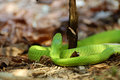
Green-Snake.jpgby GotakaComment by bassbone: Excellent colors and shallow DOF - but the snake is pointing the wrong way (albeit a safer way!). really nice sharpness in the details on the skin. |
 Photographer found comment helpful. Photographer found comment helpful. |
| 09/06/2007 06:15:35 AM |
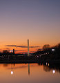
Monument.jpgby GotakaComment by bassbone: First off - good color - the oranges and cyans/blues really work well together.
As others have stated, the tilt is an issue with this iamge. Non horizontal horizons will really kill your score (unless you have done it specifically on purpose).
The lighting looks like it could use a little boost. The monument is the subject and it seems lost in the sky.
The last thing I would recommend is a recrop to bring out the monument. It looks like this is the full frame of the original image. The best part of the image IMO is the left side. The sky is more dramatic, the lights in the background are good. By cropping out a third of the image on the right, you will place the monument at one of the thirds.
I hope you don't mind, but I did a little edit just to show you what it might look like. I cropped down to get the monument at the right hand 1/3 and cropped out some of the sky to get the horizion at the lower third. In addition, I boosted the levels a little, added a bit of curve (s shaped) to bring out the sky, and adjusted the hue/ saturation on the reds, yellows, cyans and blues. This gives it a little more bunch. Finally, I quickly brightened the monument and the reflection using the dodge brush.
I probably went a little overboard with the hue, but it was just to give you an idea... 
|
| Photographer found comment helpful. |
| 09/06/2007 05:56:23 AM |
Monument.jpgby GotakaComment by kellian: The tilt, the tilt. Could be sharpened a bit and cropped to fix the tilt. Nice colors. |
| Photographer found comment helpful. |
| 09/06/2007 05:55:13 AM |
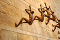
Wall Crawlersby GotakaComment by kellian: I agree and disagree with latentflip. I think the composition could be improved, maybe to see more of the climbers although part of me likes that you can't see them all, leaves me wondering just how many there are... how far they extend beyond my view. Perhaps some post-processing could draw the viewer into the composition more. |
| Photographer found comment helpful. |
| 09/06/2007 05:21:47 AM |
Green-Snake.jpgby GotakaComment by latentflip: Colours are great, depth of field is nice and the focus on the snakes head is perfect. Unfortunately some interest is lost by not being able to see the snakes 'face' and that bit of bark that obscures part of the snake is a little off-putting. Not sure about the stick either. Overall I like it but it could be vastly improved by waiting for the snake to adopt a more interesting 'pose'.
Hope that helps. |
| Photographer found comment helpful. |
| 09/06/2007 05:15:45 AM |
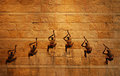
Wall-Crawlers 2by GotakaComment by latentflip: I like the composition here. It's perhaps slightly underexposed: a little more exposure would probably brighten up the wall without brightening the people too much: bumping the contrast and helping the people pop out of the frame a little more. It would be good too if the ropes were more visible as they would make for good leading lines to the people.
Hope that helps? |
| Photographer found comment helpful. |
| 09/06/2007 05:12:03 AM |
Wall Crawlersby GotakaComment by latentflip: Its a good angle in my opinion but the composition could perhaps be improved: it seems a little right-heavy with that large empty space on the left, and the people falling out of the frame on the right. I would have perhaps pulled back a little and panned right to fit them all in the frame, and opened up that aperture a little to get a slightly shallower depth of field so that the subject becomes one of the people rather than all of them.
I'm rambling now but perhaps also rotating the frame slightly, so that the leading lines of the row of bricks above and below the people intersected at the same point on the top and bottom of the frame (perhaps at the top and bottom left hand corners). Hope that makes sense? |
| Photographer found comment helpful. |
| 09/06/2007 05:05:53 AM |
Wall-Crawlers 2by GotakaComment by cloudsme: Great photo. Very interesting. What's going on here? Great composition, good exposure, like everything about it. |
| Photographer found comment helpful. |
| 09/06/2007 05:04:12 AM |
Green-Snake.jpgby GotakaComment by cloudsme: Color of the snake is beautiful. Also like the patches of light, tough to expose properly with that and you were able to. Unfortunately, the back of the snake's head isn't as interesting as the front. |
| Photographer found comment helpful. |
| 09/06/2007 05:03:38 AM |
Monument.jpgby GotakaComment by latentflip: I like the colours, lights and composition vertically. Horizontally having the monument in the middle of the frame is a little offputting perhaps it would be better moved to the right to obey the "rule of thirds".
The horizon also looks a little squint (the monument looks slightly slanted) which is easily fixed in photoshop. Otherwise I like the picture, that gradient on the sky is lovely. |
| Photographer found comment helpful. |
Home -
Challenges -
Community -
League -
Photos -
Cameras -
Lenses -
Learn -
Help -
Terms of Use -
Privacy -
Top ^
DPChallenge, and website content and design, Copyright © 2001-2025 Challenging Technologies, LLC.
All digital photo copyrights belong to the photographers and may not be used without permission.
Current Server Time: 04/07/2025 09:32:46 AM EDT.