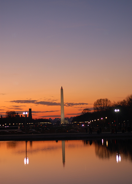
First off - good color - the oranges and cyans/blues really work well together.
As others have stated, the tilt is an issue with this iamge. Non horizontal horizons will really kill your score (unless you have done it specifically on purpose).
The lighting looks like it could use a little boost. The monument is the subject and it seems lost in the sky.
The last thing I would recommend is a recrop to bring out the monument. It looks like this is the full frame of the original image. The best part of the image IMO is the left side. The sky is more dramatic, the lights in the background are good. By cropping out a third of the image on the right, you will place the monument at one of the thirds.
I hope you don't mind, but I did a little edit just to show you what it might look like. I cropped down to get the monument at the right hand 1/3 and cropped out some of the sky to get the horizion at the lower third. In addition, I boosted the levels a little, added a bit of curve (s shaped) to bring out the sky, and adjusted the hue/ saturation on the reds, yellows, cyans and blues. This gives it a little more bunch. Finally, I quickly brightened the monument and the reflection using the dodge brush.
I probably went a little overboard with the hue, but it was just to give you an idea...
|