| Image |
Comment |
| 09/20/2002 08:59:00 AM |
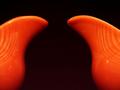
A New Bell Curveby just-marriedComment: You managed to pull a good sense of depth out of your subject. The more I look at the orange areas, the more I appreciate their curves and glossy surface. I like the tiny discrepancy in the height of each pitcher, though I�d vote for a slight shove to the right in framing. The negative space is strong and seems to hug your subject. |
 Photographer found comment helpful. Photographer found comment helpful. |
| 09/20/2002 02:57:00 AM |
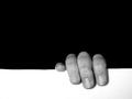
Hangin' Onby karmatComment: To me, this photo poses a friendly debate over which of the spaces is the negative space. It's the debate that keeps me interested, after the initial grin at this poor soul clinging to the edge. I would have preferred a perfectly even white area (the line is a tiny bit crooked), but the general composition is right on. Good lighting (maybe a bit more contrast?) and good use of negative space up top ... it weighs down on top of the fingers. 8 |
| Photographer found comment helpful. |
| 09/20/2002 02:50:00 AM |
Hannahby ZeissmanComment: You have captured an adorable baby in a pose balanced between awkward and graceful. Something about the extended pinky adds interest to me, suggesting future sophistication (the way some people drink wine) and future language (lettering in Sign). At first, I wanted the background to be stark black, but the hints of velvet-highlight are ultimately okay with me. They are a little like the lines a cartoonist draws around a subject to suggest movement. The negative space in this case swirls my eye around the hand, then tosses me back to the rewarding image of such a cutie. I would have preferred more contrast in the baby, but you caught a wonderful expression. 8 |
| Photographer found comment helpful. |
| 09/20/2002 08:10:00 AM |
Runnerby lionelmComment: The white area adds energy to the shoe and leg. In our left-to-right culture, moving to the left in motion or still pictures often suggests moving against the flow. Though nicely lit, I'd like to see a touch more detail in the end of the shoe lace (it almost disappears), and maybe a bit more contrast without overblowing the highlights on the show. 8 |
| Photographer found comment helpful. |
| 09/20/2002 08:49:00 AM |
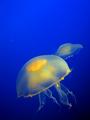
UFO by indigo997Comment: I absolutely love the vivid colors! The framing is very nice, and I like how the blue gradates into black below. (Was this taken through glass? If so, you did a terrific job of eliminating glare.) I�d like to see a stronger use of the negative space, but I�m not sure what to suggest. It�s been a difficult week for voting, mainly due to my wildly subjective interpretations of the challenge. Attractive photo, though, in any case! 7 |
| Photographer found comment helpful. |
| 09/20/2002 03:06:00 AM |
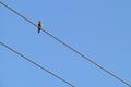
bird on a wireby FranziskaLangComment: The parallel lines divide this photo wonderfully, and the placement of the bird is great! Very nicely composed. The negative space emphasizes the unobtainable character of the bird, because it is framed high in the upper left, and the background is all sky. 8 |
| Photographer found comment helpful. |
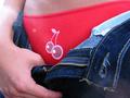
| 09/13/2002 04:45:00 AM |
Cherry Pieby drewmediaComment: Cute, witty, and sexy. Very enticing, without going over the top. |
| Photographer found comment helpful. |
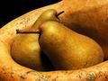
| 09/12/2002 07:31:00 AM |
Boscs and Gourdby mcmurmaComment: The color tone here is gorgeous. This bronze is evocative of Old World richness (think exquisite still life paintings, a hint of parchment from Da Vinci), so this is not only a beautiful photograph, but something that takes me into another time. Nice framing, good repetition of curves and speckling, nice balance in the pears' stems -- the whole composure keeps the eye happily roving over the sumptuous shapes. I am hanging between 9 and 10 on this one. Only things that would keep it from being perfect, to me, are the few blemishes on the gourd. |
| Photographer found comment helpful. |
| 09/13/2002 04:41:00 AM |
Lycheesby GeneralEComment: I like the muted colors! The whole thing is a nice presentation of hue, with a boost of interesting texture. Just off-center, there appears to be a whitish "hole" which suggests that this pile of lychees isn't very deep. For what this image meanss to me, I'd like to imagine pounds and pounds of fruit, so the hole breaks the spell. But all told, this is a beautiful photo. |
| Photographer found comment helpful. |
| 09/12/2002 01:43:00 PM |
Lemon Dropby joannsComment: Beautiful yellow hue ... nicely consistent. The particular yellow you used supports the lemon concept wonderfully (as opposed to, say, buttercups or some other yellow thing). I like your light and shadows, the dry and wet, the smooth and dimpled -- all very nice contrasts, held together by a central theme. |
| Photographer found comment helpful. |
Home -
Challenges -
Community -
League -
Photos -
Cameras -
Lenses -
Learn -
Help -
Terms of Use -
Privacy -
Top ^
DPChallenge, and website content and design, Copyright © 2001-2025 Challenging Technologies, LLC.
All digital photo copyrights belong to the photographers and may not be used without permission.
Current Server Time: 04/06/2025 08:36:36 PM EDT.