| Image |
Comment |
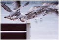
| 01/08/2008 05:18:51 AM |
Flameby RoosterComment: Clever concept. Not compromised by any distracting background elements - just nice and simple and strongly coloured |
 Photographer found comment helpful. Photographer found comment helpful. |
| 01/08/2008 05:17:26 AM |
|
| Photographer found comment helpful. |
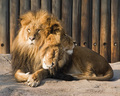
| 01/08/2008 04:56:57 AM |
Sleepy Lionby ErikVComment: Clever post processing but just not my cup of tea I'm afraid - its bordering on freaky! |
| Photographer found comment helpful. |
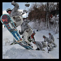
| 01/08/2008 04:55:00 AM |
Jumping At Youby BHusemanComment: Nice touch with the border, its not often people submit an image using that technique but it complements the image subject well. Positions of the snow boarder are consistent which others have failed to achieve so well done for that. |
| Photographer found comment helpful. |
| 01/08/2008 04:52:46 AM |
|
| Photographer found comment helpful. |
| 01/08/2008 04:49:48 AM |
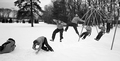
Revisiting Childhoodby arron_christensenComment: Lack of shadows is a bit odd and some positions are sharper than others. Might have been more consistent (spacing wise) to have just one position on the backswing rather than 2. Other than that, good B&W conversion and use of the wide aspect ratio frame |
| Photographer found comment helpful. |
| 01/08/2008 04:47:40 AM |
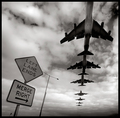
Air Traffic Control by hotpastaComment: If only the spacing was consistent between the back 4 and front 3. The rest of it is spot on, great B&W conversion, lovely tones, clever signs and title. The lampost is a bit unfortunate, you might have been able to obscure it with the forground sign without effecting the rest of the composition. |
| Photographer found comment helpful. |
| 01/08/2008 04:25:25 AM |
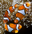
U-Turnby cloudsmeComment: Just lacking sharpness unfortunately, really bright/sharp/constrasty coloured fish against the dull/blurred background would have been great to see. You also have a bit of purple fringing would could easily have been supressed. |
| Photographer found comment helpful. |
| 01/08/2008 04:23:29 AM |
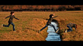
J......U........MPby jonfrommkComment: Two things initially come to mind, orange colour cast and non-traditional border - but I'm pleased to say I think both work here. Perhaps the orange is a little overdone but it completements the field and contrasts well with the blue water. The border gives it a video game feel and gives the image a "development animation" feel - hope that makes sense. The composition seems a bit weighted on the right hand side - two figures + stream verses just the one figure on the left. |
| Photographer found comment helpful. |
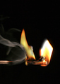
| 01/08/2008 04:02:31 AM |
Thermodynamicsby LeeDComment: Well composed, nice and simple concept. I worry that compared to some of the others I have voted on so far that the "relatively easy" technical difficultly might prevent a high score |
| Photographer found comment helpful. |
Home -
Challenges -
Community -
League -
Photos -
Cameras -
Lenses -
Learn -
Help -
Terms of Use -
Privacy -
Top ^
DPChallenge, and website content and design, Copyright © 2001-2025 Challenging Technologies, LLC.
All digital photo copyrights belong to the photographers and may not be used without permission.
Current Server Time: 04/08/2025 06:14:25 AM EDT.