| Image |
Comment |
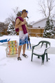
| 12/11/2007 08:08:07 AM |
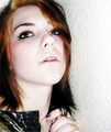
Myself.by sarberComment: interesting composition. Might be really cool if you oversaturated it, too. Too bad its OOF on the face/eyes. |
 Photographer found comment helpful. Photographer found comment helpful. |
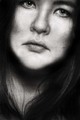
| 12/11/2007 08:07:06 AM |
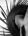
Self Portraitby jaysonmcComment: that is a fascinating hat, but the angle you took of yourself is simply not working. From above or the side would likely have been better. Also not keen on the noise. |
| Photographer found comment helpful. |
| 12/11/2007 08:06:09 AM |
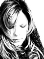
High-Key Meby loveComment: well done highkey. I like your use of dark to keep your image's detail. |
| Photographer found comment helpful. |
| 12/11/2007 08:04:58 AM |
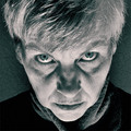
Icy Stareby quicheComment: not keen on the amount of noise, but like this image's look overall. |
| Photographer found comment helpful. |
| 12/11/2007 08:04:19 AM |
Out of Placeby awelshComment: you could have easily cropped more off the foreground to make yourself a bigger part of the scene. |
| Photographer found comment helpful. |
| 12/11/2007 08:02:10 AM |
Pensiveby tleplettComment: would have liked to see more of the forehead/top of the head. Image seems unbalanced. |
| Photographer found comment helpful. |
| 12/11/2007 08:01:33 AM |
Self examinationby agrimaceComment: placement of the hand is a bit distracting for me, but I think the composition needs something there, so I can see why you might have deliberately put your hand there. |
| Photographer found comment helpful. |
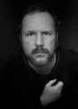
| 12/11/2007 08:00:17 AM |
I wonder if they know I'm not wearing any pants ...by rhadshawComment: great expression on your face..I was thinking to myself "I wonder what he's thinking.." and then I read your title and just about spit tea on my monitor! Lighting is adequate, but you could have used a bit of a reflector on your right side. |
| Photographer found comment helpful. |
| 12/11/2007 07:58:42 AM |
|
| Photographer found comment helpful. |
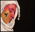
| 12/11/2007 07:57:47 AM |
Rise From The Ashesby mistchild2008Comment: i like this image. I would have cropped it a bit more off the bottom and given yourself a bit more negative space just to really balance out the light and dark. Also, you might have wanted to use a different colour of "shroud". The white just isn't doing much for the look and feel of your image. |
| Photographer found comment helpful. |
Home -
Challenges -
Community -
League -
Photos -
Cameras -
Lenses -
Learn -
Help -
Terms of Use -
Privacy -
Top ^
DPChallenge, and website content and design, Copyright © 2001-2025 Challenging Technologies, LLC.
All digital photo copyrights belong to the photographers and may not be used without permission.
Current Server Time: 04/08/2025 12:37:56 PM EDT.