| Image |
Comment |
| 08/17/2002 11:30:00 PM |
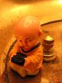
GameBoyby mcmurmaComment: great subject. good composition and lighting. nice macro. good job. |
 Photographer found comment helpful. Photographer found comment helpful. |
| 08/17/2002 11:46:00 PM |
Our New Life Togetherby langdonComment: this looks like it's a nicely composed photo, but it's really dark. as a silhouette, it would be really nice if there was more lighting in the background to make the figures stand out. i lower angle might have been better here as well, to get rid of the two harsh lights in the ceiling and the chandelier growing out of his back / her hands. other than these things, this is a nice attempt. |
| Photographer found comment helpful. |
| 08/17/2002 11:27:00 PM |
The Force Be With Youby karmatComment: excellent. great composition, subject, focus. my only nitpicks: maybe a stop or two too dark, and you might want to try cropping off some of the right hand side. otherwise, everything is really great. good work. |
| Photographer found comment helpful. |
| 08/17/2002 11:28:00 PM |
Palm Puppyby MorganComment: great depth of field on this. i really like this soft focus effect you've got going. my only nitpick would be the existance of the thumb in the photo, but i know it's probably pretty hard to hold a puppy any other way. great colors here, too. good work. one of my top 4. |
| Photographer found comment helpful. |
| 08/17/2002 11:32:00 PM |
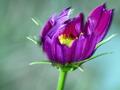
growing in the windby FranziskaLangComment: i like the depth of field and colors here, as well as the sense of motion. looks like it might have been overly sharpened to compensate for bad focus, but the shot is still very nice. good composition and positioning. nice work. |
| Photographer found comment helpful. |
| 08/06/2002 06:25:00 PM |
dividendsby magnetic9999Comment: the last two comments before voting ended are priceless when taken together. it totally sums up the frustration of having your photo up for public examination. this is a good shot, kollin, but i think i liked the wider crop you posted on photosig better. |
| Photographer found comment helpful. |
| 06/25/2002 08:37:00 AM |
Drowningby drewmediaComment: this is just wacky. heh. i think i'm bothered by the tilt in this shot. otherwise, it's a good concept and well composed. but i really think it would have been better zoomed out a tad and straightened up. the colors are really nice, but i'd also like to see a black and white version. something about the artsy commentary here i think would just look good in b&w. |
| Photographer found comment helpful. |
| 06/23/2002 07:17:00 PM |
|
| Photographer found comment helpful. |
| 06/23/2002 07:15:00 PM |
Eyesby BAMartinComment: nice composition and lighting. the shadows came across nicely in this. i'm kind of torn on the fact that this photo consists entirely of another piece of artwork, which is technically against the rules here, but the shot is nice so i'm going to grade it without taking that into consideration. |
| Photographer found comment helpful. |
| 06/23/2002 07:30:00 PM |
Shadow as Silhouetteby indigo997Comment: this is a good attempt. the shadow is a little too soft, i think, and the picture is very grainy. the underexposed bottom is also a little distracting. a nice pose and a good crop, though. i like the blue hues to this, but maybe a black and white version might look better. |
| Photographer found comment helpful. |
Home -
Challenges -
Community -
League -
Photos -
Cameras -
Lenses -
Learn -
Help -
Terms of Use -
Privacy -
Top ^
DPChallenge, and website content and design, Copyright © 2001-2025 Challenging Technologies, LLC.
All digital photo copyrights belong to the photographers and may not be used without permission.
Current Server Time: 04/09/2025 10:01:35 AM EDT.