| Author | Thread |
Comments Made During the Challenge  |
|
|
01/04/2004 10:01:51 AM |
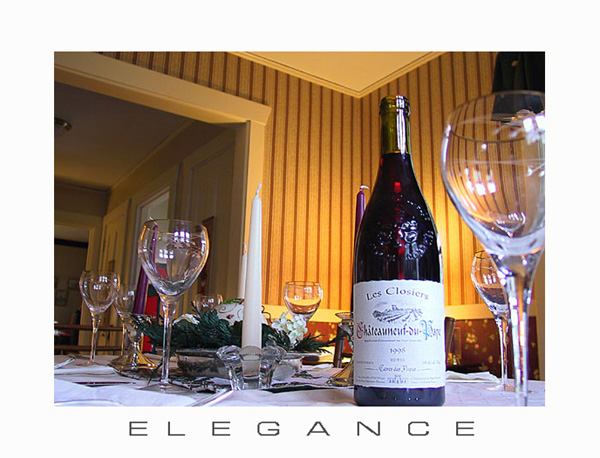
| Feels more like an advertisement, than a motivational poster, however, the shot is very nicely done. The only thing I would change would have been to use the Perspective in Photoshop to "reorient" the perspective of the shot. Nice warm lighting in the background works well with this shot. |
|
 Photographer found comment helpful. Photographer found comment helpful. |
|
|
01/04/2004 09:09:30 AM |
| Real quick, I really like the idea and shot. I do not care for the wide white border on all sides. But that is not real important, it just means I would not buy it as a poster. |
|
| Photographer found comment helpful. |
|
|
01/03/2004 03:31:04 AM |
| This looks more like an advertisement than a Motivational Poster. Nice image. |
|
| Photographer found comment helpful. |
|
|
01/01/2004 12:45:30 PM |
| Cool photo, and the fontwork is good too - nice kerning. |
|
| Photographer found comment helpful. |
|
|
12/31/2003 04:22:39 AM |
| Very elegant indeed. Great colors, angle of view, and setting. I am missing some of the "motivational" aspect here. |
|
| Photographer found comment helpful. |
|
|
12/30/2003 08:26:52 PM |
| The border is a bit over the top I think It would have been nice to focus on the table and not the triangle of the ceiling its a bit destracting |
|
| Photographer found comment helpful. |
|
|
12/30/2003 09:44:06 AM |
| Lovely colors and lighting, especially on the glasses. But if you're going to tilt deliberately, do it enough so it is obvious. This gives a slightly off impression that's almost dizzying. |
|
| Photographer found comment helpful. |
|
|
12/30/2003 06:02:41 AM |
| I'm not sure this is "motivational" but it's a nice set-up. |
|
| Photographer found comment helpful. |
|
|
12/29/2003 04:17:39 PM |
| Nice photo, although I think the bottle is a little blown out. I am not sure what is motivational about it however |
|
| Photographer found comment helpful. |
|
|
12/29/2003 10:31:12 AM |
| It sure is elegant. The white border has stuck me as a pleasant surprise after seeing lots of other photos with black and dark borders. IMO white works much better here than black or a dark color would have. Good luck with the challenge!!! |
|
| Photographer found comment helpful. |
|
|
12/29/2003 09:20:17 AM |
| The idea is good, but the shot is too busy for me. It mayhave worked better under more intimate lighting conditions - using just the bottle and maybe a candle and a couple of glasses alone. Aside from all that, it doesn't convey any sense of motivation. |
|
| Photographer found comment helpful. |
|
|
12/29/2003 09:18:58 AM |
| Nicely shot. Maybe light the candles? Good colors. |
|
| Photographer found comment helpful. |
|
|
12/29/2003 03:14:59 AM |
| The border is beautiful and the message goes with the picture, but the image seems cluttered to me. Maybe set up as a table for two would be better. |
|
| Photographer found comment helpful. |
|
|
12/29/2003 12:48:33 AM |
| Beautiful and elegant for sure. Great colours. Amazing clarity. The thin font works really nice with this image and I really appreciate that you didn't gunk it up with a huge thick border. Very well done. |
|
| Photographer found comment helpful. |
Home -
Challenges -
Community -
League -
Photos -
Cameras -
Lenses -
Learn -
Help -
Terms of Use -
Privacy -
Top ^
DPChallenge, and website content and design, Copyright © 2001-2025 Challenging Technologies, LLC.
All digital photo copyrights belong to the photographers and may not be used without permission.
Current Server Time: 04/07/2025 01:07:18 PM EDT.