| Author | Thread |
|
|
01/09/2004 04:16:07 AM |
Greetings from the Critique Club
Initial thoughts/My opinion
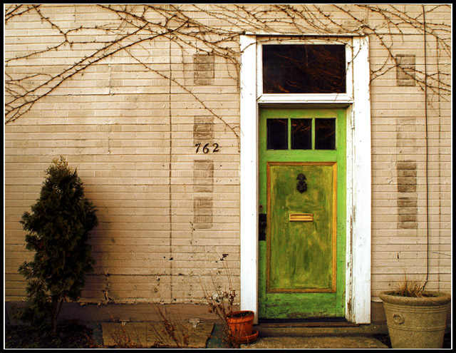
Nice, friendly looking door scene living from pleasantly looking pale colours and a variation of textures. Title not well suited though.
Content/Composition
I do like the overall composition, how the door, pots and bush are placed. It's also nicely framed at the top and bottom by the ivy and the small piece of garden that can be seen.
The image is living from texture (the wall and the old paint on the door) and shape (mainly the rectangular door and the dark spots on the wall, where probably post-boxes once were placed).
The light is looking fine to me: no sharp shadows, everything is smooth.
The colours are also very pleasant: everything has some patina, no bright shiny colours are shown. However, the scenery does not look rotten. One could envision that behind this door an elderly, friendly couple is living in old Victorian furniture. Old but nice.
At this point comes the biggest drawback of your submission: the title and image do not fit together well. There is nothing that brings up fear or cave in my mind when looking at the image. "Treasure" is fine, but to me the possibility that there are treasures behind the door is already visible when looking at the outside.
In this particular challenge, in which title/added text was much more important then usually, this was probably the reason why voters didn't vote much higher.
Camera work -technically
I think you did well very on exposure: you used the full range from dark to bright and that the lower left is underexposed fits to the overall composition. Focus could be a tad sharper (seen best on the ivy): it's just on the edge between looking soft and slightly out of focus.
Digital Processing - Technical
Looks mostly good to me: if you adjusted the saturation of this image digitally, you did just great. A bit more unsharpening mask might have been better though
You made the framing suitable for normal submissions. For this challenge however, adding a wider border with the text in it would have been the better way to go.
Fits the challenge
The image is for sure suitable for a motivational poster, the title too, but their combination not so much, as already stated above.
Good luck for you further submissions
|
|
 Photographer found comment helpful. Photographer found comment helpful. |
Comments Made During the Challenge  |
|
|
01/03/2004 04:19:32 PM |
| Excellent title/quote but not sure it goes with the photo (no sense of fear) |
|
| Photographer found comment helpful. |
|
|
01/03/2004 02:55:23 AM |
| Motivation doesn't need words to convey, however it might help here unless there was more emphasis on what is intended on moitivating in this piece. |
|
| Photographer found comment helpful. |
|
|
01/02/2004 08:02:40 PM |
| This was poster, should have had the text with the image. But I am not going too vote that down. I like the idea. Is this the Mother or Mother In-Laws house? LOL |
|
| Photographer found comment helpful. |
|
|
01/01/2004 10:13:35 PM |
| Sometimes so true. Excellent picture with feeling and a sense of pathos. It is possible to find our answers in the least likely places. 10 |
|
| Photographer found comment helpful. |
|
|
12/30/2003 09:30:52 PM |
| I like the green door th epot is great and the bland wall- awesome color- but thematically what is the treasure inside there- the drugs you want to buy? I don;t get it. |
|
| Photographer found comment helpful. |
|
|
12/30/2003 03:10:57 PM |
| This house doesn't look all that fearsome, but it's a nice rendition anyway. The detail on the run-down wood is very good, and the whole picture has a paited quality to it. |
|
| Photographer found comment helpful. |
|
|
12/29/2003 02:17:10 PM |
| To abstract. It may sound like a facile comment, but the image is just too far away from the notion of a cave, and though well composed doesn't stand on it's own here. You should consider a curves adjustment because the exposure is off as well - underexposed bush and overexposed door frame. |
|
| Photographer found comment helpful. |
|
|
12/29/2003 01:00:05 PM |
| Interesting photo, but it lacks sharpness a little, and the diffuse lighting takes away from it. Also, the phrase being about a cave and fear doesn't clearly tie to a door - the fear is not evident, so the metaphorical cave entrance (the door) doesn't work as well. |
|
| Photographer found comment helpful. |
|
|
12/29/2003 09:09:36 AM |
| Behind the green door? Very emotive photo - needs the typography on it, though. |
|
| Photographer found comment helpful. |
|
|
12/29/2003 05:23:18 AM |
| Lovely door shot. Great colour and good composition. It's a bit soft, but holds well. |
|
| Photographer found comment helpful. |
Home -
Challenges -
Community -
League -
Photos -
Cameras -
Lenses -
Learn -
Help -
Terms of Use -
Privacy -
Top ^
DPChallenge, and website content and design, Copyright © 2001-2026 Challenging Technologies, LLC.
All digital photo copyrights belong to the photographers and may not be used without permission.
Current Server Time: 02/01/2026 10:37:28 AM EST.