| Author | Thread |
|
|
06/01/2004 09:45:09 PM |
| I love this shot! And the title for it is absolutely perfect! Outstanding in my opinion...I can almost hear that rushing water....great job! |
|
|
|
01/07/2004 04:54:41 AM |
Greetings from the Critique Club
Initial thoughts/My opinion
Wonderful tranquilling and peaceful scenery. Easy understandable, well fitting text. A joy to look at.
Content/Composition
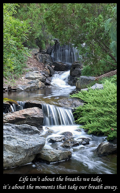
While the topic you chose is not new, i.e. showing a waterfall with long exposure, you selected a very nice one and didn't use a too long exposure time. The 0.7 s just made the water soft enough to make the overall mood quiet and peaceful (one does not think about a gurgeling creek as one would at faster shutter speed), but the water still looks natural because it is not just featureless white, especially at the central fall and in the very back.
On your composition I also like that the creek serves very well as a guiding line: the viewers eyes can walk it up and down and sees everywhere some nice spots and features which are all of equivalent quality. Same holds for the plants and rock.
Maybe that's the most important part of this composition: nothing is particularly standing in the foreground and nothing serves as a background for something. Very homogeneous while there is still plenty to see.
Hence, the title you gave it fits very well, because it's a calm, peaceful and philosophical title. Something to contemplate on.
As it has been commented, the image itself might not be breathtaking for everybody, but it's the best image to start contemplating about life and the own breathtaking moments one had. So image and title are very well chosen.
Camera work -technically
You for sure know how to handle your camera: the aperture is set great to not bring anything in the foreground or back by blurring it, exposure is on the spot, very balanced (the white portion of the water seems to be overexposed, but hey: they are just white).
Digital Processing - Technical
Also well done: well cropped, like the border and text.
It could be sharpened a little more, but really only a tiny bit. Too crisp would disturb the atmosphere.
Speaking of atmosphere: a slightly warmer tint, less bluish might have been better IMO.
Fits the challenge
Of course it does!
Good luck for you further submissions and hope to see you with a ribbon soon.
|
|
Comments Made During the Challenge  |
|
|
01/02/2004 12:20:04 PM |
| Love this picture, although I don't get along too well with the choice of font. Beautiful. |
|
 Photographer found comment helpful. Photographer found comment helpful. |
|
|
01/02/2004 07:09:18 AM |
| Certainly a breathtaking scene. Seems a bit blurry. The colors are probably realistic, but making them a bit warmer would improve the image I think. |
|
| Photographer found comment helpful. |
|
|
01/02/2004 01:03:29 AM |
|
| Photographer found comment helpful. |
|
|
01/01/2004 10:47:32 PM |
| A wonderful peaceful scene and great text. I think the amount of blur in the water is exactly right, still enough structure but also a nice soft flow. |
|
| Photographer found comment helpful. |
|
|
01/01/2004 06:51:00 AM |
| Lovely image, fills the criteria perfectly for me 10 |
|
| Photographer found comment helpful. |
|
|
01/01/2004 04:42:35 AM |
| Superb entry for the challenge. Crisp, great color, and just the right shutter speed to capture the water's movement. The choice of font works very well with this image, as well. Great job all around. |
|
| Photographer found comment helpful. |
|
|
12/30/2003 09:32:47 PM |
| It is a most wonderful picture and the words I treasure. It is a remind me of a place long ago where I will go to pray and a friend who is dear to my heart. |
|
| Photographer found comment helpful. |
|
|
12/30/2003 04:44:14 PM |
| Very nice flowing waterfall shot/ not exactly breathtaking or emotional- but it is prettier than what I see most days. |
|
| Photographer found comment helpful. |
|
|
12/30/2003 03:43:32 PM |
| One of the tops in this theme. Perfectly executed and aptly described. |
|
| Photographer found comment helpful. |
|
|
12/30/2003 01:48:33 PM |
| A lovely motivational message and nice image to go with it. This kind of project is one of the few times when I think a wider border would look better. I'd also opt for a less fussy font. Those are just personal preferences, of course! |
|
| Photographer found comment helpful. |
|
|
12/30/2003 09:28:40 AM |
| Nice use of slow shutter on the moving water, and a nice contrast between the moving water and the still water. |
|
| Photographer found comment helpful. |
|
|
12/29/2003 11:10:02 PM |
| great text - nice picture |
|
| Photographer found comment helpful. |
|
|
12/29/2003 08:11:58 AM |
| Fantastic dof, perspective, light and color. Compliments only. |
|
| Photographer found comment helpful. |
|
|
12/29/2003 01:44:12 AM |
|
| Photographer found comment helpful. |
|
|
12/29/2003 12:10:23 AM |
| Beautiful soft water effect, great depth and perspective, good composition. I would bump up the colours a bit (maby add some soft reddish tones on the rocks). |
|
| Photographer found comment helpful. |
Home -
Challenges -
Community -
League -
Photos -
Cameras -
Lenses -
Learn -
Help -
Terms of Use -
Privacy -
Top ^
DPChallenge, and website content and design, Copyright © 2001-2025 Challenging Technologies, LLC.
All digital photo copyrights belong to the photographers and may not be used without permission.
Current Server Time: 04/07/2025 12:14:22 AM EDT.