| Author | Thread |
|
|
01/05/2004 12:09:21 PM |
I'll see what I can do Mary. :-)
Thank you all for your wonderful comments. I have learned from this shot and hopefully plan to do more in the future like it.
Soni |
|
|
|
01/05/2004 09:26:27 AM |
| Please, make prints of this to sell. I do want it to hang in my library where I am the school librarian. This is beautiful and reminds students to work for success. |
|
 Photographer found comment helpful. Photographer found comment helpful. |
|
|
01/05/2004 08:29:31 AM |
| Congrats on your top 10 finish Sonja! I thought this would place - I really like it! Excellent work :-) |
|
| Photographer found comment helpful. |
|
|
01/05/2004 12:10:38 AM |
I thought for sure this would be in the top 3! Great work
Message edited by author 2004-01-05 00:10:49. |
|
| Photographer found comment helpful. |
|
|
01/05/2004 12:09:10 AM |
| Really quality shot, Sonja! Strong finish and great score for you! |
|
| Photographer found comment helpful. |
Comments Made During the Challenge  |
|
|
01/04/2004 05:37:05 PM |
| great photo....love the balanced lighting! |
|
| Photographer found comment helpful. |
|
|
01/04/2004 03:09:12 PM |
|
| Photographer found comment helpful. |
|
|
01/04/2004 02:49:01 PM |
|
| Photographer found comment helpful. |
|
|
01/04/2004 02:18:42 PM |
| My favourite of the pack, wonderful, everything fits together in harmony (10) |
|
| Photographer found comment helpful. |
|
|
01/03/2004 02:14:39 PM |
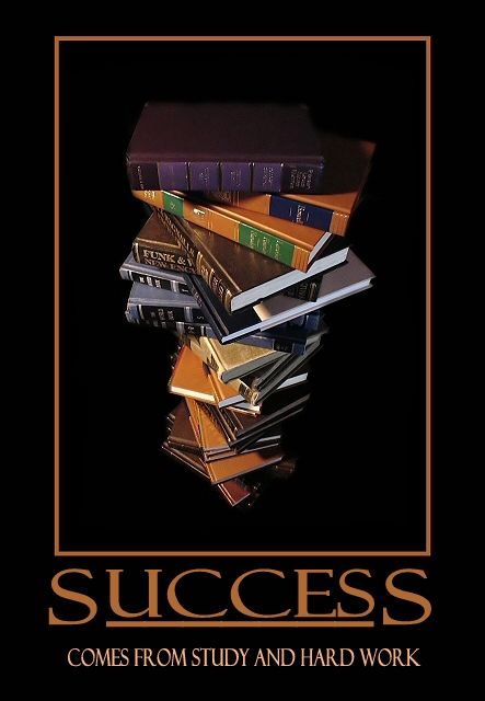
| Ah. Wish it were true. Very nice work on the book stack - colors are perfect. Love the matching frame and text - just the right font, placement, framing, etc. The underline was just the right touch. |
|
| Photographer found comment helpful. |
|
|
01/03/2004 04:13:37 AM |
|
| Photographer found comment helpful. |
|
|
01/02/2004 05:23:36 AM |
| This poster is very well done. -9 |
|
| Photographer found comment helpful. |
|
|
01/01/2004 05:49:09 PM |
| Good job on this - terrific control over lighting. |
|
| Photographer found comment helpful. |
|
|
01/01/2004 02:58:17 PM |
| fantastic 10/10 my third 10 good luck |
|
| Photographer found comment helpful. |
|
|
12/31/2003 11:01:11 AM |
| Great angle. Great concept. Great framing. Great photo. 8 |
|
| Photographer found comment helpful. |
|
|
12/30/2003 09:51:51 PM |
I really like this one- but are those reader's digest condensed books? you have too read the whole moby dick to get true book learnin smarts!Nice border, nice contrast and great lighting.and great choice of pumpkin yellow for the text.
You might want to rethink the colorof the top book. The placement of the top book is perfect. |
|
| Photographer found comment helpful. |
|
|
12/30/2003 07:02:58 PM |
| Nicely put together - good colour choices for border and text. Not sure I like the perspective/ angle of view on the pile of books. |
|
| Photographer found comment helpful. |
|
|
12/30/2003 02:59:16 PM |
| Are the books an illustration of the ladder to success? Nice blend of colors and composition. |
|
| Photographer found comment helpful. |
|
|
12/30/2003 10:49:58 AM |
| great image, I really like the composition and the lighting |
|
| Photographer found comment helpful. |
|
|
12/30/2003 12:57:31 AM |
| This would be a great motivational poster for an educational subject, I like it this looks very professional, the way the books are stacked adds dimesion and interest to this shot I like it |
|
| Photographer found comment helpful. |
|
|
12/29/2003 05:08:55 PM |
|
| Photographer found comment helpful. |
|
|
12/29/2003 03:22:21 PM |
| I can definitely see this hanging in a library of a university or school to encourage students to study. Awesome photo and great quote. Good luck with the challenge!!! |
|
| Photographer found comment helpful. |
|
|
12/29/2003 02:46:25 PM |
| One of the best of the lot. Very good light and good clean focus throughout. I also love your title text with larger S's and underlining. However, your secondary title is almost properly aligned but is s tad too close to the right - I measured. |
|
| Photographer found comment helpful. |
|
|
12/29/2003 01:37:31 PM |
| Very nice composition and use of light. I do think, however, that the title and text is too dominant - so much so that it overpowers the photo when the two should be able to coexist. |
|
| Photographer found comment helpful. |
|
|
12/29/2003 08:24:34 AM |
| one of the best yet. good image, and good text treatment. |
|
| Photographer found comment helpful. |
|
|
12/29/2003 07:32:45 AM |
| Great image and poster. Would like to see the smaller text in upper/lower case. All caps are a little distracting in this case. |
|
| Photographer found comment helpful. |
|
|
12/29/2003 04:46:20 AM |
|
| Photographer found comment helpful. |
|
|
12/29/2003 03:49:46 AM |
| Clean, simple, beautifully designed. Not so sure about the brown colour and the pinkish smaller text. But the photo itself is great and fits your caption perfectly. |
|
| Photographer found comment helpful. |
|
|
12/29/2003 01:40:49 AM |
| Nicely done, the lighting here is great. |
|
| Photographer found comment helpful. |
Home -
Challenges -
Community -
League -
Photos -
Cameras -
Lenses -
Learn -
Help -
Terms of Use -
Privacy -
Top ^
DPChallenge, and website content and design, Copyright © 2001-2026 Challenging Technologies, LLC.
All digital photo copyrights belong to the photographers and may not be used without permission.
Current Server Time: 02/01/2026 07:44:56 AM EST.