| Author | Thread |
Comments Made During the Challenge  |
|
|
01/16/2007 11:40:26 PM |
| not much contrast. also very small |
|
|
|
01/14/2007 11:52:00 PM |
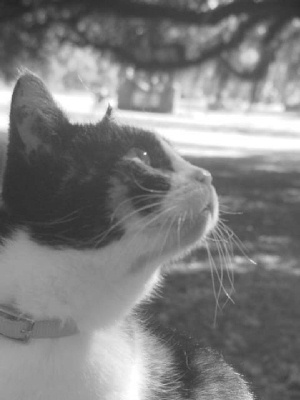
Lighting is a little flat here.
You might also want to read the following tutorial on sizing your photo.
//www.dpchallenge.com/tutorial.php?TUTORIAL_ID=26
Some people can be a bit brutal when it comes to picture size. |
|
|
|
01/14/2007 01:09:21 AM |
| This is really lacking contrast |
|
|
|
01/13/2007 04:36:03 PM |
| More contrast would add a bit of punch to the shot? The blacks are very light as it is. |
|
|
|
01/12/2007 03:42:17 PM |
| more contrast would help this, and perhaps levelling the background. |
|
 Photographer found comment helpful. Photographer found comment helpful. |
|
|
01/12/2007 02:34:18 PM |
| Too out of focus and bright for my taste. Sorry. |
|
|
|
01/12/2007 10:51:33 AM |
| cute cat but too small, no contrast, and not sharp enough... |
|
|
|
01/11/2007 08:32:35 PM |
| Washed out and flat. Needs more contrast. Looks like it might have been brought up in the Shadow/Highlight feature in CS2. |
|
|
|
01/11/2007 07:42:08 PM |
| Too small. Lacks crispness. |
|
|
|
01/11/2007 12:50:02 PM |
| lacks contrast and is not very sharp |
|
| Photographer found comment helpful. |
|
|
01/11/2007 12:46:17 PM |
| Looks a bit out of focus. |
|
|
|
01/11/2007 07:06:20 AM |
| This is a cute picture of the cat. Unfortunatly the washed out look really detracts from it IMO. |
|
|
|
01/11/2007 03:02:19 AM |
|
| Photographer found comment helpful. |
|
|
01/10/2007 03:01:32 PM |
| Could do with a bit of contrast. |
|
| Photographer found comment helpful. |
|
|
01/10/2007 08:47:00 AM |
| I think he lightng could be greatly improved. the burned out background is distracting |
|
|
|
01/10/2007 03:44:40 AM |
| Too small and you cropped part of your friends head off. |
|
|
|
01/10/2007 01:34:59 AM |
| Angled horizon, low contrast, not a particularly interesting capture. Sorry. |
|
|
|
01/10/2007 01:15:28 AM |
| For me it's too small and not enough contrast, Good Luck 3 |
|
Home -
Challenges -
Community -
League -
Photos -
Cameras -
Lenses -
Learn -
Help -
Terms of Use -
Privacy -
Top ^
DPChallenge, and website content and design, Copyright © 2001-2026 Challenging Technologies, LLC.
All digital photo copyrights belong to the photographers and may not be used without permission.
Current Server Time: 02/01/2026 10:24:32 AM EST.