| Author | Thread |
|
|
06/25/2006 07:15:35 AM |
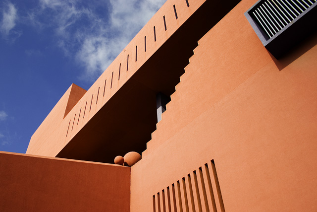
[[trading post]]
this is a very interesting image, composition is nice, the image is quite busy but that's something you can't help, it's the architects fault ;)
all those leading lines are great, too bad they don't lead to anything except those balls in the center...
the colors are good, and so is postprocessing.
I didn't vote on this but would have given it a 7. |
|
 Photographer found comment helpful. Photographer found comment helpful. |
|
|
06/07/2006 12:46:23 PM |
If I had more time I was going to go down and take a picture of the same building (I have one in my portfolio now).
Good job! |
|
| Photographer found comment helpful. |
|
|
06/07/2006 01:12:21 AM |
Trading Post Comment
I liked this photo a lot. The abstract nature of the composition with all the diagonals, sharp edges, and angles, as well as the near-complementary shades of blue sky and orange/peach/rust color of the building really works for me. (I notice a similar choice in my own picture, so obviously I like what you did.)
I also like the interplay of light and shadow and the way they define the volume of the spaces and walls.
I just read some of the comments below and I (respectfully) disagree with two notions expressed there: (1) I think the A/C belongs in the photo. It repeats the vertical lines in the building itself and it provides one more shape/volume to the picture. It also balances with the rectangular shapes in the building on the left side of the photo. Without the A/C I think the picture suffers from the loss. (2) The idea that the concept of "architecture" is somehow lessened because the photo emphasizes the "abstract" nature of the lines, shadow, shapes, etc. rather than, say, the look of the whole building in its entirety seems illogical to me. (You might as well tell Frank Lloyd Wright his buildings aren't "architectural" because they are too "abstract".) Your photo's concentration on the abstract is an artful depiction of the architecture IMHO. Obviously we all have different and valid views of things (I don't mean to take away from anyone's view to the contrary) and that's part of what makes dpc (and this trading post) fun and valuable. I just wanted to add my two cents because I thought otherwise and thought you should know.
I scored it a 7 and should have scored it higher.
Message edited by author 2006-06-07 01:13:02. |
|
| Photographer found comment helpful. |
|
|
06/06/2006 01:07:53 PM |
| I like the various reflecting diagional shapes, in the vent, lower right, and along the top of the building, as well as all the regular lines in teh structure. The "steps" kind of add to that for me. Nice colours and a good overall composition. |
|
| Photographer found comment helpful. |
|
|
06/06/2006 10:06:37 AM |
Trading post...
I like the composition. The way the black box (AC?) seems to be the opposite of the lines (windows?) cut into the building. Almost like an inverse, if that makes any sense. It appears that they were even cut off in the same way (the crop). The orange of the building against the very blue sky is dramatic and I love it. All in all a great image (and nice finish too btw). |
|
| Photographer found comment helpful. |
|
|
06/05/2006 12:43:24 PM |
| This one left me a bit blah. It almost seemed to be more of an abstract rather than an architecture entry. While the lines were kind of interesting the shot as a whole didnt leave me wanting to look at it too long. Technically I think you did very well here. The shades and shadows work well and the sky is a good contrast to the color of the building but it just didnt grab me overall. But you cant complain about a 6+ score. |
|
| Photographer found comment helpful. |
|
|
06/05/2006 05:49:35 AM |
Composition
At first look the composition seemed a little arbitrary, but looking again i like the shapes and shadows, but would prefer a slightly less angled viewpoint. Although this may not have fitted architecture so well, I would like to see a tighter crop on the 2 sphere things, which are beautifully lit.
Technical stuff (exposure, dof, lighting etc…)
considering its such a bright scene, you've done well to expose well, and keep good strong colours.
Meeting the challenge
Yes, nice to see a closer study of shapes/lines etc within local architecture.
Post-processing
You've got the sky very well exposed in relation to the rest, so looks like whatever you did to it worked well
My personal opinion
Nice interplay of shapes and shadows, but I'm not convinced abou the composition. |
|
| Photographer found comment helpful. |
|
|
06/05/2006 03:57:28 AM |
| Nice photo Deb - intriguing angle of an intriguing building. Beautiful colours, too. |
|
| Photographer found comment helpful. |
Comments Made During the Challenge  |
|
|
06/04/2006 11:45:19 PM |
| This really reminds me of Ricardo Legoretta's architectural style. The orange colors of his buildings are typical of Spanish?mexican architecture. Great use of colors to make this punch. Good luck! |
|
| Photographer found comment helpful. |
|
|
06/02/2006 04:43:41 PM |
| Interesting shapes, perspective, and rhythum. The object in the upper right corner is distracting but all in all a great photo. |
|
| Photographer found comment helpful. |
|
|
06/02/2006 02:47:41 PM |
| Wow! This is such an interesting composition of a most unusual building! The rich colors and sharp contrast make it such a bold photo. Very impressive! |
|
| Photographer found comment helpful. |
|
|
06/02/2006 12:46:40 AM |
Using a new formula....
0-2 Meets the Challenge = 2
0-2 Technical Merit = 2
0-4 Interest/Creativity = 1
0-2 The "wow factor" = 0
Final score: 5
The A/C detracts. |
|
| Photographer found comment helpful. |
|
|
05/30/2006 11:57:23 PM |
| "Line upon line, precept upon precept, Here a little, There a little..." Wisdom about Education from the Library between two covers: The Bible! :) |
|
| Photographer found comment helpful. |
|
|
05/29/2006 12:08:34 PM |
good strong colours & interesting building
personally (all these things are so personal so pls feel free to ignore...) i would have considered cropping this image on the right side, making it more square & so losing the a/c unit(?) |
|
| Photographer found comment helpful. |
|
|
05/29/2006 03:50:31 AM |
| Very nice. I love the colors. It's simple and abstract. It's a photograph of many shapes. |
|
| Photographer found comment helpful. |
|
|
05/29/2006 01:40:49 AM |
|
| Photographer found comment helpful. |
|
|
05/29/2006 12:39:10 AM |
| Ok, this could only be one building ... San Antonio Library. Great angle and contrast, sharp and well composed, well done! |
|
| Photographer found comment helpful. |
Home -
Challenges -
Community -
League -
Photos -
Cameras -
Lenses -
Learn -
Help -
Terms of Use -
Privacy -
Top ^
DPChallenge, and website content and design, Copyright © 2001-2026 Challenging Technologies, LLC.
All digital photo copyrights belong to the photographers and may not be used without permission.
Current Server Time: 02/01/2026 10:46:40 AM EST.