| Author | Thread |
|
|
04/12/2007 06:43:14 PM |
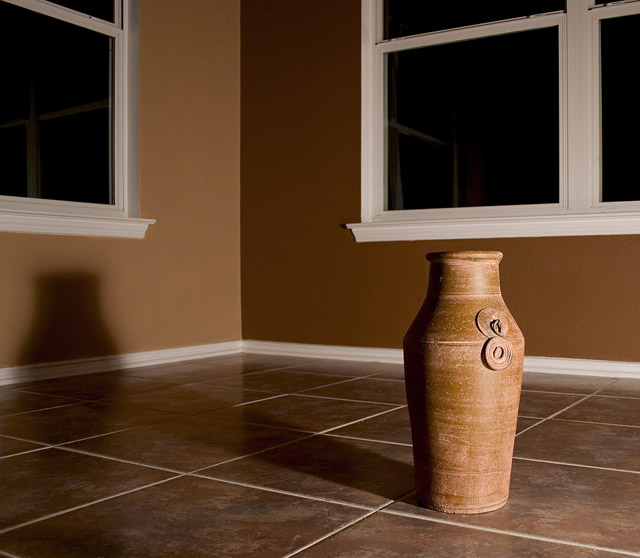
| I love the shadow because it emphasizes the depth of the room. |
|
 Photographer found comment helpful. Photographer found comment helpful. |
|
|
09/25/2006 05:13:25 PM |
| I love the earth tones and light in this! Very nicely done! |
|
| Photographer found comment helpful. |
|
|
07/02/2006 03:39:00 AM |
| I like this picture. The color and focus are very strong. The lighting seems a bit harsh to me, though. ...I can imagine the table lamp with the shade removed sitting on the floor just out of the frame. A little softer light would have worked better IMHO. I am one of the 94 who scored this a 6. (Interestingly, I chose an earth tone setting for my shot, too. Yours, however is much better.) |
|
| Photographer found comment helpful. |
|
|
06/25/2006 03:22:33 AM |
[[trading post]]
this is a nice shot, composition is good, could use a wider angle.
the lighting is bad though, the harsh shadows are not helping.
try using a softbox ( white bedsheet ) to soften the light, works great for shots like these.
congrats on your top 25 :) |
|
| Photographer found comment helpful. |
|
|
06/16/2006 10:29:01 AM |
Trading Post -
Nice shot overall Deb. You have a knack for these warm, earth tone type shots. Great long shadow and nice overall lighting. Would like to have seen more of the room but this still works well and easily fits the challenge. My eyes are drawn secondarily to the reflections in the window. Cloning those out may have been nice - but probably a very minor point. Good shot and who can complain about another 6.+ score. |
|
| Photographer found comment helpful. |
|
|
06/16/2006 01:52:13 AM |
Composition
Nice composition but I'd like to see it a little wider. Not really much to say
Technical stuff (exposure, dof, lighting etc�)
Beautiful lighting, enough to get the nice long shadow which is very important compositionally, but not enough to light the vase too harshly. Seems perfectly exposed, everything else spot on.
Meeting the challenge
Yeah, its wide enough and empty enough to not be a corner so of course
Other
I find the reflections of the frames in the windows distracting. If I were you i'd clone them out.
My personal opinion
If I'd voted on this challenge, I would have picked this out as one of yours. Your shots like this are always so beautiful (as is this one). Great to have a "signature shot" based on fundamental photography skills such as subtle lighting and tones rather than just the content. Pretty impressive that you can score a 6+ and not even make a dent on your profile page! |
|
| Photographer found comment helpful. |
|
|
06/14/2006 08:17:44 PM |
hello again,
this is a very nice shot. well done.
i dont really see anything that would make it better. this is a really pleasing image to me. |
|
| Photographer found comment helpful. |
|
|
06/14/2006 01:09:31 PM |
| This was one of my favourite images in the challenge. I really like the warmth of the earthy tones and the great shadows generated by the seemingly single light source. I think you've composed this very well, because there is a lot of "reflectivity" in the picture: the two windows, vase versus shadow, angular floor tiles versus nice curved neck of the vase. I think it was a wise choice to clone out the sockets (and litter). Great shot. |
|
| Photographer found comment helpful. |
|
|
06/12/2006 02:39:20 PM |
Trading Post...
This is a lovely shot. Great warm colors. I love the shadow. Nice placement of your "object". You met the challenge in every way, which your score reflects! BTW - that's 5 challenges in a row above a 6 score. I smell a ribbon soon! |
|
| Photographer found comment helpful. |
|
|
06/12/2006 12:20:15 PM |
Way to GO Deb!!! I think you better give up your seat on that middle club you started. . .you no longer qualify with all these top place finishers!!
Congratulations!!!! You're awesome!!!
|
|
| Photographer found comment helpful. |
|
|
06/12/2006 12:43:58 AM |
Great shot as usual, Deb. Thought I would make you my guinea pig for the scoring pro forma I have been developing. Hope you find it useful.
Challenge: Empty Room
Challenge Description: Your challenge this week. Take one thing and your camera into an empty room and photograph it. (Advanced Editing)
A Score re meeting the challenge
{ 0} Does not meet challenge
{+1} Clearly meets the challenge
**{+2} Epitomises the idea behind the challenge
For me, this is an excellent example of how I saw the challenge being realised.
B Composition & Aesthetics
{ 0} No discernible compositional form or merit
{+1} Snap-shot like composition
**{+2} Well composed, aesthetically pleasing
{+3} An exceptional composition/exceptional aesthetics
The tones are superb and the use of the rule of thirds on the major verticals all work well. The cast shadow adds a degree of poignancy to the mood of the picture.
C Technical Considerations
{ 0} Technically flawed
{+1} Technically OK
**{+2} Technically well executed
{+3} Evidence of technical mastery/wizardry
Clean rendition of the shot, in line with the minimalist aesthetic expected of the subject matter.
D WOW Factor
{ 0} Not special/ordinary
{+1} Has some degree of impact
**{+2} Obvious impact
{+3} Slaps you in face
This picture does it for me in a quietly stated way.
Total score: 8
|
|
| Photographer found comment helpful. |
|
|
06/11/2006 08:09:34 PM |
| I love this... You do wonderful with these clean simple shots, like your tribute to JJ Beguin a while ago. |
|
| Photographer found comment helpful. |
Comments Made During the Challenge  |
|
|
06/11/2006 07:13:41 PM |
| Nice and clean, yet warm and stylish ... |
|
| Photographer found comment helpful. |
|
|
06/10/2006 07:00:52 PM |
| Nice lighting and use of lines. |
|
| Photographer found comment helpful. |
|
|
06/09/2006 03:49:10 AM |
| Great image. I can see this in a decor mag. |
|
| Photographer found comment helpful. |
|
|
06/07/2006 05:06:24 AM |
| nice attempt ... i liek the textures |
|
| Photographer found comment helpful. |
|
|
06/06/2006 08:25:56 PM |
| nice photo. great texture and color in the tile floor and on the vase. I think the room may have been more powerful without the windows, but oh well. Great image otherwise. |
|
| Photographer found comment helpful. |
|
|
06/06/2006 06:22:14 PM |
| One of the most pleasant entries. I like that you can't see out the windows. |
|
| Photographer found comment helpful. |
|
|
06/06/2006 05:07:28 PM |
| I do not feel the emptiness of the room because such a small part of it is shown. |
|
| Photographer found comment helpful. |
|
|
06/06/2006 03:46:14 PM |
| I like the monotone feel. Looks nice. |
|
| Photographer found comment helpful. |
|
|
06/06/2006 03:17:56 PM |
| Excellent... Love the tones and clean crisp lines. |
|
| Photographer found comment helpful. |
|
|
06/06/2006 12:40:09 PM |
| The colors are nice on this. The lighting bothers me a bit because of the shadow of the vase. |
|
| Photographer found comment helpful. |
|
|
06/05/2006 07:29:24 PM |
| This is such a strong photo! The light and shadows are so striking, and those rich brown tones are to die for. This is definitely one of my favorites in this challenge!! |
|
| Photographer found comment helpful. |
|
|
06/05/2006 06:36:43 PM |
|
| Photographer found comment helpful. |
|
|
06/05/2006 04:59:00 PM |
| shapes and light well handled |
|
| Photographer found comment helpful. |
|
|
06/05/2006 03:14:39 PM |
| Very nice shot... cool shadow :) |
|
| Photographer found comment helpful. |
|
|
06/05/2006 03:10:06 PM |
| Lovely lighting, very good color |
|
| Photographer found comment helpful. |
|
|
06/05/2006 01:29:54 PM |
|
| Photographer found comment helpful. |
|
|
06/05/2006 01:14:38 PM |
| I like the lighting and shadow. Nice! |
|
| Photographer found comment helpful. |
|
|
06/05/2006 12:18:46 PM |
| Good image for light source.... |
|
| Photographer found comment helpful. |
|
|
06/05/2006 09:43:38 AM |
| Excellent! The subtle tones, the use of lighting to enhance the subject and the symmetry of the tile all enhance this image. |
|
| Photographer found comment helpful. |
|
|
06/05/2006 08:43:05 AM |
|
| Photographer found comment helpful. |
|
|
06/05/2006 06:07:04 AM |
| This had a really lovely warm feeling to it, due to the earthy tones, as they worl so well in this image..... |
|
| Photographer found comment helpful. |
|
|
06/05/2006 04:29:58 AM |
|
| Photographer found comment helpful. |
|
|
06/04/2006 09:38:47 PM |
| Very minimalistic and clean. Single light source makes it even more interesting. |
|
| Photographer found comment helpful. |
|
|
06/04/2006 08:53:21 PM |
| ooo, pretty, I love the color tones, 8 |
|
| Photographer found comment helpful. |
Home -
Challenges -
Community -
League -
Photos -
Cameras -
Lenses -
Learn -
Help -
Terms of Use -
Privacy -
Top ^
DPChallenge, and website content and design, Copyright © 2001-2025 Challenging Technologies, LLC.
All digital photo copyrights belong to the photographers and may not be used without permission.
Current Server Time: 04/07/2025 01:44:53 AM EDT.