| Author | Thread |
|
|
09/03/2006 05:04:52 AM |
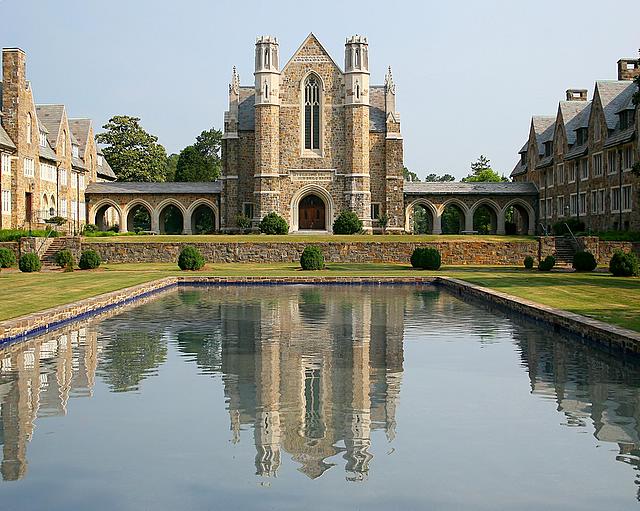
| I love the concept of this idea, however I think this shot at night or closer to night and I'd really like to see this in portrait rather then landscape. I'd like to see you take out the side buildings and just key in on the subject and the reflections in the water. Not sure if its possible but a higher vantage point with more straight on would also help. This image has so much potential even though it did really well, I think this has ribbon potential with a few very minor changes. |
|
 Photographer found comment helpful. Photographer found comment helpful. |
|
|
06/06/2006 01:19:54 PM |
Greetings from the Critique Club
This image has a great feel to it mostly due to the wonderful capture of the reflections in the water. The symmetry is spot on. The horizon is straight. Perfect! As far as improvements, there a re a few that I would recommend. I would use a circular polarizer to gradiate the skies. The color of the sky currently is a bland light blue. I think that this would add punch to an already strong image. If you couldn't make the sky pop using the polarizer, a gradient filter in PS is allowed since this was an advanced editing challenge. Refer to the Landscape Learning Thread for additional information about gradients. The colors could be saturated a little bit as well to give it punch and drama. The grass and the neutral colors of the brick would come out wonderfully if you used a Velvia filter to bring out the warm tones of this image.
If you have a chance to return to this location, might I suggest you shoot this at night on a long exposure just after sunset? I believe this would look great shot in the evening sky as well with lights emanating from inside the building. This is a great shot that could use a little push in post processing to make it sing.
If you have any questions or comments regarding this critique, please do not hesitate to PM me. Thanks and good luck.
Cheers,
Rikki
|
|
| Photographer found comment helpful. |
Comments Made During the Challenge  |
|
|
06/04/2006 07:12:00 PM |
| Wonderful light and textures! |
|
| Photographer found comment helpful. |
|
|
06/04/2006 03:37:54 AM |
| Fantastic image but IMHO not creatively captured. |
|
|
|
06/02/2006 05:19:58 PM |
|
| Photographer found comment helpful. |
|
|
06/01/2006 04:08:31 AM |
| I think the building on the sides are a little disturbing. |
|
| Photographer found comment helpful. |
|
|
05/31/2006 09:13:57 AM |
| Very good use of leading lines. |
|
| Photographer found comment helpful. |
|
|
05/30/2006 07:17:23 AM |
| I think the buildings on either side take away from this image, cropped it would be an amazing picture! |
|
| Photographer found comment helpful. |
|
|
05/29/2006 05:34:13 PM |
|
| Photographer found comment helpful. |
|
|
05/29/2006 11:06:47 AM |
|
| Photographer found comment helpful. |
|
|
05/29/2006 11:06:40 AM |
| Nice, good reflection, nice symmetrical photo. Too bad the sky is washed out. |
|
| Photographer found comment helpful. |
|
|
05/29/2006 04:17:20 AM |
| Nice shot, would like it a little darker also :o) |
|
| Photographer found comment helpful. |
|
|
05/29/2006 01:10:48 AM |
| lovely postcard type image |
|
| Photographer found comment helpful. |
|
|
05/28/2006 10:32:45 PM |
| Love the "impressionistic" reflection in the pond, a soft colored image, thays works well,but could have been slightly saturated a little more..... |
|
| Photographer found comment helpful. |
Home -
Challenges -
Community -
League -
Photos -
Cameras -
Lenses -
Learn -
Help -
Terms of Use -
Privacy -
Top ^
DPChallenge, and website content and design, Copyright © 2001-2025 Challenging Technologies, LLC.
All digital photo copyrights belong to the photographers and may not be used without permission.
Current Server Time: 04/07/2025 02:02:36 PM EDT.