Greetings from the Critique Club. My critiques are generally geared towards trying to help you improve your score within DPC, and not on any true "artistic" merit of the photograph itself, unless it relates to DPC voters and scoring. Please keep that in mind as you read this.
Initial Thoughts
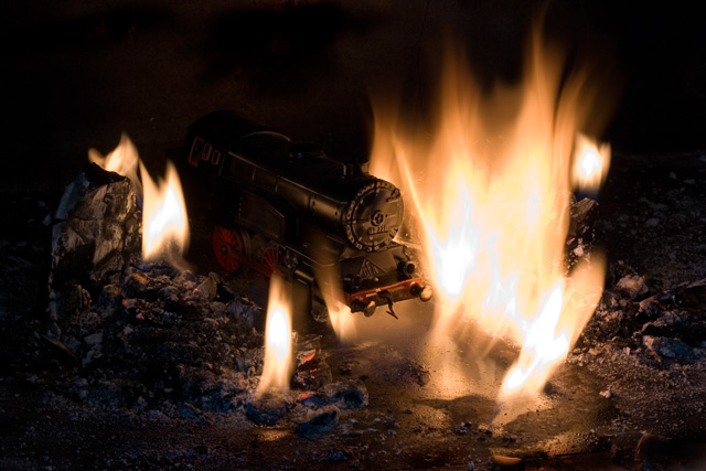
Where're the tracks?
Composition/Content
Not a bad composition overall. You leave enough space to really make something of this photo, but.. unfortunately, don't really complete the idea. On DPC, this can really lead to voters scoring you lower because of the expectations that aren't realized. What I think you needed were some tracks, and perhaps a little more ambient environment.. hints of the evil that hell is known for, and perhaps just a little more train (instead of just an engine). I can't guarantee that it would have placed you all that much higher, but I do think you'd have done much better than you did. It's a nice, creative idea.. but it just fell a little short in application.
Background
Because of the front-lighting, you have some noisy background elements that could have been cloned or dodged out some, but over-all it's a good effect.
Camera Work/Technical
A pretty good exposure, nice and dark and moody. Focus is good, although sharpening is a bit soft.
Digital Processing
One of the problems with this shot is the color balance working against you. Even with all the flames, it still has a "cooler" look to it.. no so much "heat". I don't get the sense of heat radiating. If you'd used some warmer tones throughout the shot, I think you could have put that across a little better. It's not bad, as is, but I think the effect definitely could have worked better. As I said, there are little marks and spots throughout the photo that could have used some spot editing as well.
Fits the Challenge
Certainly fits, although with the warmer tones I talked about, I think you could have really made it say "heat" better.
My Opinion of the Photo
I like the idea. It's creative and shows a good deal of initiative. However, the fact that it's incomplete (missing the tracks, more train, and a certain ambiance), hurts it. The voters probably picked up on this in their quick pass-by and thus you suffered in voting. As it stands, it's still a rather plain image with not much pop or that ever-present "WOW". A great try, so keep on working on your ideas, and good luck in future challenges. |