| Author | Thread |
|
|
06/03/2006 02:29:29 PM |
Hello, Greetings from the Critique Club. As requested, here is an indepth critique of your submission.
Please keep in mind this is a personal opinion. This is also my very first critique for the CC ;)
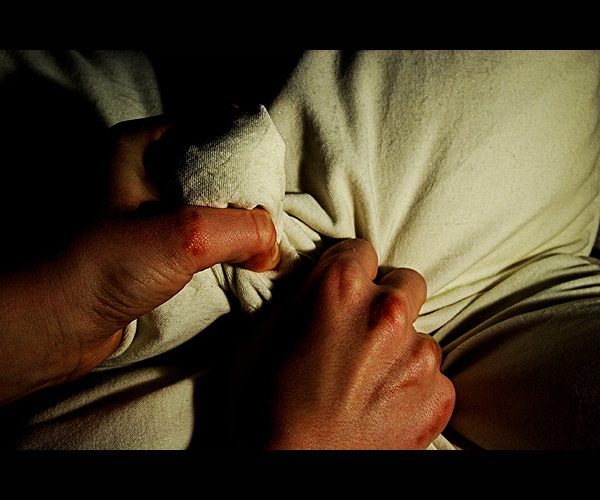
My first impression was a good one. Great visible textures.
The composition looks pretty good, though my eyes keep going to the lighter right part of the image. The sheet seems to look a bit too straight, a couple of wrinkles might have fitted better.
The subject is recognisable, and clear. Everybody has been angry once in a while ;)
Focus is spot on, and in a way you can see the textures of the hands and the sheet. That looks great! I'm not quite sure about the colors, the hands look a bit too red. Have you tried B&W with this image? Or maybe a B&W-layer, with an opacity of, let's say, 75%. But it all comes down to taste, and I think this is what you were looking for. The light might be a little brighter at the left side of the image.
The border seems to fit in this kind of image, but it's not my personal taste.
I like the fact you've tried something different then the "usual" heat. This is a unique idea for the challenge, and I think you did a great job overall.
I hope you've found this critique helpful. Good luck with future challenges! |
|
 Photographer found comment helpful. Photographer found comment helpful. |
Comments Made During the Challenge  |
|
|
05/28/2006 09:55:40 PM |
| I really like the fact you did something different. Not only is it unique here but its also well done. Bumping up. |
|
| Photographer found comment helpful. |
|
|
05/26/2006 01:16:39 PM |
looks exactly like a picture from a wide-screen movie..
Like it a lot! |
|
| Photographer found comment helpful. |
|
|
05/25/2006 01:03:57 PM |
| A great shot! Composition is great and really conveys a feeling of anger or frustration. |
|
| Photographer found comment helpful. |
|
|
05/24/2006 10:51:22 AM |
| Good lighting and texture. I don't like the border. |
|
| Photographer found comment helpful. |
|
|
05/22/2006 10:08:35 PM |
| emotional... great idea. Very original and the lighting adds emotion as well. |
|
| Photographer found comment helpful. |
|
|
05/22/2006 07:02:19 PM |
| good contrast in the lighting |
|
| Photographer found comment helpful. |
|
|
05/22/2006 06:07:36 PM |
|
| Photographer found comment helpful. |
|
|
05/22/2006 06:05:45 PM |
| Definitely an unusual and original take on the challenge. The more I look at it the more I'm convinced that there's really nobody inside the shirt, and that reduces the effect. |
|
|
|
05/22/2006 09:43:17 AM |
| This is a very good pix. However, I am not convinced. Great light, nice comp, nice texture, good color. |
|
| Photographer found comment helpful. |
|
|
05/22/2006 08:02:31 AM |
| Technically well done but pretty far streching considering the challenge. Hard to conect without the title. |
|
| Photographer found comment helpful. |
|
|
05/22/2006 07:47:46 AM |
| great take on this challenge. the bloody knuckles are a terrific addition to this. I think the border works really well with this. i hope it doesnt get you dq'ed though. good luck! |
|
| Photographer found comment helpful. |
|
|
05/22/2006 07:15:35 AM |
|
| Photographer found comment helpful. |
Home -
Challenges -
Community -
League -
Photos -
Cameras -
Lenses -
Learn -
Help -
Terms of Use -
Privacy -
Top ^
DPChallenge, and website content and design, Copyright © 2001-2026 Challenging Technologies, LLC.
All digital photo copyrights belong to the photographers and may not be used without permission.
Current Server Time: 02/01/2026 07:04:09 AM EST.