| Author | Thread |
|
|
06/04/2003 03:41:55 PM |
*Critique Club*
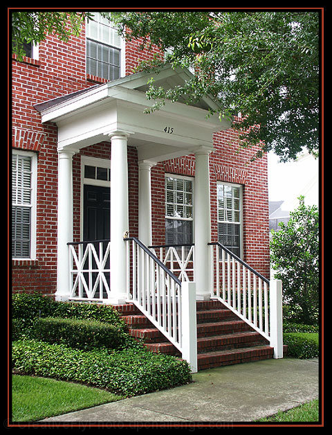
A very well maintained house. Good bushes, nice grass, pleasant to look at for sure. It's the kind of shot you'd see in a House For Sale ad. I'm not realy sure about the 'creative' part of the challenge though. Someone stated that it looks like a snapshot, and while I think it's a step further than a snapshot, I don't think it you have gone out of the way for creativity.
Technically though, you hit this right on the mark. My only technical complaint would be that the sky in the background is a bit white out, and bright on the building in the background.
Focus and clarity are really great. Love the detail in the brick and the white stair rails. Nice crisp lines.
The angle and framing/cropping are nice to display the house at. We get to see the main elements. Door, brick, window, and stairs. We can tell that it's more than single story, however, are close enough to get the real detail, rather than the overall size.
The lighting looks ok for the detail and for not getting bad shadows or bright spots on the house. The far windows are showing a little reflection, however, nothing real serious. The only real lighting problem I see is that hot spot in the back on that other building.
The title does work nicely. Reminds me definately of home cause that's kind of like we tell people where our house is.
I have a question. Did you remove the flag for the photo? I know how some people complain about flags in photos. Could have been one of those seasonal flags though. Anyway, I think you did a good thing to remove the flag, even though it is part of your home, because it would have been in the way to see your actual home.
Overall, technically, it's quite good, little to complain about, but it just doesn't stand out to me more than that.
~Heather~ |
|
 Photographer found comment helpful. Photographer found comment helpful. |
|
|
06/04/2003 10:34:37 AM |
| From the standpoint of technique, I like this picture alot. The focus is great, and the colors are very rich. What I find average in it is the composition, which seems to me to be just a snapshot (this is my house type of picture). Also, the overexposed part on the right between the tree and bush is bothersome. I still gave you a high mark on this though. |
|
| Photographer found comment helpful. |
Comments Made During the Challenge  |
|
|
06/03/2003 09:46:55 AM |
| The brick adds nice texture to the photo. |
|
| Photographer found comment helpful. |
|
|
06/03/2003 09:11:57 AM |
| Pretty, Plain, and Simple = Great photo. |
|
| Photographer found comment helpful. |
|
|
06/02/2003 04:05:56 PM |
| nice bricks. looks slightly oversharpened. |
|
| Photographer found comment helpful. |
|
|
06/02/2003 12:59:01 PM |
| Lovely portrait! I just want to add, after having looked at this photo again and again over the week, that this is definitely a great example of everything a photo in this challenge should be, in my opinion. The colors are rich, the composition is interesting and keeps the eye moving, and the title adds a neat personal descriptiveness that you don't otherwise get. The white sky on the right is a bit blown out, which is a peeve of mine, but I'm changing my score on this from a 9 to a 10 because I really hope to see it in first place! Well done! :) |
|
| Photographer found comment helpful. |
|
|
06/02/2003 10:05:50 AM |
|
| Photographer found comment helpful. |
|
|
06/02/2003 09:02:32 AM |
| Pretty house, but boring picture. |
|
| Photographer found comment helpful. |
|
|
06/02/2003 08:31:56 AM |
| I really like the way you captured the subject. The tree in the forground is a nice touch. It can go without the red line in the border. |
|
| Photographer found comment helpful. |
|
|
06/01/2003 06:50:50 PM |
| Very nice exposure, composition, color, focus,..... hey, you did a super job! |
|
| Photographer found comment helpful. |
|
|
06/01/2003 05:46:27 PM |
| pleasant looking home, very good color, composition. |
|
| Photographer found comment helpful. |
|
|
05/31/2003 07:01:25 PM |
| Really cool but could use some warmth. 7 |
|
| Photographer found comment helpful. |
|
|
05/29/2003 06:31:07 PM |
|
|
|
05/29/2003 11:52:32 AM |
| 5. Fits the theme well enough, and there are no blatant 'you suck!' flaws to it, but neither does it really grab me for any reason at all. For reasons of composition, cropping, or subject choice, it's just a photo, and doesn't do especially much for me, aesthetically. |
|
| Photographer found comment helpful. |
|
|
05/29/2003 09:30:08 AM |
| nice job on the clarity and nice job getting the colors to turn out |
|
| Photographer found comment helpful. |
|
|
05/29/2003 12:15:39 AM |
| Are there brick houses on the right? |
|
| Photographer found comment helpful. |
|
|
05/28/2003 09:44:04 AM |
| Nice and inviting picture. I like the cleaness of it. |
|
| Photographer found comment helpful. |
|
|
05/28/2003 06:13:39 AM |
| I once visited a house that looked just like this :) |
|
| Photographer found comment helpful. |
Home -
Challenges -
Community -
League -
Photos -
Cameras -
Lenses -
Learn -
Help -
Terms of Use -
Privacy -
Top ^
DPChallenge, and website content and design, Copyright © 2001-2025 Challenging Technologies, LLC.
All digital photo copyrights belong to the photographers and may not be used without permission.
Current Server Time: 04/07/2025 01:03:06 PM EDT.