| Author | Thread |
Comments Made During the Challenge  |
|
|
05/18/2003 06:45:01 PM |
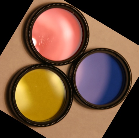
| I think this would be better if the red were more RED, and less pink. The angle is a little off, I know a lot of people don't like symetry, but I wish this were a bit more centered and straight on. The glare in the red area is a distraction in my opinion. ~Heather~ |
|
|
|
05/15/2003 07:07:26 PM |
| Nice idea. A touch more diffuse lighting to bring out the detail on the rings a touch more. Most likely said before, but the cropping may have been better with a little more space around the filters to see the full shadows and even(ing) out the spacing, and then the rotation part not sure of, but making it a bit more symmetrical again with like a diamond in a square |
|
|
|
05/15/2003 07:44:15 AM |
| I like the idea of using the filters -- and I find the arrangement you made for the photo very aesthetically appealing. If this were an ad, I'd probably think about buying them. :) |
|
|
|
05/13/2003 10:32:51 AM |
|
|
|
05/13/2003 06:33:08 AM |
| score would be higher were focus sharper |
|
|
|
05/13/2003 05:49:18 AM |
| Nice colours but I think it would be more effective if the light background filled the shot. |
|
|
|
05/12/2003 02:37:11 PM |
| an attractive shot...very nice. What are these? Filteres? I like them..really good looking colors. |
|
|
|
05/12/2003 06:20:38 AM |
| I LOVE the camera related theme! Wish I'd thought of it. Very nice composition, also. The red is a bit on the "pink" side, but overall a great idea. |
|
|
|
05/11/2003 08:32:09 PM |
| Good shot - the reflection is a tad bit distracting in the red - so are the scratches. Good idea, but with such a flat bg, I'm not sure I like it. |
|
Home -
Challenges -
Community -
League -
Photos -
Cameras -
Lenses -
Learn -
Help -
Terms of Use -
Privacy -
Top ^
DPChallenge, and website content and design, Copyright © 2001-2025 Challenging Technologies, LLC.
All digital photo copyrights belong to the photographers and may not be used without permission.
Current Server Time: 04/15/2025 12:36:30 AM EDT.