Critique Club
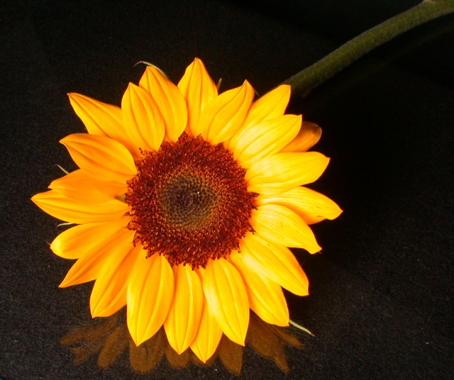
Well, I've been looking at this shot for a while, and come back to it a couple of times too: the thing is, there isn't anything really striking about it - there's good stuff, and not so good stuff. The capture of the colour is fine, but the detail, especially of the middle of the flower, is missing. The background is OK - reflections good but under done, and the texture of it, or patterning also - but it looks acciddental, as though you've concentrated only on the appearance of the petals. Likewise with the stem of the flower as it disappears out of shot: visible, but so dimly lit that it looks like an accident.
I wonder if you've checked out the brightness of your monitor? Mine's pretty well set (use the white to black boxes under photos when voting, if you don't know what I'm talking about), but this shot becomes a lot more interesting if i darken it a bit.
I suspect the lighting is perhaps too flat: a more directional but diffused light would bring out more texture.
I think it scored where it did because of two things primarily: people were looking for all of the primary colours, and you've only shown one, and because there's nostand-out element of this shot.
Good luck in future challenges
Ed |