| Author | Thread |
|
|
05/16/2003 01:32:16 PM |
~ Critique Club Comment ~
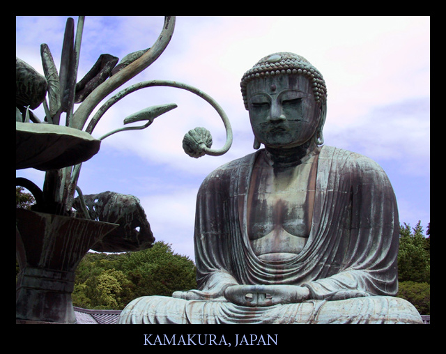
Composition : Extraordinary... The positioning of Buddha's head on the "rule of thirds" grid is achieved with a certain something that makes it look very natural and un-contrived. The rest of the frame is filled with interesting curves and lines. Wonderfully done!
Exposure / Lighting : I think the people that mentioned the lack of light on Buddha's face have a point. That may have been the "little extra" needed to escalate this shot to the top. I have never had the pleasure to visit this site, so I'm not sure if a different time of day would have given you better lighting or not. But if you have an opportunity to spend more time here, you may want to shoot a few at different times of day. Particularly early morning or late afternoon, depending on which direction he is facing.
Focus : Flawless.
Post Processing : Extremely professional looking border. Very well done.
Challenge / Wow : The challenge is certainly nailed here. I could easily imagine this shot on a postcard at a vendor. A slightly better lighting situation would have truly nailed the "wow" as well.
My opinion : Great shot! One very small nitpick and I'm not even certain I'm right... Is the title misspelled? I thought it was "Buddha"... I could be wrong and it doesn't make much difference either way :) |
|
 Photographer found comment helpful. Photographer found comment helpful. |
Comments Made During the Challenge  |
|
|
05/11/2003 06:18:58 AM |
| I really enjoyed your submission, it should place well in this week's competition. 8 Morgan |
|
| Photographer found comment helpful. |
|
|
05/10/2003 06:56:39 PM |
| Good job capturing the highlights and shadows. Good representation. |
|
| Photographer found comment helpful. |
|
|
05/10/2003 12:27:35 PM |
| Nice composition, I do wish the Budda's face were better lit.. |
|
| Photographer found comment helpful. |
|
|
05/09/2003 08:06:19 PM |
| I would have loved a bit more light on the buddha's face. Otherwise, super composition, I like the greenery in the background. |
|
| Photographer found comment helpful. |
|
|
05/08/2003 02:33:47 PM |
| Very postcardy, and technically speaking a beautiful shot. The only thing that kept it at 9 and not 10 for me was a lack of a certain spung, that magic 'Wow!' spark. But I have to save 10s for *something*, right? :-> Great composition, and nice curvy shapes echoed all over. |
|
| Photographer found comment helpful. |
|
|
05/07/2003 02:51:51 PM |
| I like this a lot - it makes me want to visit! |
|
| Photographer found comment helpful. |
|
|
05/06/2003 12:57:31 PM |
| This is lovely. Good composition and color. The text is nice too. |
|
| Photographer found comment helpful. |
|
|
05/06/2003 12:11:16 PM |
| Beautiful Buddah. I especially like that rich green in the background. Too bad the sculpted flowers were not able to fit into your frame. |
|
| Photographer found comment helpful. |
|
|
05/06/2003 10:38:42 AM |
| Typical postcard shot, well done. The composition/cropping are ideal and the framing and text fit well to the image. Not too sure about the magenta tint in the clouds tho. |
|
| Photographer found comment helpful. |
|
|
05/05/2003 05:06:30 PM |
| This is one I would buy!!! Love the composition, love the lighting!! |
|
| Photographer found comment helpful. |
|
|
05/05/2003 11:09:12 AM |
| Great....just love this ...bit dark, but good. |
|
| Photographer found comment helpful. |
|
|
05/05/2003 12:27:27 AM |
| I really like this picture and I think the text color is perfect with the black border, overall just love it. Well done. |
|
| Photographer found comment helpful. |
Home -
Challenges -
Community -
League -
Photos -
Cameras -
Lenses -
Learn -
Help -
Terms of Use -
Privacy -
Top ^
DPChallenge, and website content and design, Copyright © 2001-2026 Challenging Technologies, LLC.
All digital photo copyrights belong to the photographers and may not be used without permission.
Current Server Time: 02/01/2026 10:08:25 AM EST.