| Author | Thread |
|
|
05/15/2003 10:29:06 AM |
Greetings from the Critique Club :)
Hi Xertion...
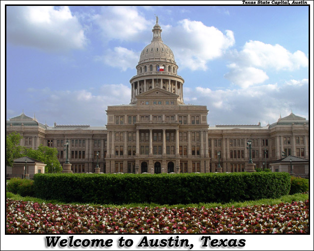
I like the general composition of this photo... It looks like a fine composition for a postcard... The symmetry works very well.
The puffy white clouds in the blue sky are always nice. The can really enhance a photo. The only area I see that could be improved in this particular photo is possibly the time of day you shot it... The front of the building seems to be a little on the dark side... I don't know if a differnt time of day would have lit it up more or not...
Good work :)
John Setzler
|
|
 Photographer found comment helpful. Photographer found comment helpful. |
Comments Made During the Challenge  |
|
|
05/11/2003 11:31:23 AM |
| A good postcard shot. One typo: since it's the building itself, it's spelled Capitol, even though Austin is the Capital of Texas. Ain't English wunnerful? |
|
| Photographer found comment helpful. |
|
|
05/09/2003 03:09:00 PM |
| As an actual postcard, I'm sure this one would sell really well. But I'd prefer something more dramatic or less traditional. |
|
| Photographer found comment helpful. |
|
|
05/09/2003 01:37:17 PM |
| Nice symmetry and clouds. The greenery in front really grounds the image well. INteresting light,too. |
|
| Photographer found comment helpful. |
|
|
05/09/2003 01:26:19 PM |
| Very, very good shot! Focus is wonderful. Color seems very true. I'd have liked the building a bit brighter, but that's a nit. 9 Rob the Swash |
|
| Photographer found comment helpful. |
|
|
05/08/2003 09:50:54 PM |
| Beautiful postcard, love it, no suggestions. |
|
| Photographer found comment helpful. |
|
|
05/07/2003 08:40:05 PM |
| Interesting layers here ... flowers building and sky. Good job. Looks like a wide angle lens. Good capture. Jacko. |
|
| Photographer found comment helpful. |
|
|
05/07/2003 10:40:36 AM |
| Good subject choice. Not sure about the flowers in the foreground though, and the text isn't quite central. |
|
| Photographer found comment helpful. |
|
|
05/06/2003 12:37:29 PM |
| Gee, could you have asked for a better sky? This picture is awesome, and I can't think of a single thing you could do to make this better. It's great! |
|
| Photographer found comment helpful. |
|
|
05/06/2003 10:03:42 AM |
| Is it just me or is the horizon slightly off? Anyway, nice details :-) |
|
| Photographer found comment helpful. |
|
|
05/06/2003 06:29:07 AM |
| Really nice pic, but too much text. |
|
| Photographer found comment helpful. |
|
|
05/06/2003 06:11:57 AM |
| When I looked at the thumbnail I thought those flowers in the foreground were crowds of people :-). This is a typical postcard shot, I like it. It would have looked amazing had you used a polarizer filter to bring out the sky and clouds more. |
|
| Photographer found comment helpful. |
|
|
05/05/2003 07:22:15 PM |
| nice building shot. text could be more precisely centered |
|
| Photographer found comment helpful. |
|
|
05/05/2003 06:47:04 PM |
| Great shot. I've noticed that cloud pics for postcards really make them more interesting. I like the bold text also. |
|
| Photographer found comment helpful. |
|
|
05/05/2003 02:47:17 PM |
| This one would also make a nice jigsaw puzzle. :) |
|
|
|
05/05/2003 10:37:58 AM |
| Pretty---little dark, but really nicely done. |
|
| Photographer found comment helpful. |
|
|
05/05/2003 08:59:53 AM |
| Nicely done . Well exposed sky, good use of the foreground flowers to add some interest |
|
| Photographer found comment helpful. |
|
|
05/05/2003 12:42:51 AM |
| Weondeful use of symetry. This picture looks great! Flag waving and all. The only thing I might change is the choice in text. something simpler might have looked better. none the less, overall this is a wonderful image. |
|
| Photographer found comment helpful. |
Home -
Challenges -
Community -
League -
Photos -
Cameras -
Lenses -
Learn -
Help -
Terms of Use -
Privacy -
Top ^
DPChallenge, and website content and design, Copyright © 2001-2026 Challenging Technologies, LLC.
All digital photo copyrights belong to the photographers and may not be used without permission.
Current Server Time: 02/01/2026 11:47:29 AM EST.