| Author | Thread |
|
|
05/17/2003 06:26:48 PM |
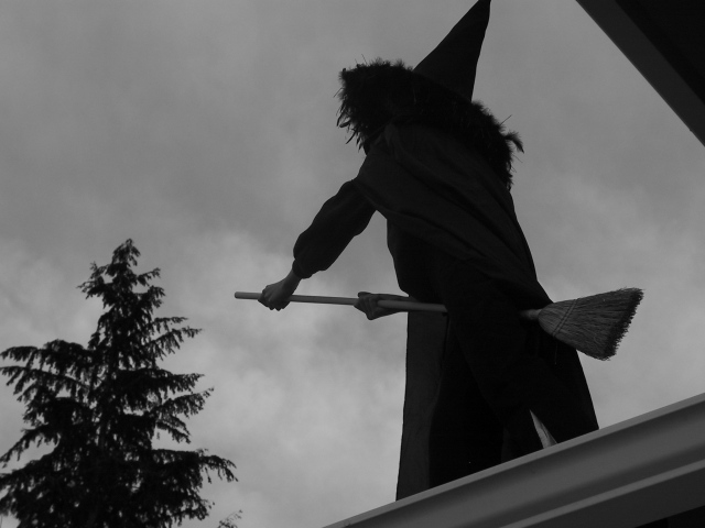
ok, this time I don't like it. Yes, the roof is gone, but there is simply not enough left of the photo. And you know, I actually wanted to show the fact that she is on a roof..... suggesting that its kind of scary to think it could be YOUR house...... so I would not want to get rid of the roof entirely anyway.
However, I did like the way you explained what you did and how you did it, thanks for that. That technique will come in handy in the future. Thanks for helping me learn. |
|
|
|
05/17/2003 04:07:18 PM |
It could be done within the DPC rules, but the vignette would be exactly centered instead of a little off like I have it, and would take a lot more experimenting to get right. Basic technique is to SelectAll, Border (with a big value like 60 pixels), Feather a large amount, and then fill with black. The color change is tone curves applied to the RGB and Blue channels.
Quick re-do: DPC-Legal  |
|
 Photographer found comment helpful. Photographer found comment helpful. |
|
|
05/17/2003 10:20:39 AM |
Thanks for your suggestions, guys. I do like what you have done to the photo, General, but I could not have done that for the contest, right? Against the rules, I'm sure.
Unfortunately I faced a few problems while taking the pic, most of them having to do with her possibly falling off the roof, or the tree not being in the photo (and I just HAD to have the tree there). On top of that, this one was pretty much the last photo I got to take, my daughter was sick of posing by that stage.
I had taken plenty of photos by then, and played around with some of them afterwards, but most of what I could have done was against the rules :-( However, I'm still pleased with the idea and I enjoyed the end-result even if it was not the best it could possibly be. Every exercise like this just adds to our experience and is therefore very worthwhile.
Thank you to everyone who took the time to think about it and to offer constructive criticism. As to the ones that "didn't get it" - what can I say? *grin* |
|
|
|
05/17/2003 08:14:17 AM |
I went ahead and tried the modifications I suggested. You can see if you like the results here  |
|
| Photographer found comment helpful. |
|
|
05/14/2003 02:05:23 PM |
I like the idea a lot. I agree moving her a bit to the left would let you exclude all of the roof. Since this is traditionally a night scene I think I'd have darkened everything up even more, while trying to retain a bit of detail in her robes. (I'll have to try this to see if it's even possible.)
I read somewhere that, despite the Hallowe'en cliche image, the broom was ridden with the bristles facing forward...but then you would have gotten a zillion comments about that!
With as much fun as it looks like you had, and people's comments, you might consider re-shooting this... |
|
| Photographer found comment helpful. |
|
|
05/14/2003 01:24:36 PM |
A Comment From The Critique Club
Hi Karin,
I'm sorry my CC review is a bit late, I requested your photo and then lots of stuff happened at work ... but I'm now getting to it. :) My first impression was how unique yet obviously recognizable your approach to the challenge was, I would've never thought of broomstick-riding :) Definitely meets the challenge.
COMPOSITION / CONTENT - Looking up at the witch and just seeing the profile works really well here, so does the cloudy sky. I don't like the corner of the roof in the top right but I guess that was probably unavoidable, I would also like to have seen the whole hat in the picture, since only the very top is cropped off it looks a bit accidental to me. The tree is great in the picture, gives me even more context.
CAMERA WORK / TECHNICAL - Conversion to black&white was definitely the right decision here, and not just because it removed emphasis from the overcast sky. I kind of always see the image of the witch flying on the broom over forests, right in front of the moon, so I always imagine them in silhouette anyhow. Focus is good, usually I'd say the pic is a little underexposed, but that's probably deliberate because it works here.
MY OPINION - A creative approach to the challenge, changing the angle of your photo (still up, but excluding more of the roof) would've probably improved your score, as well as increasing the brightness (even though I kind of like it that dark, it fits the mood). Glad your daughter didn't fall off and had fun helping you with the challenge :)
Please let me know if you have any questions or comments about this review.
Franziska. |
|
| Photographer found comment helpful. |
Comments Made During the Challenge  |
|
|
05/06/2003 07:38:22 PM |
| An unusual but creative form of transportation. Very original. |
|
| Photographer found comment helpful. |
|
|
05/06/2003 01:19:48 PM |
| Kind of a cute idea, but implemented in an almost half-hearted-seeming manner. If the figure were clearer (the top half especially), or else a complete silhouette, it might be better. |
|
| Photographer found comment helpful. |
|
|
05/06/2003 10:00:20 AM |
| is the transportation the broom. |
|
|
|
05/06/2003 04:35:41 AM |
| Now there's a stretch!!! - 1 |
|
|
|
05/05/2003 06:00:15 PM |
| good idea, but this just looks like a snap shot, the way it is composed. |
|
|
|
05/05/2003 09:53:07 AM |
| great idea, i love the contrast in the sky it sets the mood for the entire image, the image is also sharply focused, nice job 5 |
|
| Photographer found comment helpful. |
|
|
05/05/2003 06:48:22 AM |
| LOL original idea to meet the challenge. I like the black and grey: it gives an eerie feeling to the photo. The POV is appealing. |
|
| Photographer found comment helpful. |
|
|
05/04/2003 05:02:15 AM |
| Creative thinking! Good silhouette. |
|
| Photographer found comment helpful. |
|
|
05/02/2003 03:36:38 AM |
| This could have a much better shot with a better angle and cropping, none the less it is a deserving original in this contest. |
|
| Photographer found comment helpful. |
|
|
05/01/2003 08:51:44 PM |
| LMAO. Should have trying to not include the upper part of the house. |
|
| Photographer found comment helpful. |
|
|
05/01/2003 07:23:01 PM |
| Great approach to the challenge! Very creative. Seems a bit too dark, in my opinion; a little more detail might improve the shot, in my opinion. |
|
| Photographer found comment helpful. |
|
|
04/30/2003 06:28:16 PM |
| Good! I vote this a 10 just for originality alone. Also a good sillhouette, too. Dreary background which is perfect for Ms. Witch |
|
| Photographer found comment helpful. |
|
|
04/30/2003 03:09:16 PM |
| Watch out Dorothy! I like the tree balancing the figure, I don't like the dark triangle in the corner |
|
| Photographer found comment helpful. |
|
|
04/30/2003 06:11:25 AM |
| Is that the chimney attached to the witch? More contrast would have made your center of interest stand out better. |
|
| Photographer found comment helpful. |
|
|
04/30/2003 06:10:13 AM |
| Good idea. I wish it wasn't quite so dark, but then that may have been your purpose, eh? |
|
| Photographer found comment helpful. |
|
|
04/30/2003 05:00:52 AM |
| i'm stumped, but it's cool sillhouette |
|
| Photographer found comment helpful. |
|
|
04/29/2003 08:48:07 PM |
| clever idea, wish was a lil more in focus |
|
Home -
Challenges -
Community -
League -
Photos -
Cameras -
Lenses -
Learn -
Help -
Terms of Use -
Privacy -
Top ^
DPChallenge, and website content and design, Copyright © 2001-2025 Challenging Technologies, LLC.
All digital photo copyrights belong to the photographers and may not be used without permission.
Current Server Time: 04/08/2025 01:29:41 AM EDT.