| Image |
Comment |
| 09/15/2008 09:36:42 PM |
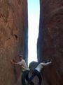
Dead Weightby bigfellaComment: I am not sure about the angle here, its making me want to tilt my head to look at this. Apart from that, light is good, I like it in black and white. |
 Photographer found comment helpful. Photographer found comment helpful. |
| 09/15/2008 09:35:21 PM |
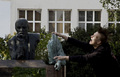
A meeting with Lenin.by random_Comment: Very different take on the challenge. None of the photo to me looks in focus. Both the Guy and the Statue should be sharp and to me they are not here. |
| 09/15/2008 09:34:14 PM |
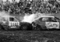
war of horsepower by saintaugustComment: Yeah, after you finish no-one is moving these. Like the shot, but not the crop. Would have preferred all both cars be in the photo, rather than cropping the boot out and the bonnet out of the different cars. I like the black and white (would also like to see what it looked like in colour). Would also have been better with a shallower depth of field, so that the crowd faded more into the background. |
| Photographer found comment helpful. |
| 09/15/2008 09:32:00 PM |
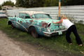
Not giving upby badsilverfox66Comment: Works well for hte immovable challenge.
Backgroung car/Caravan and pole are istracting. Maybe a slightly different angle to at least remove the other car out of the photo would have helped. Taken a little more side on. Can't do much about the pole (unless you move the immovable car of course).
Light is good, playing with the depth of field, keeping the women and car in focus and the caravan/trees/fence more blurred could also have worked remove the clutter...... |
| Photographer found comment helpful. |
| 09/15/2008 09:28:35 PM |
Closing in....by jumboshrimpComment: Like the idea here. Would have been better if it looked like both were actually trying to push the rock, instead of leaning onto it.
Space would have been quite dark, and hence the bright overexposed background. Did you use flash on this. It may have helped light the people, especially the women on the right who is very dark, and then maybe the back wouldn't be so overdone and distracting.
I would have liked you to include the feet, rather than cropping the photo off at ankle height. |
| 09/15/2008 05:31:52 PM |
Come on.......ahhhh.......the last train to Brussels!by naomikComment: I hate brussels sprouts so i will give you the immovable here. The Sprout is very sharp. I am not sure about the hand being out of focus. I would have probably tyied to have the sprout, fork and hand all in focus for this. Also not sure about the border on this. |
| Photographer found comment helpful. |
| 09/15/2008 05:31:49 PM |
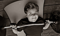
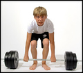
umpfhhhhhhhby NobodyComment: The tilt of this photo is distracting. It would have been better if the weights were straight, such that the bar is straigh across the photo. Would have also preferred a better stance. The knees are uneven, and his feet too close. It doesn't look like he is really trying to lift this.
I probably would have overemphaised it, and had larger weights (if possible) on the bar as well. |
| Photographer found comment helpful. |
| 09/15/2008 05:27:30 PM |
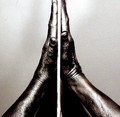
just say a little prayerby cutoutComment: It is a shame that the top of the fingers has been cropped off. The noise through the background unfortuntely annoys me here as well. I like the idea both with the shot and the post processing though... |
| Photographer found comment helpful. |
| 09/15/2008 05:25:42 PM |
No!by behindmyblueeyesComment: Different which is often good. Close enough to meeting the challenge for me. Unfortunately the light on her face is a little too much, which means some of her expression has been lost. Apart from that, well composed and well shot. |
| 09/15/2008 05:21:13 PM |
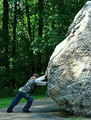
Put some muscle into it, would ya?by libertyComment: Composition is good. I would have reduced the depth of field so that the dense bush behind was more out of facus, thus forming a very interesting backdrop and being less recognisable. The light on the rock is a problem as the boy is in shaddow. SOme extra light on him by some means would have then emphasised him more than the rock. The bright patches ont he rock currently draw attention. |
| Photographer found comment helpful. |
Home -
Challenges -
Community -
League -
Photos -
Cameras -
Lenses -
Learn -
Help -
Terms of Use -
Privacy -
Top ^
DPChallenge, and website content and design, Copyright © 2001-2025 Challenging Technologies, LLC.
All digital photo copyrights belong to the photographers and may not be used without permission.
Current Server Time: 04/12/2025 10:02:58 AM EDT.