| Image |
Comment |
| 06/11/2003 08:07:36 PM |
Action Asia: Lakeside viewsby starblazerComment: GORGEOUS. I like the way the sky/land/water balance, the softer look of the sky with the brass and shadow of water and land. And the birds - with both bird and shadow visible as a shadow on the near two - are wonderful. |
 Photographer found comment helpful. Photographer found comment helpful. |
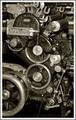
| 06/11/2003 08:04:52 PM |
Popular Mechanics - History of Printing and Graphic Artsby DJLubaComment: Now that is a lovely photo. Good choice to do in a more monochromatic look, and I like the way the eyes can follow the gears, flowing down the picture. It's busy, but because it's all busy with the subject, it holds together and works nicely. |
| Photographer found comment helpful. |
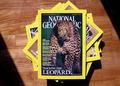
| 06/11/2003 08:03:24 PM |
National Geographicby ashwinComment: Does National Geographic show their own magazines on their cover? The use of sunlight and shadow on the floor frames the photo really nicely, though - attractive. |
| 06/11/2003 08:02:30 PM |
Hi-FiChoiceby The KidComment: The angle's a bit awkward and the right side of the picture is "blank" enough to feel empty/wanting, unbalancing the photo. Lovely detail on this one, though. |
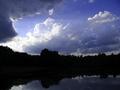
| 06/11/2003 07:22:14 PM |
"Outdoor Photographer"by lykofosComment: The trees/lake are a bit dark and hard to make out - I wish more of them could be seen - but the sky is nicely dramatic. (The shadowing of the trees would work better if there were some sunset/sunrise colors, I think, as it's more expected then. As it is, it looks like a bright day and yet the details are all hidden.) |
| Photographer found comment helpful. |
| 06/11/2003 07:16:04 PM |
New Scientistby PaulkComment: The light on this is awfully bright/glare-y - I assume that's deliberate, but it doesn't seem to fit in, and I'm not sure what it's supposed to tell me. With the high angle on (beaker?), it also is too tall an image, with the bottom part sort of dragging on and leaving it feeling imbalanced. Cropping it at the bottom edge of the glare (taking a distance off the bottom about equial to the distance between the right edge of the photo and the right edge of the beaker) seems to balance it out a bit more. |
| Photographer found comment helpful. |
| 06/11/2003 07:03:21 PM |
China Popularaby TiberiusComment: Nice shot - nice control of the lighting, to get that level of exposure and only as much glare as you did aroudn the lights. This is a very striking, and lovely, picture. |
| Photographer found comment helpful. |
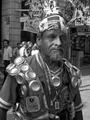
| 06/11/2003 07:02:11 PM |
www.cuartoscuro.comby diegohsComment: Fascinating subject - the background is somewhat distracting, though, especially the tree; a shallower focus might have drawn the eye more completely to the man in the foreground. |
| Photographer found comment helpful. |
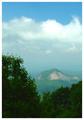
| 06/11/2003 06:37:50 PM |
Our State -- North Carolinaby karmatComment: Nice, nice use of the vivid foreground trees to "frame" the mistier background. Nice division of the frame between the foreground, the misty area, the clouds, and the clear sky. This is the sort of picture that just makes you want to step into it. |
| Photographer found comment helpful. |
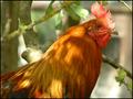
| 06/11/2003 06:36:38 PM |
Birder`s world magazineby marboComment: I find it hard to imagine a chicken on a magazine about birding, but it's a gorgeous shot - the framing, the background, the lighting are all just perfect. (If the rooster we had when I was a kid was looking like that, however, he'd have been pecking the camera and photographer very shortly after.... :) |
| Photographer found comment helpful. |
Home -
Challenges -
Community -
League -
Photos -
Cameras -
Lenses -
Learn -
Help -
Terms of Use -
Privacy -
Top ^
DPChallenge, and website content and design, Copyright © 2001-2025 Challenging Technologies, LLC.
All digital photo copyrights belong to the photographers and may not be used without permission.
Current Server Time: 04/13/2025 10:23:58 AM EDT.