| Image |
Comment |
| 06/13/2003 01:21:24 PM |
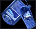
The Virtual Officeby ToddhComment: I don't know if your relative devices are really that shade of blue (in which case, that's neat, and where do I get the faceplates? :)) or if you tinted it (looks more likely overall) but either way it makes them very cool to look at. I like the idea in general. I'm kinda curious how it would look against a background that suggested something out of the office, but in this challenge it probably would have gotten your head handed to you. So, a neutral background is fine. |
 Photographer found comment helpful. Photographer found comment helpful. |
| 06/13/2003 01:15:26 PM |
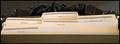
A Well-Organized Circular Fileby alanfreedComment: This is funny. I think larger type on the labels would have made it more a photo I'd actually envision wanting to hang on my cubicle or something (in the dual sense of 'office art') but this one requires too close-up to make a good poster style thing. |
| Photographer found comment helpful. |
| 06/12/2003 04:14:38 PM |
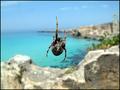
House Beautifulby giampoComment: House Beautiful = interior design magazine. This = at best a poor pun.
If you were going to do a pun like this, you should have found a more attractive spider web. The background looks attractive but as the focal point is on the spider and web and the background is blurred that doesn't much help.
Better still, if you wanted to enter this shot into this particular challenge, you should have found a magazine that might have accomodated it. I would have thought more highly of it. I don't care for spiders and if I look at a web I'd like it to be pretty and iridescent but I would at least have felt it was truly on topic. |
| Photographer found comment helpful. |
| 06/12/2003 04:11:52 PM |
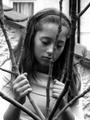
The Faceby kate_rioComment: Although there is a magazine called this, I had understood it to be a music or performance magazine, so I don't see how this ties in. The other possiblity is you titled it as the photo title and not the magazine title.
This image seems very small compared to the allowable size, which suggests a significant crop. While it's an interesting shot, even somewhat photojournalistic-seeming, it's hard to judge it outside of context. |
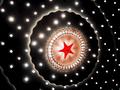
| 06/12/2003 04:09:26 PM |
Star Light Expressby donpramComment: I cannot find any indication on if your magazine really exists.
It's hard to judge from the title if this would be an apt magazine cover; the title appears to describe the image.
The image, while visually interesting, is without context for me given the challenge. |
| Photographer found comment helpful. |
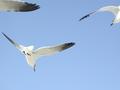
| 06/12/2003 04:04:09 PM |
Nashville Skylineby daemoniComment: I have a hard time believing your magazine exists.
That having been said, I would expect a magazine with that title to focus on buildings or at least contain them somewhere.
Even without that, the wing at the top left is just distracting. The bird at the top right still looks good even though it is cut off and the one at the bottom left is captured well, but that other wing, not so much.
A compositor might crop that out but it would leave no whole birds if done in portrait style. |
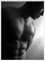
| 06/12/2003 04:01:31 PM |
Male Fitnessby imagesloyolaComment: I'm going to pretend you meant "Men's Fitness" or something like it.
Although this does show off some amount of the fitness, I am dubious sucha magazine would use a black and white photo or leave the abs in such shade. Usually they're all about in your face pictures that qualify as goals to attainment. The angle/placement isn't the issue, note, except as in regards how hard it is to make out the details on the left side. |
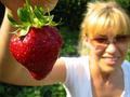
| 06/12/2003 03:59:33 PM |
Strawberry smileby MikuComment: I'm dubious of the existence of your magazine, which google does not seem to believe exists as a magazine.
I cannot imagine this picture on the cover of a magazine. The strawberry by itself in its epic proportion, maybe. A person holding up the strawberry if she were in focus, maybe. The combination does not work.
|
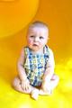
| 06/11/2003 05:08:07 PM |
Parents Magazineby chelseayankieComment: I don't really have any problem picturing a Parents Magazine cover featuring a baby, but generally don't they go with less cranky-looking ones? Why is this image so much smaller than max dimensions; was it a huge crop?
The lighting on this is probably too focussed on the bottom/right.
Aside from the weirdly small crop, the dimensions seem about right for the magazine. They generally go with a neutral background anyhow so it probably wouldn't have mattered much. |
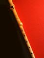
| 06/11/2003 05:06:01 PM |
The Recorderby KoriyamaComment: Problem: never heard of your magazine, was dubious and checked, google hasn't either. There are probably existing magazines this photo could be for in general, wish you'd picked one.
The lighting on this is not at all to my liking, with so much bright on one side and so dark on the other. It might, however, work out fairly well for a copy compositor depending on how much cover copy there was. |
| Photographer found comment helpful. |
Home -
Challenges -
Community -
League -
Photos -
Cameras -
Lenses -
Learn -
Help -
Terms of Use -
Privacy -
Top ^
DPChallenge, and website content and design, Copyright © 2001-2025 Challenging Technologies, LLC.
All digital photo copyrights belong to the photographers and may not be used without permission.
Current Server Time: 04/11/2025 04:41:35 PM EDT.