| Image |
Comment |
| 12/01/2003 08:47:18 AM |
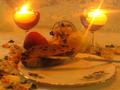
Scents from the Kitchenby utopian mangComment: Most of the stuff that has scents seems so far away! The bread(?) being on the far side of the plate makes this seem somewhat unbalanced; if the plate were plain, I might just see it as negative space, but since there's decor on it, it just feels off. I do really like the neat flare off the candles, it really draws attention there, and candles definitely have a scent of their own. |
| 12/01/2003 08:45:33 AM |
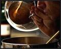
Feeding The Sensesby ToddhComment: I really don't care for the grainy look of this. It also took me a few moments to get the point, probably because there's so much emphasis on the pot lid, even though the reflection is a really interesting way to show the contents. Ultimately I think that means the image may be a little busy. Maybe if the pot was only shown in the reflection, and not directly at all? |
 Photographer found comment helpful. Photographer found comment helpful. |
| 12/01/2003 08:43:54 AM |
mexican restaurantby MiahComment: Unless your waiter had a BO problem, this isn't really the best of choices for the topic. |
| Photographer found comment helpful. |
| 08/12/2003 09:24:06 PM |
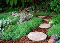
The Path Before You IIby kyrielleComment: I'm looking at both right now, and this one is definitely an improvement. It doesn't look washed out (which the other did), and I do like that the lighting is not as even. I think I would have liked it better if the lit parts had been in the foreground and faded to shade in the background; this way looks slightly odd to me. But that would have probably been more problematic in terms of getting lighting.
This one also looks crisper, by the way. I don't know how much of that is lighting, but it looks overall like you got a crisper shot. Since your shutter speed is quicker on this one, I suspect you may have had a little inadvertant motion on the other.
The only way the other one wins out is it's a slightly better angle for the terms of the challenge. |
| Photographer found comment helpful. |
| 08/04/2003 08:46:08 AM |
Follow the pathby kevinswopeComment: Very nice. A lovely illustration of the topic, and a pretty picture to boot. It may be just a tad on the bright side -- the leaves seem lighter/a little faded than I'd expect. |
| 08/04/2003 08:44:47 AM |
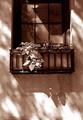
A breath of fresh air in the city...by FayechComment: I love this. The angle of light and the play of shadows across the wall, the reflection in the window, and the use of sepia tone are all wonderful details. I often don't care for duotone pictures, but in this case it seems completely natural. |
| Photographer found comment helpful. |
| 08/04/2003 08:40:35 AM |
|
| 08/04/2003 08:39:03 AM |
|
| 08/04/2003 08:38:08 AM |
|
| Photographer found comment helpful. |
| 08/04/2003 08:36:07 AM |
Presidents Gardenby jeeptuningComment: Mmm, not sure "front yard" and "garden" are automatically equivalent. I have a niche in my head for 'gardening' and a separate one for 'landscaping' and this seems more the latter. That aside, the house seems to take up enough of the picture that it feels more about the house than the rest to me. |
Home -
Challenges -
Community -
League -
Photos -
Cameras -
Lenses -
Learn -
Help -
Terms of Use -
Privacy -
Top ^
DPChallenge, and website content and design, Copyright © 2001-2025 Challenging Technologies, LLC.
All digital photo copyrights belong to the photographers and may not be used without permission.
Current Server Time: 04/11/2025 04:38:17 PM EDT.