| Image |
Comment |
| 12/11/2007 04:00:38 AM |
|
 Photographer found comment helpful. Photographer found comment helpful. |
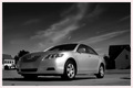
| 12/11/2007 03:57:43 AM |
Camryby zeus0826Comment: Lovely tones, good viewpoint - nice and low adds interest and gives the car more "authority" and makes for a more dramatic advert. Good sky, shame you have a relatively complicated background, would have been better if the buildings weren't there. Composition wise, you might consider placing the car more to the right to give it room to "move into" on the left hand side given it is pointing to the left. You have less space on the left currently than on the right and so it is almost "moving" out of the frame. Good job on remembering to get rid of the number plate. |
| Photographer found comment helpful. |
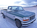
| 12/11/2007 03:54:09 AM |
f150 best offerby whiterookComment: Taken from eye level. Most car photography articles on the internet say to try and avoid this and instead go for pretty much any other viewpoint to add interest as we all look at cars everyday from eye level - a suggested camera position to try would be just above wheel height. Well composed though, nice wide angle (another must on every site I have looked at). The horizon isn't straight though, perhaps consider squaring it up or more purposely crop on an angle for dramatic effect |
| Photographer found comment helpful. |
| 12/11/2007 03:50:24 AM |
2007 Monte Carlo, one owner, new engineby sfmorrisComment: Large DOF which completely gives away the fact that this is a model. The focus should be on the front of the car, the headlights are the eyes of the car and so portrait photography rules should apply here. The focal point is mid way on the bonnet and so doesn't look quite right. |
| Photographer found comment helpful. |
| 12/11/2007 03:48:19 AM |
Marque of Quality or Overcompensation?by jonfrommkComment: Well composed. Shame you can't clean it up a bit in post processing, I'm sure that if this was a real advert to go in a magazine then it would have been done in CGI. More of a branding thing than a car advert but still meets the challenge in my opinion. |
| Photographer found comment helpful. |
| 12/10/2007 10:43:41 PM |
First Come, First Servedby 1m1AComment: I dont regard this as a serious entry although for a capture of a screen, your DOF and composition are outstanding. |
| Photographer found comment helpful. |
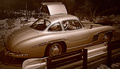
| 12/10/2007 04:02:53 AM |
In fifty years your today’s Mercedes will still look this brilliantby HighNoonerComment: The duotone hue fits the era well. Just a shame the image wasn't taken from the other side as the barrier in the foreground obscures the car and the gull wing door is open on the otherside and so some of the interior would have been visible. The barrier would have made quite a nice background with its race circuit paint job and would have complemented the cars racing heritage. |
| Photographer found comment helpful. |
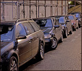
| 12/10/2007 03:58:27 AM |
Anonymousgetawayvehicles.com - Cash onlyby raishComment: You see to have a bit of camera shake or motion blur here which unfortunately is the first thing hit me, secondly was the colour scheme - all the cars look the same colour and seem to blend in with all surfaces of the location. I would normally expected to see a single clean car in an advert, rather than many cropped/obscured ones. |
| Photographer found comment helpful. |
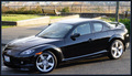
| 12/10/2007 03:53:40 AM |
RX-8 - Zoom Zoom Off The Beaten Path!by smardazComment: Not sure about the border nor the the angle. When reading up on car photography before doing the challenge myself, the recommendation was to avoid shooting from eye level and aim to go for about wheel height with a wide angle lens. This seems higher than eye level and I'm not sure it works all that well. The cropping is very tight and you have quite a distracting background. Quite a lot of glare from the roof too. |
| Photographer found comment helpful. |
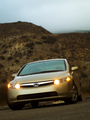
| 12/10/2007 03:50:13 AM |
Honda - The Power of Dreamsby briantammyComment: Missing number plate really makes this look like something out of a magazine and makes all the difference. Lovely glow around the lights, the composition works well with the viewpoint angle although you have quite a bit of wasted space towards the top. Might have been better to do landscape with just the car filling the frame but still keeping the angle. Nice DOF and good focus on the lights of the car, the lights are essentially the eyes and so portrait photography rules apply. |
| Photographer found comment helpful. |
Home -
Challenges -
Community -
League -
Photos -
Cameras -
Lenses -
Learn -
Help -
Terms of Use -
Privacy -
Top ^
DPChallenge, and website content and design, Copyright © 2001-2025 Challenging Technologies, LLC.
All digital photo copyrights belong to the photographers and may not be used without permission.
Current Server Time: 04/15/2025 10:52:05 PM EDT.