| Image |
Comment |
| 06/04/2003 12:19:31 AM |
|
 Photographer found comment helpful. Photographer found comment helpful. |
| 05/26/2003 01:36:38 AM |
|
| 05/26/2003 01:33:50 AM |
|
| Photographer found comment helpful. |
| 05/26/2003 01:32:30 AM |
Stolen Kiss by dsidwellComment: Hehe, collecting ribbons, are you?
Nice shooting, David. Great eye for composition.
Congrats, Marco. |
| Photographer found comment helpful. |
| 05/24/2003 05:20:09 AM |
Natures Purple, Man's Yellowby K-RobComment: Honestly, I don't think you took this image while thinking of a way to shoot complementary colors ;o) But it sure turns out like one, although I really think that more colorful images would score better.
You did however manage to capture a great lightning here. Composition works well, with the massive clouds above and the tiny objects below. The area of improvement lies in these objects, though. There not completely clear and in focus. The ground-scene also looks tilted because of the non-vertical poles. Imho, the image would have had much more impact without the ground-elements. But then you loose one of your two colors offcourse :o)) Regards and good luck, Marco. |
| Photographer found comment helpful. |
| 05/24/2003 04:58:43 AM |
The Birth of Envyby harveymorrisComment: I like this very much. The colors are very clear and the structure of the ball-shape ads more interest and depth to the picture. This image is an example of how simplicity works for an image, and of how much there reálly is to see in an image that looks simple at first site. I hope it scores well. Regards, Marco. |
| Photographer found comment helpful. |
| 05/23/2003 02:21:11 AM |
Floating Flameby TerryGeeComment: Nice! The colors are very clear and vibrant, great detail, and nice capture of the flame. Composition also deserves a praise... Welldone!
Regards, Marco |
| Photographer found comment helpful. |
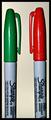
| 05/23/2003 02:17:04 AM |
Face Offby magnetic9999Comment: When I saw the title, I thought: 'Great! He or she switched the caps of the markers to make an allusion on the movie' ... and then I looked at the picture and I was a bit disappointed that I didn't find any reference of that idea. But.. it's a photography contest, and not a 'creative titling' contest, so I won't hold it against you, when scoring.
Technically speaking, I've got two remarks:
- the pens are not placed completely symmetrical. (Otherwise, if this was your intention, the difference between the two is not prominent enough.) It gives a kind of 'sloppy' impression.
- the background color doesn't match with the colors of the pens.
You've got good detail and sharpness, and the challenge is met very well (although not very creatively imho)
I hope that I not offended you with these comments. I honestly think you could do better than this. Regards, Marco. |
| Photographer found comment helpful. |
| 05/23/2003 01:56:42 AM |
Spring Feverby severinComment: Ooooooooooooooooh !! This is a beautiful shot. Very subtile and with style. Challenge met (although it could have been a tad more 'red'). Nice composition and good job on exposure. Welldone!
Regards, Marco |
| Photographer found comment helpful. |
| 05/23/2003 01:50:31 AM |
Evening Colorsby rll07Comment: Okay, you definitely WOW-ed me here... Nice observation. You did well on the composition and exposure. Challenge met. I\'m not completely sure about the tree and the blue border, though...
Regards, Marco. |
Home -
Challenges -
Community -
League -
Photos -
Cameras -
Lenses -
Learn -
Help -
Terms of Use -
Privacy -
Top ^
DPChallenge, and website content and design, Copyright © 2001-2025 Challenging Technologies, LLC.
All digital photo copyrights belong to the photographers and may not be used without permission.
Current Server Time: 04/13/2025 04:29:56 AM EDT.