| Image |
Comment |
| 05/10/2007 03:41:34 PM |
Seusserificby idnicComment: Nice idea and fab composition. However IMO it is very bright and harsh on the eyes with a lot of glare |
 Photographer found comment helpful. Photographer found comment helpful. |
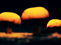
| 05/10/2007 11:51:05 AM |
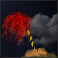
Theodor Geisel's "Design For Death"by GeneralEComment: Very dark visually and title. The over enhancement has given a lot of speckle and although it is easy to see the mushrooms the overall look is not pleasing to MY eye. Sorry |
| Photographer found comment helpful. |
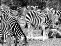
| 05/10/2007 11:39:36 AM |
ZEBRASby leigh-micheleComment: I am not quite sure what you have done to accomplish this look but it is quite extraordinary. You may have added rain or perhaps a motion blur layer. The crop is also unusual. I think that if this is what you intended and you are happy with it then that is great. For me it all seems to be a bit confusing and cluttered. I find the contrast a little insensitive too. I would be very interested to know your inspiration for the shot. |
| 05/10/2007 02:08:59 AM |
I sat there with Sally. We sat there, we two.by jasonlpriceComment: I think that the addition of the white curtain makes this shot very stark and the other colours look subdued. Side lighting and an adjustment on the contrast would have brought out the folds in the material and contrast would bring out the colour |
| Photographer found comment helpful. |
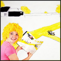
| 05/10/2007 01:56:08 AM |
"I do so like green eggs and ham! Thank you! Thank you, Sam-I-am!"by hotpastaComment: A lot of effort in this composition and in general it is very good but IMO the white kind of predominates and makes the shot stark. I think this would have been improved with the addition of a pastel colour in the background and a bit less use of the smudge/blur tool. The composition is top notch = 6 |
| Photographer found comment helpful. |
| 05/10/2007 01:47:06 AM |
|
| Photographer found comment helpful. |
| 05/10/2007 01:46:07 AM |
|
| Photographer found comment helpful. |
| 05/10/2007 01:46:00 AM |
|
| Photographer found comment helpful. |
| 05/10/2007 01:41:08 AM |
|
| Photographer found comment helpful. |
| 05/10/2007 01:37:20 AM |
|
| Photographer found comment helpful. |
Home -
Challenges -
Community -
League -
Photos -
Cameras -
Lenses -
Learn -
Help -
Terms of Use -
Privacy -
Top ^
DPChallenge, and website content and design, Copyright © 2001-2025 Challenging Technologies, LLC.
All digital photo copyrights belong to the photographers and may not be used without permission.
Current Server Time: 04/07/2025 06:18:53 AM EDT.