| Image |
Comment |
| 07/02/2006 08:50:49 PM |
|
 Photographer found comment helpful. Photographer found comment helpful. |
| 07/02/2006 08:50:35 PM |
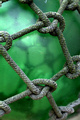
Glass in a ropeby photom1946Comment: As a photo of rope, this works well. Good detail and nicely framed.
But the "glass" element is a bit lacking, unfortunately. If it had been a cleaner, more transparent sphere you might have been able to get some interesting reflections and refractions going. |
| 07/02/2006 08:46:34 PM |
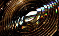
The Rings of Saturnby THEOLDGEEZERComment: This is a nice idea for a shot. The reflections and refractions running diagonally across the lenses are quite absorbing.
It's a shame about the flecks of light everywhere. I assume that this is the internal lighting, but it creates the impresison of a damaged or dirty subject. Would it have been practical to turn off these lights? |
| Photographer found comment helpful. |
| 07/02/2006 07:59:57 PM |
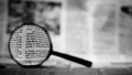
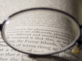
Can't Read Without It...by cardmaverickComment: A great idea. Unfortunately, the background is so out of focus that I don't get a real sense of there being a newspaper there for the magnifying glass to focus on. Maybe it needs just a little more depth of field. This would bring out more detail of the glass itself, as well, which would add to the shot. |
| Photographer found comment helpful. |
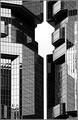
| 07/02/2006 07:55:49 PM |
City Of Glassby TiberiusComment: This is a great shot. Complex without being busy. All the angles, reflections, etc, work well together.
It does kinda bug me that it's not quite vertical. I think it would've worked well as a properly vertical shot, or as an abviously angled one. But this "almost but not quite" thing just makes it look like a framing error.
I think making it monochrome was the right choice; too many colours would have pushed it over into being "busy". But it might also work well as a duotone or tritone. |
| Photographer found comment helpful. |
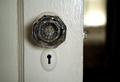
| 07/02/2006 07:50:25 PM |
Glass Door Knobby JMSComment: This is nicely composed, with the main visual elements positioned well. A good level of detail, too. But I do find the burned out white spot in the background a bit distracting.
I'll take your word for it that the door knob is glass. But there's not a lot of "glassy" things happening, in terms of interesting reflection, refraction, etc. |
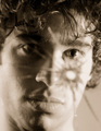
| 07/02/2006 07:47:15 PM |
Encounterby MichaelCComment: A great idea. Nicely composed too, although the subject looks just a little cross-eyed. Probably because he's looking at the crack in the mirror rather than at (or, even better, behind) the camera's reflection.
Effective lighting on the face, too.
Did you think about asking your subject to hold off shaving for the shot? It might've enhanced the broody effect. And men usually see a bit of stubble when they look at themselves in the mirror in the morning... |
| Photographer found comment helpful. |
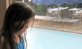
| 07/02/2006 07:40:55 PM |
Rain, rain, go away ...by levyj413Comment: This captures the mood of the subject well.
It's a shame there isn't more light on the girl's face, creating a bit more contrast. But then, it is a rainy day, I suppose... |
| Photographer found comment helpful. |
| 07/02/2006 07:36:24 PM |
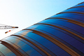
//Glass/||\Gradient\\by tmhallingComment: This is a stunner.
I love the idea of making the crane the horizontal element - inspired. And the range of blues in the windows and the sky is great. |
| Photographer found comment helpful. |
| 07/02/2006 07:33:23 PM |
Reading through her eyes...by chimericvisionsComment: A great idea, well executed. And with a title that enhances your perception of the photo, too.
I love the way the text recedes away from the focal point, a la "Star Wars".
Well done. |
| Photographer found comment helpful. |
Home -
Challenges -
Community -
League -
Photos -
Cameras -
Lenses -
Learn -
Help -
Terms of Use -
Privacy -
Top ^
DPChallenge, and website content and design, Copyright © 2001-2025 Challenging Technologies, LLC.
All digital photo copyrights belong to the photographers and may not be used without permission.
Current Server Time: 04/16/2025 01:28:18 PM EDT.