| Image |
Comment |
| 05/07/2004 12:12:50 AM |
|
 Photographer found comment helpful. Photographer found comment helpful. |
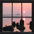
| 04/16/2004 05:41:08 PM |
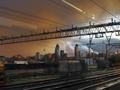
Sunset Stormby ImagineerComment: This one made me stare for quit a bit. This looks like it should come with a soundtrack. |
| Photographer found comment helpful. |
| 04/16/2004 05:39:49 PM |
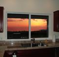
Evening View from Kitchenby scottwilsonComment: I bet you love living here. I think two things would make this photo stronger.
1 - Move that grill
2- Tighter crop to isolate the window frame and the view.
I don't think you needed the kitchen actually in the photo.
Great caputure on the sunset, and exposure control. I have to admit though, with the kitchen in the photo....it's very interesting. I've never seen a true granite tile installation on the east coast. Dig the cherry & stainless. |
| Photographer found comment helpful. |
| 04/16/2004 05:33:29 PM |
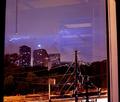
4th floorby jab119Comment: I think this is a great capture, but I've got a small issue w/the bottom of the photo. All the telephone wires are incredibly distracting. Maybe a tighter crop? |
| 04/16/2004 05:31:43 PM |
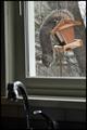
Hangin Outby hopperComment: This would have worked a bit better w/o the sink faucet I think. Great candid of the squirrel! |
| Photographer found comment helpful. |
| 04/16/2004 05:30:44 PM |
Sunday Sunrise by UNCLEBROComment: I don't see a focal point in the photo.
I also think the top 1/2 works better than the bottom. |
| Photographer found comment helpful. |
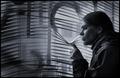
| 04/16/2004 05:28:21 PM |
a Room with a viewby NazgulComment: Very cool. I'm not sure why I like it, but I do. It's interesting....because I'm wondering what she's looking at. Nice job |
| Photographer found comment helpful. |
| 04/15/2004 06:24:37 PM |
Spring Strollby BobsterLobsterComment: Good things = Window Frame - Subject - B & W
Bad things = Tilt ...too far left and to the bottom..... Defocus on right side of path.
Why is that path so blurry? |
| Photographer found comment helpful. |
| 04/15/2004 06:21:25 PM |
Lost Highwayby orussellComment: Your view kinda sucks. Nothing personal, but the framing around the window and the lighting is very strong. The actual view kinda sucks. |
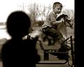
| 04/15/2004 07:25:04 AM |
I want to ride too...by cbellerComment: This is really well done. B & W use is perfect for this spot. Great use of Foreground and key subject. High marks |
| Photographer found comment helpful. |
Home -
Challenges -
Community -
League -
Photos -
Cameras -
Lenses -
Learn -
Help -
Terms of Use -
Privacy -
Top ^
DPChallenge, and website content and design, Copyright © 2001-2025 Challenging Technologies, LLC.
All digital photo copyrights belong to the photographers and may not be used without permission.
Current Server Time: 04/07/2025 05:53:20 AM EDT.