|
|
| Image |
Comment |
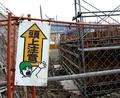
| 01/20/2003 03:55:07 PM | OMG!! Caution: Above!!!by AntithesisComment: Just too too funny. Great idea for a sign. The focus is good and crisp and the background doesn't detract but adds to the feel of the sign. The only problem I am having is the angle of the shot. The sign is on an angle leaning the right, the scaffolding is leaning left, and camera doesn't follow either. I wonder ehat it might have looked like with the sign perpendicular which would have the scaffolding kinda leaning and ready to fall on the sign. Just a thought. 8. |  Photographer found comment helpful. Photographer found comment helpful. |
| 01/20/2003 03:47:39 PM | Directions To My Houseby bamasterComment: Funny, I really liked the angle of the sign in this shot. I am also glad you included the whole sign too. At first I was thinking there was just too much open space, put after using envelopes to imitate cropping, I like the open space. If it was cropped then the sign would be dead center and that just doesn't work too well. The color contast between the bright blue and yellow are great also. Good crisp focus. I guess the only draw back in my mind that it is kinda boring, but then street signs as a subject is fairly boring also.8. |
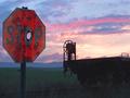
| 01/20/2003 10:21:42 AM | Drew's Stop Sign Revisited by autoolComment: This is just too funny for words! Though quoting Drew's sign revisited I may have gone more with a close up of the sign. Drew's was a very close shot. The scenery and railroad car? are beautiful, but detract away from the sign. Also, I woul dhave left a bit more space left of the sign, it is cropped just a tad too close for my liking. Overall, I just loved this shot.8. | | Photographer found comment helpful. |
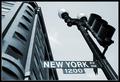
| 01/20/2003 10:11:49 AM | Start Spreadin' the News by magnetic9999Comment: This is a very cool perspective. I am tending to like the shots where the sign is the main subject, but here all the scenery really adds to make the effect. I love the upward angle, flow towards the top of the photo following the lines int he lamp post and the curve of the building. I really can't find much wrong with this shot, there is a shadow on the left side of the building, but hat isn't distracting at all. Mabey the street sign could be up just a tad, it is very low, but I would be afraid it would ruin the perspective. Great Job.9. | | Photographer found comment helpful. |
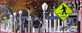
| 01/20/2003 09:56:58 AM | walk walk 40 walk no stopping no stopping no stopping no stopping walk no stoppingby spidermanComment: I really love the depth of the picture, all those street signs in such a small area, it's unreal. I love how my attention goes from one side of the shot focusing on the first school sign and is dragged across the whole shot all the way to the left. It looks to be a bit hazy and some of the signs further away are hard to read, but you know what they are. I am very impressed with this shot.9. | | Photographer found comment helpful. |
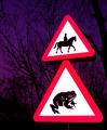
| 01/20/2003 09:23:16 AM | Beware of the Giant Toadby KonadorComment: I really like this shot a lot, the time of night you took it worked well with the background coloring and really brought your sign out. The focus is excellent on the sign and the background trees do not detract any attention from the main subject. I also like your placement of the sign it is very pleasing to the eyes. Hmmm something constructive.hmmm let me think, I guess the only thing is I would like to see the sign post a little better, all that you can see is a tiny white line. I don;t know if it is from color editing or just not enough flash, but the signs kinda seem to float on air.9. | | Photographer found comment helpful. |
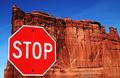
| 01/20/2003 06:54:46 AM | Red Rock, Red Stopby YomiComment: Great idea and flawless execution. I know your subject was red, but I do wonder what a black and white would have done here to help in contrast. The sign "pops" but not huge due to the same hue. At first I didn't like the inclusion of the sky on the left hand side, but now, I think that is what makes the picture work. I like the placement of the sign it is pleasing to the eye, your focus was just excellent everything is just sooo crisp. THere is a small bush in the lower right hand side, but due to the colors it really does not stand out. In fact I didn't notice it till about the tenth time staring at the shot. Great job.10. | | Photographer found comment helpful. |
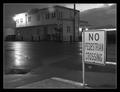
| 01/20/2003 06:48:46 AM | No Pedestrian Crossingby bdshortComment: There is just something visually pleasing about this shot. I like the placement of the No Ped sign and the fact you can see the pedestrian crossing sign across the intersection. The black and White in the photo really makes the main No ped sign stand out. This just proves you can take an everyday sign and make it art. Great Job! 10 The only thing that troubles me about this shot is the bright light on tyhe building, The no ped sign is so bright compared to the dark background, but the light is even brighter, and draws my attention. The dilema though is if you cropped it out, then you would not have a full building, I like the choice you made, but the light is still a bit distracting. |
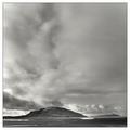
| 01/19/2003 07:59:07 AM | Tranquilityby greenem2Comment: I like this, especially with black and white, but for me there is just too much sky.When I view it I scroll down so the top part is cut off and wow, it takes my breathe away. With all the clouds, that is all you see, I don't focus on the scenery at all, I just focus on the clouds. THere is just so much of them! 7. | | Photographer found comment helpful. |
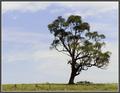
| 01/19/2003 07:51:15 AM | Windswept Treeby lisaeComment: Really great concept, that tree all mangled from the wind, standing lonesome against the skyline. At some points the tree looks to be a bit fuzzy and out of focus, but that could also be the texture of the tree tricking my eyes. I think the framing great, although there is a bunchof dead space, without it this picture wouldn't work. 7. | | Photographer found comment helpful. |
Home -
Challenges -
Community -
League -
Photos -
Cameras -
Lenses -
Learn -
Help -
Terms of Use -
Privacy -
Top ^
DPChallenge, and website content and design, Copyright © 2001-2025 Challenging Technologies, LLC.
All digital photo copyrights belong to the photographers and may not be used without permission.
Current Server Time: 04/11/2025 12:06:24 AM EDT.
|