| Image |
Comment |
| 01/24/2003 07:26:17 PM |
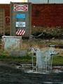
The Crossingby howzaComment: Interestin gchice for a location, it sure is not scenic. I just love the shopping cart in the mud puddle, for som ereason I find it funny. The placement of the objects sign & cart is superb. The focus is sharp, the lighting a tad dark, could stand to be a bit lighter. Subject matter, OK, but not a shot I would want to hang on my walls. 7. |
 Photographer found comment helpful. Photographer found comment helpful. |
| 01/24/2003 07:21:59 PM |
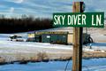
Feeling Daring?by alanfreedComment: Nope not daring at all. Very good focus on the sign with the background blurred out. I think the skydiver shop should have been a bit more crisp due to that plays an integral part in this shot, but I love the effect on the trees. The lighting is great, really bright on the sign, a bit less on the shop and very dark on the trees, kind of follows the importantness of objects in this shot. The placemento of the sign is good, but I think cropped just a bit too close on the right part of the sign, but not bad. 7. |
| Photographer found comment helpful. |
| 01/24/2003 07:13:08 PM |
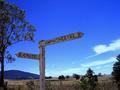
Sign in Blueby PtmanComment: What a beautiful BLUE sky! The focus on the sign was good and the placement OK. Mabey a little less of the tree on the left and a little bit more of the land, the horizon is a bit low creating a bit toooo much sky and empty space.
The lighting is good and the sign is interesting, not your typical strret sign.7. |
| Photographer found comment helpful. |
| 01/24/2003 06:39:21 PM |
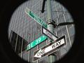
at the end of the tunnelby BeeGeeComment: This is a nicely done shot, I like the creativeness with tunnel aspect. Why did you crop part of the effect? Your focus was very crisp and the lighting was good. To be honest though the sign is a bit boring, though you truly tried to liven it up, it still doesn't just jump out and interest me. The technical aspect of the shot is sound though. 7. |
| Photographer found comment helpful. |
| 01/24/2003 06:32:38 PM |
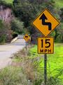
Slight Turn Aheadby xertionComment: Wow that is one dirty sign. I don't prefer centered shots, but in this case it works. You have placed it almost dead center of this shot and is pleasing to the eyes like that. I like the colors They are really vivid. Your focus was good, the sign is very crisp and so is the background, but it is not distracting. The lighting on the sign is good I guess the only thing that bothers me is how dark the foreground is and the shadowing. All in all great shot.7. |
| Photographer found comment helpful. |
| 01/24/2003 06:20:41 PM |
Duck Crossingby Wheeler1992Comment: This is a cute & creative idea, but there is not enough emphasis on the sign. The background is a bit distracting and there is a weird glare on the sign. Next time try not to put the sign right in the middle. By not centering the sign, you could have eliminated some of the background. |
| Photographer found comment helpful. |
| 01/23/2003 06:25:02 PM |
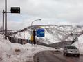
up at the ski area - usually two more degrees lowerby kenboComment: Yikes, that is cold! This shot has really good focus, and I love the originality, but I am not really drawn to the signs in this shot more to the scenic back drop/road/cars. I think I would have cropped the whole road out of this shot and kept with the 2 signs as this would create more visual attention to them . With a crop like that it would tend to follow the 3rds a bit more also. 7. |
| Photographer found comment helpful. |
| 01/22/2003 08:41:14 PM |
Ironic Intersectionby Ricky CleaveComment: Very cool find, I just love the title. Your focus is good, but color wise, there is just too much blue in this shot. Where is the green of the signs? The color contrast of blue/green or even white/green would also help the signs stand out a bit more. I also might have tried to approach this shot at a different angle if at all possible. Due to the fact of having to read both signs I would have tried to get the post dead center in the shot, or if you cropped some include a bit more sky on the state side, give the shot a sense of balance. 7. |
| 01/22/2003 08:27:05 PM |
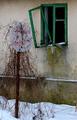
Abandonedby miracComment: Cool find, it sure looks like a long lost forgotten sign. Besides the fact that the sign is faded, I think the shrubbery really adds the touch to create the image of forgottoness. Due to the nature of the shot there are not many colors, except the green, I think I would like to see this shot in black and white. The placement of the sign is great, focus is good, and in this shot I really like the inclusion of the whole post. 7. |
| Photographer found comment helpful. |
| 01/22/2003 03:18:15 AM |
Show Me A Signby bobgaitherComment: The first thing that hit me in this shot is what awesome clors, the green is just so vivid.I like how you kept the first two signs, which are the most notable in excellent focus. I also really liked how the road comes in then curves off out of the shot. I think you could have cropped it up to about the bottom of the two track, the weeds do nothing for the shot unless you just reallly wanted the bottle included, but in my opinion, you really don'tneed it. 8. |
| Photographer found comment helpful. |
Home -
Challenges -
Community -
League -
Photos -
Cameras -
Lenses -
Learn -
Help -
Terms of Use -
Privacy -
Top ^
DPChallenge, and website content and design, Copyright © 2001-2025 Challenging Technologies, LLC.
All digital photo copyrights belong to the photographers and may not be used without permission.
Current Server Time: 04/11/2025 12:08:34 AM EDT.